Work of the Week
by Derrick R. Cartwright, Director of Curatorial Affairs
Work of the Week #52
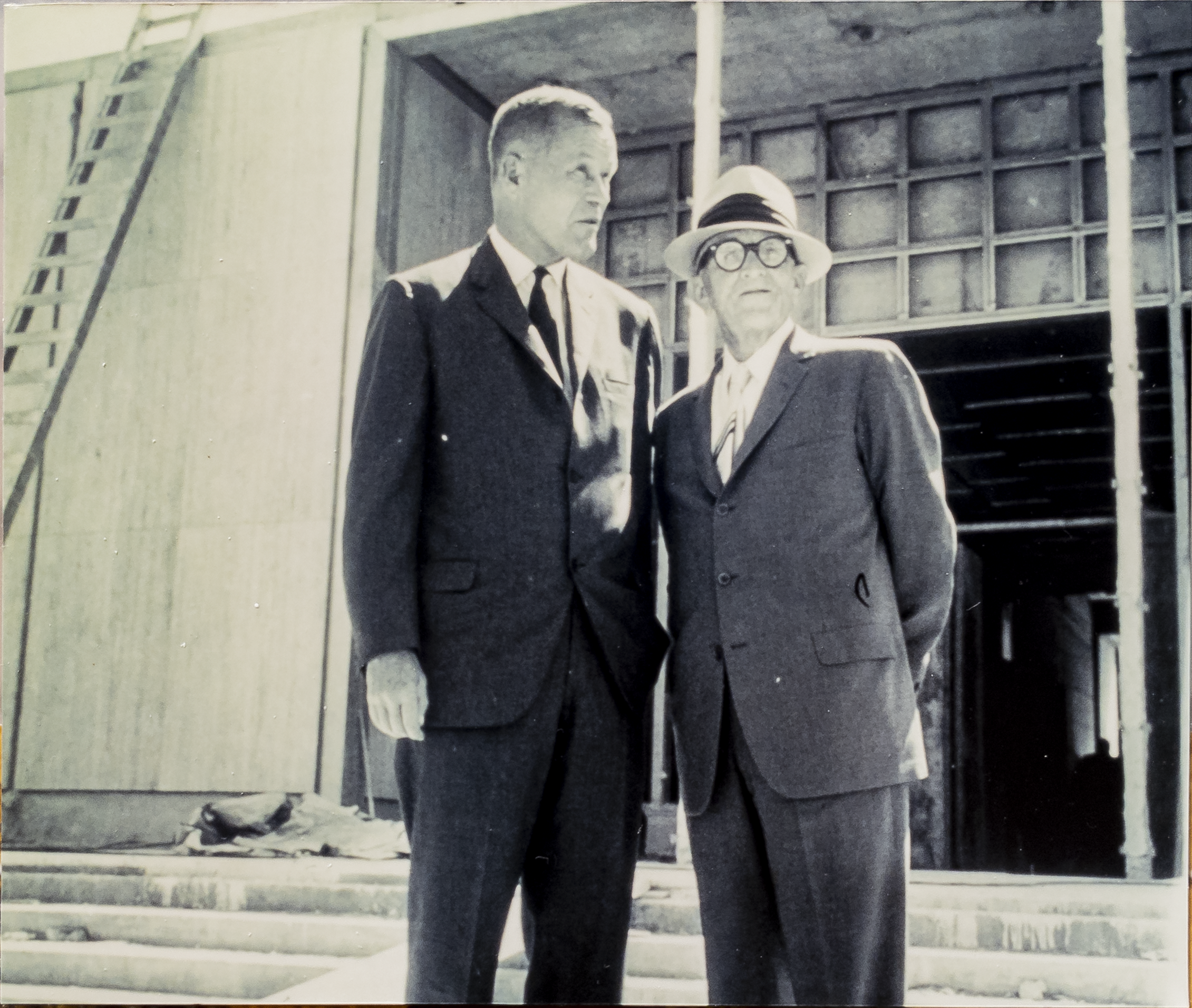
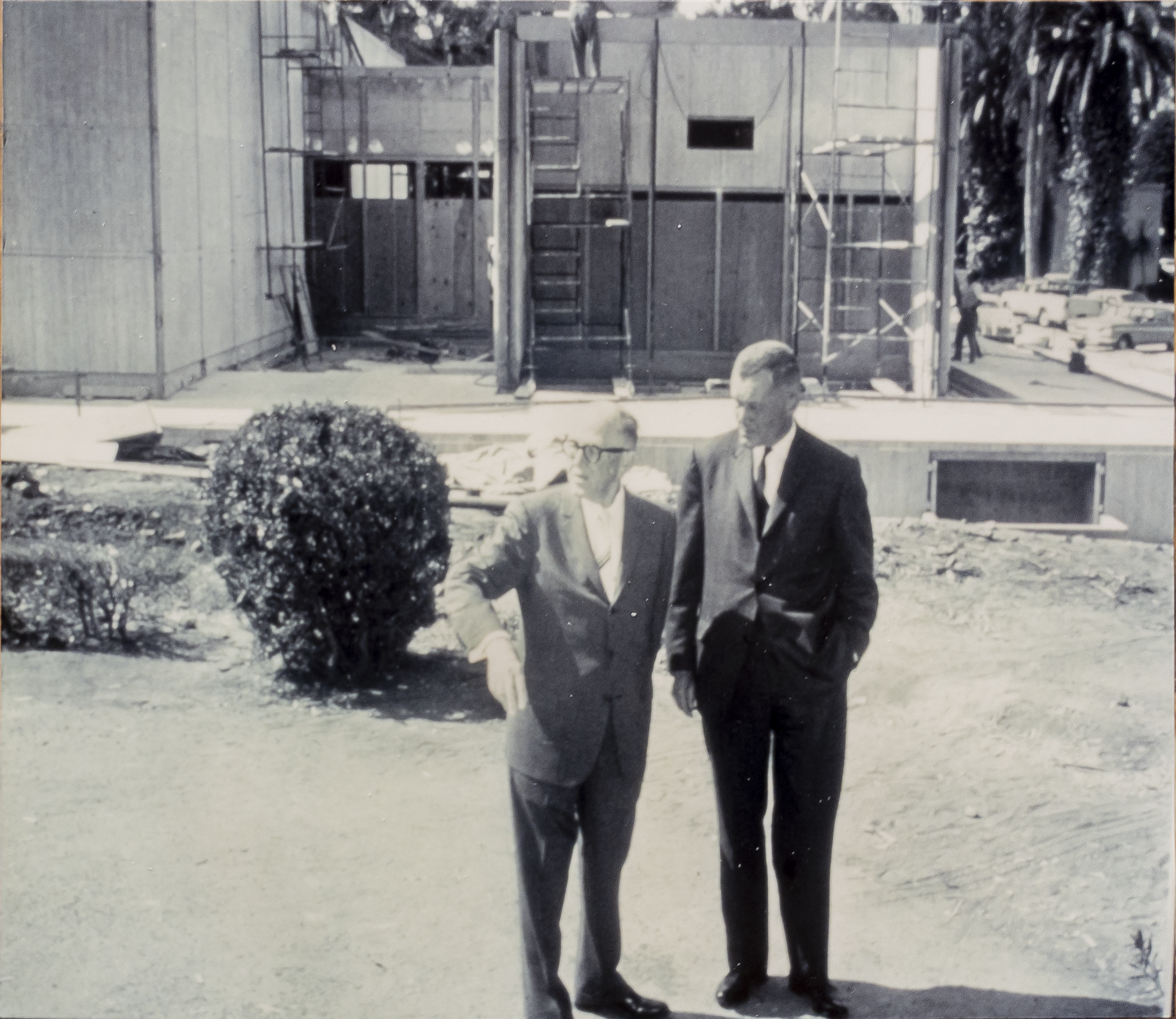
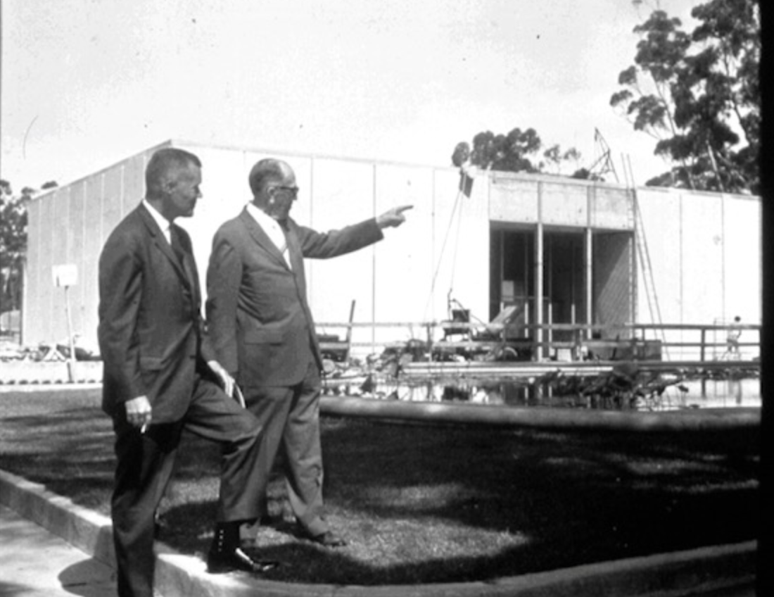
Frank L. Hope & Associates, The Timken Museum of Art, 1965

This weekly posting has been used to celebrate Timken paintings and sculpture. It seems fitting to mark a full year of “works of the week” with a note about the museum building itself which is another object of distinction.
Plans for a “free gallery” to house the extraordinary collection of European paintings collected by the Putnam sisters date back to 1951. Amy and Anne Putnam, with guidance from their attorney, Walter Ames, quietly began exploring the idea that year, relying on the advice of leading museum professionals as they patiently moved their project forward. During the time that the Putnams were actively acquiring major works of art for the benefit of the public, and lending their pictures to other prestigious museums. they imagined a new, permanent home for their display in San Diego. By the early 1960s, these plans had evolved significantly for a stand-alone building adjacent to the San Diego Museum of Art, where the sisters had started their philanthropic art donations back in the 1930s. SDMA had been designed by a Beaux-Arts trained architect, William Templeton Johnson (1877-1957) in 1926, using the Spanish-Renaissance-inspired vocabulary that the Panama-California Exposition had promoted so successfully. Ames determined that the Putnam Foundation’s collection ought to look invitingly different. With essential funding from another prosperous client with San Diego connections, the Timken Family, Ames set out to identify an architect capable of building a new, state-of-the-art structure to house the priceless artworks stewarded by the Putnam Foundation.
Ames ultimately engaged Frank L. Hope & Associates (later the Hope Consulting Group), a local architectural firm. Frank Lewis Hope, Jr. (1901-1994) came to San Diego as a teenager. It seems likely that he witnessed the architectural transformation then taking place in the city’s Balboa Park. It is hard to imagine that the appearance of Bertram Grosvenor Goodhue’s (1869-1924) landmark California Building (today’s Museum of Us), did not partly inspire Hope’s ambition to become an architect of note. He worked briefly on domestic buildings with legendary figures such as Richard Smith Requa (1881-1941) and Lillian Jeannette Rice (1889-1938) before opening his own firm in 1928. During the 1960s, Frank L. Hope & Associates enjoyed a bustling practice that included numerous important civic structures, including San Diego Stadium (later Jack Murphy/Qualcomm/SDCCU Stadium, recently demolished). Perhaps for this reason, Hope charged one of his younger associates, John R. Mock (b. 1934) with key design responsibilities for the Timken Gallery commission. Walter Ames, deeply engaged in the project on behalf of his clients, provided significant financial and aesthetic oversight.
When it opened to the community in October 1965, the building that Mock designed with Ames’s approval looked strikingly different than the reigning revivalist architecture in Balboa Park. According to some with direct knowledge of the construction costs, the Timken Gallery was then the most expensive building per square foot ever built in the city. Not everyone was an immediate fan of the white travertine and glass structure. Nevertheless, the Director of the National Gallery of Art at the time, John Walker, praised it unreservedly as “a jewel box for the arts.” Today, mid-century modernism has wide currency as a retro style, in addition to ardent fans in the architectural community. The Timken is often compared with iconic museums that were finished soon after it: Louis Kahn’s Kimbell Art Museum in Fort Worth (1972), I.M. Pei’s Herbert F. Johnson Museum at Cornell (1973), or Gordon Bunshaft’s Hirshhorn Museum and Sculpture Garden (1974). San Diego is fortunate to have this remarkably prescient example of modernist principles--pure geometries and undisguised use of materials--within its overall ecology of fine museum buildings. When the museum re-opens later this year, Mock’s sense of clarity and gracious public space will again be on full display, enhancing appreciation of the art that we all miss so much.
Work of the Week #51
Rembrandt van Rijn, Saint Bartholomew, 1657
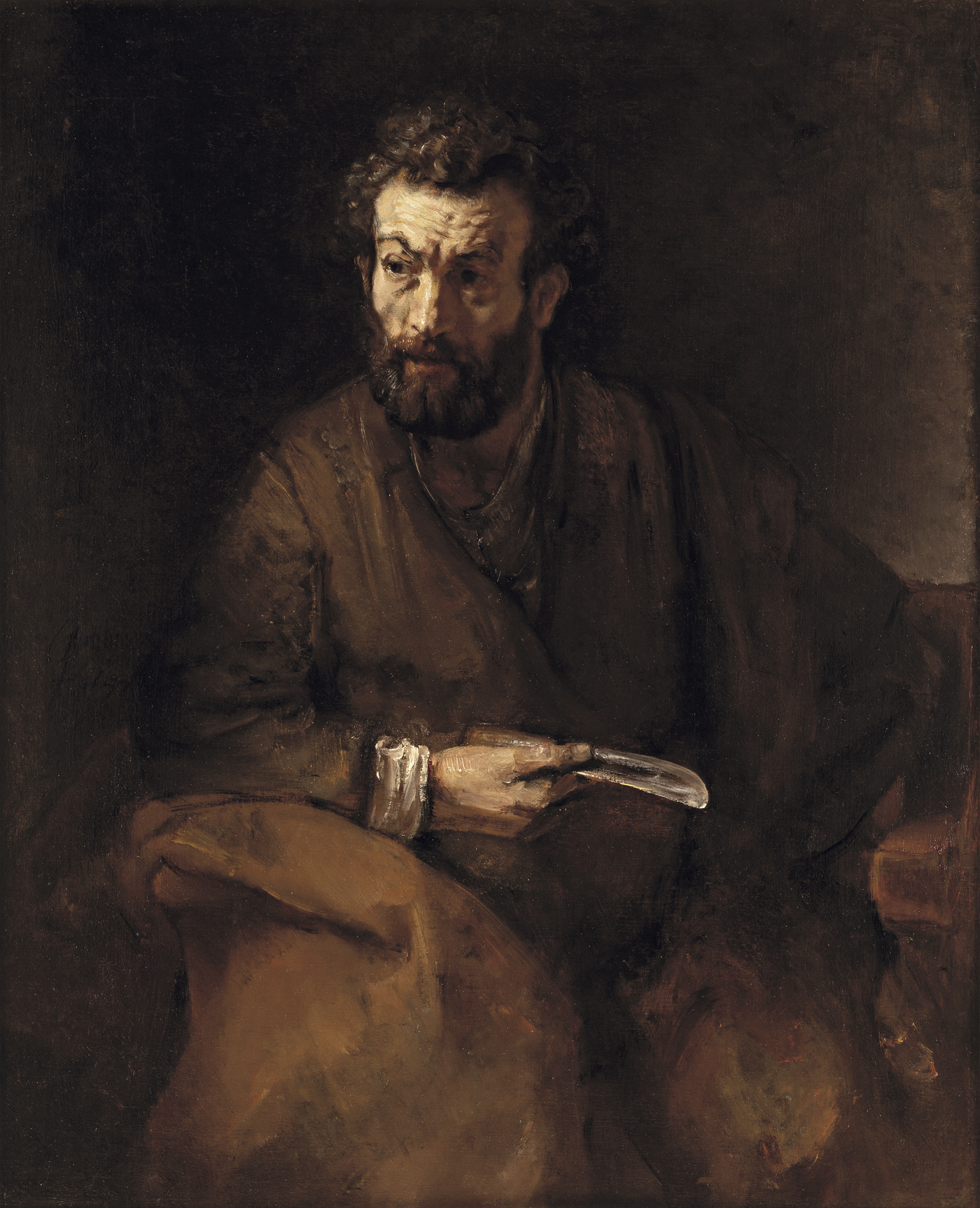
Ever since the Putnam Foundation acquired a major work by Rembrandt van Rijn (1606-1669), in 1952, stewards of the 17th-century masterpiece have been keenly aware of how people from across the globe flock to it. Without overdramatizing, St. Bartholomew serves as a pilgrimage destination for devotees of the artist. The large image is, after all, the only authentic oil painting by Rembrandt in San Diego, and one of just 14 paintings by him in Southern California according to the scholars who know these things (https://mk0rembrandtins14vr1.kinstacdn.com/wp-content/uploads/2019/05/Rembrandt-In-Southern-California-Exhibition-Guide-v7.pdf. ) Although the Timken has been closed to the public for almost a year now, the museum has felt a responsibility to ensure that museum visitors have access to Saint Bartholomew, whenever it is possible. To this end, several months ago, we worked with our colleagues at the San Diego Museum of Art to install the painting in their European galleries while the Timken took advantage of its closure to perform some facility improvements. The pandemic vexed even that effort to share. For my part, I’ve postponed writing about this image in this space for almost a year, anticipating the chance to use my “Work of the Week” forum to celebrate Saint Bartholomew’s reinstallation in our galleries.
We don’t know precisely when that will happen, but an end is in sight. Public health guidelines permitting, the museum will likely reopen--magnificently refreshed--later this year. Rembrandt’s painting calls us back from any despondency about delays, however. At his best, as he was when painting St. Bartholomew, the artist was masterful at representing complex states of mind. Leaning forward in a slightly inquisitive manner, the bearded figure in this dark composition seems to ask: “What makes you think you’ve got it bad?” As if in response to his own question, he holds in his right hand a broad, steel blade that references his own martyrdom: Bartholomew was skinned alive. Pointedly (no pun intended), the knife itself reflects an exterior light source, glinting near the image’s center. It is a curious fact about this work that, at one point in its history, a squeamish owner eliminated the knife by having a book painted over it. Thankfully, conservators were able to remove that overpainting without leaving a trace. We should remember that images like this one had precise, didactic purposes. Beyond showing off the artist’s bravura brushwork and his uncanny ability to conjure realist effects, St. Bartholomew’s expressive impact depends on our appreciation of the Saint’s refusal to give in to, or even register personal despair. He remains stoic and utterly convinced of his role in spreading the gospel throughout the world. If we feel disillusioned about the state of things today, just consider St. Bartholomew. Rembrandt puts him on the edge of his seat, poised to spring into action, and visibly unconcerned about whatever fate brings his way. By way of contrast, let’s consider a slightly earlier treatment of the Saint’s iconography, by Jusepe de Ribera (c. 1591-1652) (https://www.museunacional.cat/en/colleccio/martyrdom-saint-bartholomew/josep-de-ribera-o-jusepe-de-ribera-dit-lo-spagnoletto/024162-000 ). In that dramatic, Spanish work, Bartholomew is shown near the beginning of his torment. His physical suffering is palpable as, upside-down, he gazes imploringly back at the spectator. Eschewing the principle of calling for empathy with the martyr, Rembrandt instead offers the firmly seated figure as a source of almost professorial wisdom. Bartholomew’s furrowed brow suggests that he is thoughtfully engaged with the present. Even though he recognizes things aren’t going well for him, he won’t be thwarted from his higher purpose. Let’s take courage from Rembrandt’s example. Emerging from darkness, there is reason to remain hopeful and alert.
Work of the Week #50
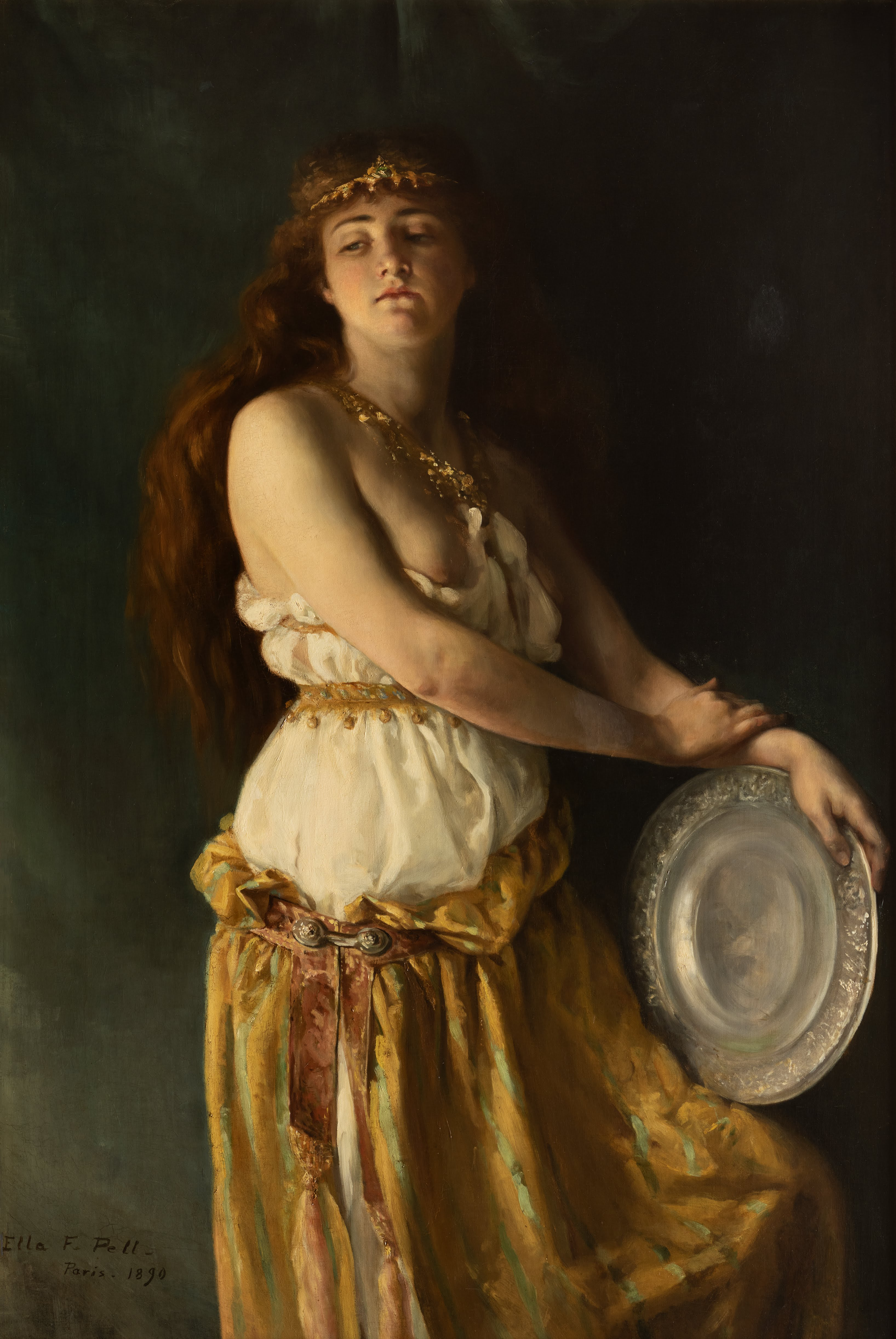
Ella Ferris Pell, Salomé, 1890
Ella Ferris Pell (1846-1922) rose to a prominent place in American art circles during the decades immediately following the Civil War. First, she studied with the English-born artist, William Rimmer (1816-1879), at Cooper Union School of Design in New York. While still a student, Pell was praised for her sculpture entitled Andromeda that was displayed in a survey of new talent. Accompanied by her sister and brother-in-law, Pell next voyaged throughout Europe and North Africa from September 1872 until November 1878. That trip is documented by a stack of sketchbooks that are today kept at Vassar College. Upon returning to New York, Pell expanded her career as painter and illustrator. Her triumphs in local exhibitions and the leadership roles she played in several New York art groups meant that Pell’s name appeared often in American art journals and newspapers, including the society pages that tracked her summer forays to resorts in the Catskills. At age 43, Pell returned to Europe, determined to get noticed in the thriving expatriate American art community in France. She entered the atelier of Jean-Paul Laurens (1838-1921), among others, where she was steeped in the exotic historicism of late-19th-century academic painting. Pell had success showing numerous works at the Salons of 1889 and 1890, then returned to New York City. Her career continued to bloom for another decade with allegorical subjects being acquired by major museums throughout the United States. In 1905, Pell moved to the small town of Beacon and spent the rest of her life in the Hudson River Valley. There she worked, not quite in obscurity, but without the substantial, visible triumphs that attended her early career.
Salomé was one of two large paintings by Pell displayed at the 1890 Salon. Among the limited number of American works that the jury selected in May of that year, Pell’s depiction of the biblical femme fatale attracted favorable attention. Instead of focusing on the brazen dance of a bejeweled temptress, as Gustave Moreau (1826-1898) had in his Salon entry of 1876 (https://hammer.ucla.edu/collections/armand-hammer-collection), or the adolescent’s legendary blood lust, as so many contemporaries did, Pell represents Salomé as an introspective figure. The embossed, silver platter that will soon receive her reward for pleasing King Herod, the severed head of John the Baptist, rests casually on her striped skirt. Pell gives her anti-heroine an inscrutable expression and an almost ambivalent attitude, attributes that stoked critical debates at the time, and which have earned this painting extensive scholarly attention ever since. Pell herself recognized the stir that this image caused and considered it to be one of her best. After its public exhibition in Paris, Salomé went on display at the National Academy of Design in New York and, subsequently, went on a tour of the United States. It was purchased by the Boston Art Club for its permanent collection in 1896. Pell’s masterwork has been included in numerous exhibitions throughout the world since.
Some of you may recall that Salomé was a centerpiece of the Captivating Women exhibition held at the museum just before the pandemic brought our in-person programs to an abrupt end. Then, as in the past, Pell’s enigmatic picture was a popular favorite with the public.
Work of the Week #49
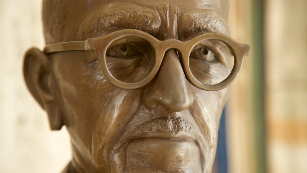
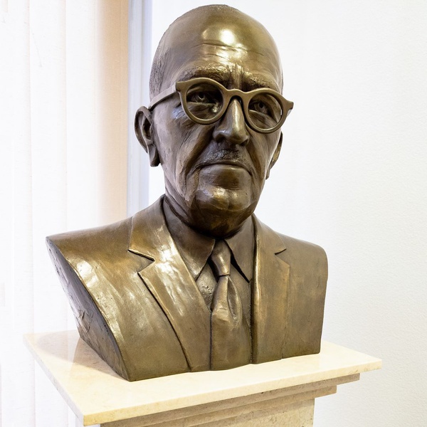
Ruth Hayward, Bust of Walter Ames, c. 1980
When writing about the Timken’s history, it’s practically obligatory to invoke the support of the Putnam sisters--Amy, Anne, and Irene. Less frequently, and usually in passing, I’ve had occasion to mention members of the Ames family, who played another critical role in the creation of this museum. Walter Irving Ames (1894-1980) was the Putnams’ trusted attorney, after all. He orchestrated the sisters’ estate planning in ways that have ensured the long-term health and sustainability of the Timken, even during trying times. Ames was part of the San Diego law firm --Gray, Cary, Ames & Driscoll (later, until 1993, Gray, Cary, Ames & Frye)--which he helped found in 1927. For decades, Ames lived on Hillside Drive in La Jolla, together with wife Marguerite and his children, Nancy and Bob. Highly respected in San Diego business circles, he was sometimes identified as a member of the “Broadway Barons”--a group of downtown leaders that included the likes of Roscoe Hazard and Walter Trepte. At the time of Amy Putnam’s death, in 1958, Ames stepped in to become the President of the Putnam Foundation, the legal entity tasked with purchasing important works of art for a future “gallery” in Balboa Park. Though Ames never pretended to be anything other than a lawyer, he capably negotiated the acquisition of numerous paintings for the museum while simultaneously overseeing construction of the modernist structure that opened to the public as the Timken Gallery of Art, in 1965. Next, he dedicated himself to leading the gallery, serving as its first Director, until 1977, when Nancy Ames Petersen, his daughter, succeeded him in that role. Fellow-board members so appreciated Ames’s dedicated service that they commissioned a commemorative portrait shortly after his passing.
The decision to select Ruth Hayward (b. 1934) as the artist responsible for that lasting tribute may seem like a foregone conclusion. Hayward created the larger-than-life bronze statues of Kate Sessions, Alonzo Horton, and George Marston that greet most visitors to Balboa Park on either side of the Fifth Avenue entrance. She also created likenesses of philanthropists, such as Ellen Browning Scripps, the opera conductor, Karen Keltner, entrepreneur, Dr. Terry Straeter, and the comedian, Lily Tomlin, for prominent public displays. Hayward, a native San Diegan who is now 86, is also a noted nature photographer. Despite her status as a go-to sculptor for the civic leaders, Hayward came to that profession late in her career. Her early background was not in the arts. Hayward trained as a mathematician and worked as an engineer at General Dynamics for four decades before retirement provided her with the opportunity to pursue a second career as a sculptor. Hayward studied with the Leucadia-based artist, T. J. Dixon (?-2018) who with her husband, James Nelson, specialized in similarly realist monuments of noteworthy Californians. The likeness she produced of Walter Ames has stood for more than 3 decades on a pedestal near the entrance to the Timken Museum of Art.
For many years Hayward’s bust was the only permanently, if inconspicuously, displayed work by a woman artist in the building. That is about to change. Stay tuned.
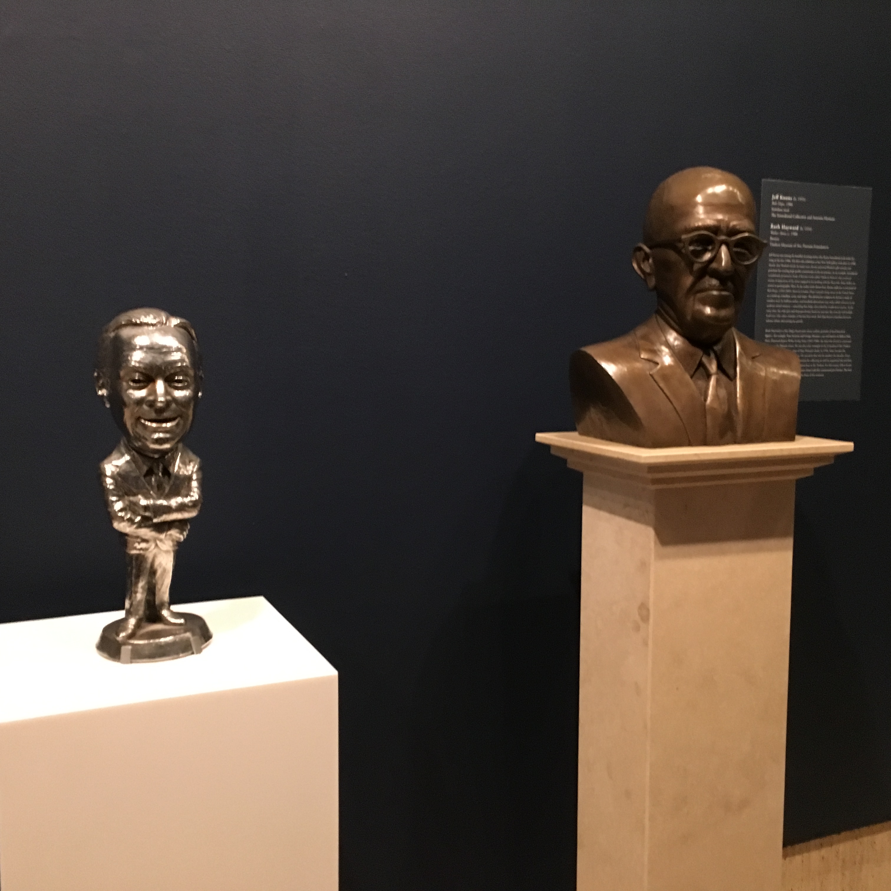
This photo was taken from Timken Museum of Art's Spring 2019 Exhibition Metonymies from the Sonnabend Collection. Bust of Walter Ames sits next to Bob Hope by Jeff Koons.
Work of the Week #48
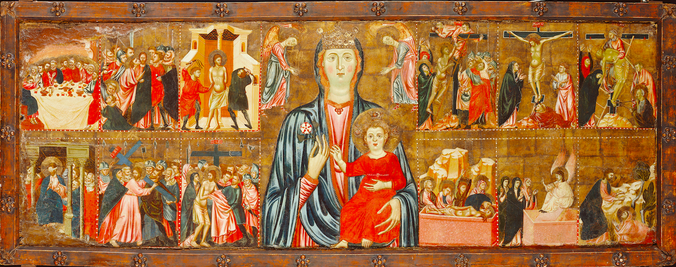
Luca di Tommè, Trinity with Crucifixion Triptych, c. 1355
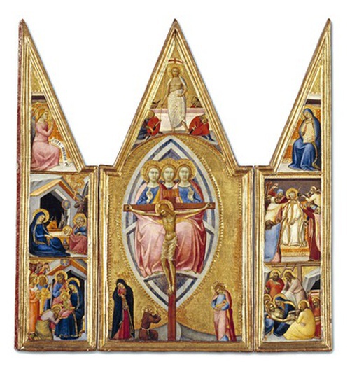
Luca di Tommè (active 1355-1389) was a prolific artist who was among the first to join the painters’ guild in Siena shortly after it formed in 1356. Although it is not certain, scholars have suggested that he likely received his own training from Pietro (act. 1306-ca. 1348) and Ambrogio Lorenzetti (1285-ca. 1348), the important family of artists who dominated Sienese painting during the early trecento (1300s). Luca supervised multiple decorations in the Duomo di Siena, a cathedral begun in the 12th century but which was only completed in his lifetime, around 1348. When not managing the crew of apprentices who populated his thriving workshop, he busied himself with commissions to paint book covers and devotional images--both public and private. These were coveted objects throughout the second half of the 14th century.
The Timken’s small triptych was almost certainly created for a private individual’s use. It is noteworthy for the sheer profusion of its biblical narratives. The whole measures roughly 22 inches wide by 22 inches high, when fully opened, but includes no less than seven detailed scenes from the life and death of Christ on its three hinged elements. The central, largest panel represents the Crucifixion. The body of Christ is framed within a blue and white mandorla (almond-shaped orb) where he is supported by the Trinity draped in an encompassing red shroud. Mourning figures, including Mary, Saints John and Francis, appear at the base of the cross while in the top part of this peaked panel, Luca depicts the Resurrection. The triptych’s wings are similarly sub-divided into corresponding iconographies: at top right and left we have the Annunciation; in the center, the Nativity and mocking of Christ; at bottom, the Adoration and the Lamentation. The whole of this heraldic, dialogic, compressed narrative is set off by its bright gold background, at once paying homage to its Byzantine precedents and asserting its conspicuous presence as a luxury object.
A large number of Luca di Tommè’s works exist today. A few ambitious decorations from the late 1360s through 1370 remain in situ, such as the Altar of St. Anne in Siena (c. 1367) or another altarpiece made for the cathedral of Rieti, south of Perugia, which is signed and dated (1370). A spectacular, painted crucifix of roughly the same date that would have been used in liturgical services is now at the Harvard Art Museums (https://harvardartmuseums.org/collections/object/227905?position=0). More commonly, however, we encounter small panels that have been disassembled from much more complex works, likely to make them saleable to collectors long after the Renaissance. For example, a similarly-sized triptych depicting the Virgin and Child with Sts. Louis and Michael (bef. 1362) can today be found at the Los Angeles County Museum of Art (https://collections.lacma.org/node/232449). A few larger representations, presumably elements of more ambitious altarpieces, are also attributed to the artist. These include The Assumption of the Virgin (1362) at Yale (https://artgallery.yale.edu/collections/objects/263) and St. John the Baptist (late 14th c.), at the Getty (https://www.getty.edu/art/collection/objects/614/luca-di-tomme-saint-john-the-baptist-italian-late-14th-century/). The Timken’s early, complete, and remarkably well-preserved work by Luca is a rare thing, therefore.
Acquired by the Putnam Foundation in 1967, the Trinity with Crucifixion helps distinguish the fine group of trecento works available to study here in Southern California.
Work of the Week #47
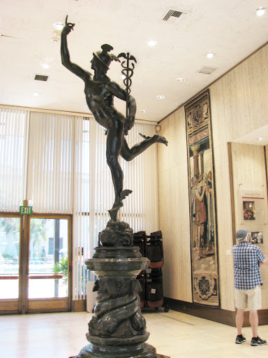
After Giambologna, Flying Mercury, late 19th- or early 20th-century
Jean de Boulogne--better known to art history by his nick-name, Giambologna (1529-1608)--was born in Douai, in today’s Northern France, but which was Flanders in the 16th century. He worked for the greatest part of his career in Florence, Italy. It has been suggested that Giambologna’s Medici patrons jealously refused to give him permission to leave the city once he had proven his talents. Indeed, he was widely judged to be the most innovative sculptor among the generation of artists who came of age after Michelangelo Buonarroti (1475-1564). Giambologna’s powerful, intertwined figures in marble and bronze epitomized Mannerist principles as the aesthetic values of his era tipped from pure Renaissance idealization toward heightened Baroque drama.
The Timken has a fine example of Giambologna’s work. Well, sort of. For many years, we displayed a copy of the artist’s Flying Mercury in the museum’s main reception area. An original, sixteenth-century cast of this famous bronze sculpture is now kept at the Bargello in central Florence. Multiple replicas of Mercury are to be found in museums throughout the world. A remarkable, half-sized version is at the Kunsthistorisches Museum in Vienna, for instance, along with more than a dozen other great examples of this artist’s sculpture which were collected by Habsburg connoisseurs. Some of these casts of Mercury are, if not original, quite old. The Timken’s is relatively new. Experts believe that it was likely created during the second-half of the 19th-century, if not later, and most of the folks we’ve consulted have noted that its resemblance to the expertly-finished bronzes that were produced in Giambologna’s time is strained. A distant relation, a gesture toward the noble past--or maybe just a really nice piece of garden decoration--ours is far from a masterpiece in its own right.
How did this work come to be at the Timken, a place that doesn’t have the habit of displaying replicas in its galleries? There is a good answer to that question in the institution’s archives. Walter Ames, the formidable lawyer who helped San Diego mastermind the construction of the Timken building, was a fan of the National Gallery of Art. During one of Ames’s frequent visits to Washington, D.C. in the early 1960s, he paused to admire the NGA’s cast of Mercury. That version was also created significantly later than the original. It likely dates from the 1780’s/1850’s, but had once belonged to Paul Mellon, whose philanthropy helped boost the creation of that institution. “If good enough for Paul Mellon,” Ames may have reasoned, “then it is good enough for the Timken.” A receipt for Mercury exists still in the curatorial records of the Timken, demonstrating that Ames knew exactly what he was acquiring: a very late copy.
A couple of years ago, we removed Flying Mercury from the prominent, centrally-located space it had occupied since the museum’s opening. This decision, it needs to be said, was reached not because it was inauthentic, but because we desperately wanted to create a more welcoming environment for our visitors. A few ardent fans of the sculpture complained about missing it, but those with whom I spoke directly did not understand that this sculpture was a copy, made long after Giambologna’s time. Indeed, most were surprised to learn it was a modern object, not much older than the modern building in which it had been placed. We are in the process of re-siting Flying Mercury in the small, manicured garden located just to the South of our entry corridor. I am confident it will look lovely there, like the sturdy outdoor garden decoration that it was always intended to be.
Work of the Week #46
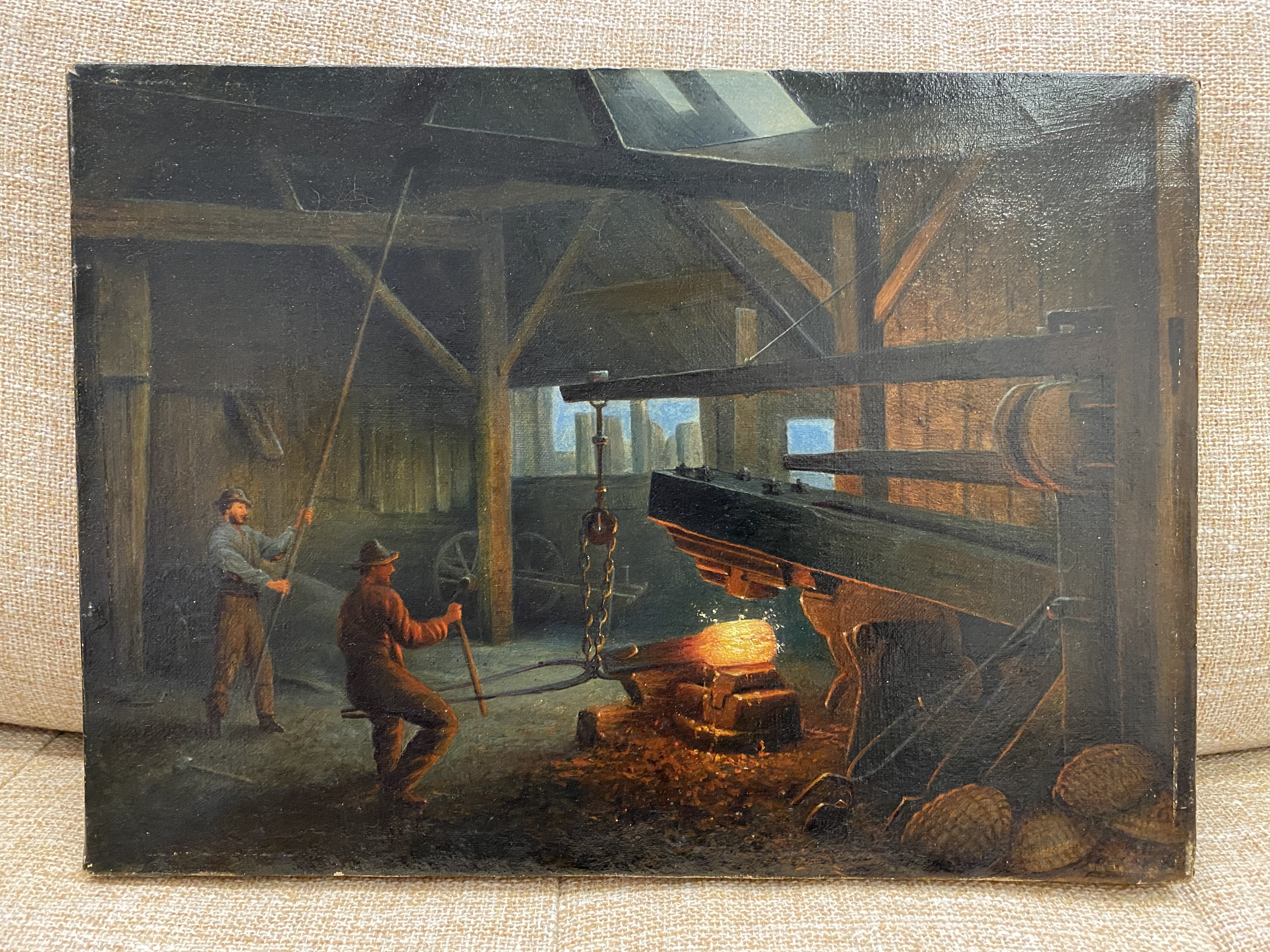
Unknown American Artist, Putnam Forge, after 1870
A small painting--from memory, I’d say it measures only about 8 inches tall by 11 inches wide--hangs on a rack toward the back of a secured storage space at the Timken Museum of Art. Without a frame, it appears inconspicuous, even ignoble. It lacks a signature and, if we turn it over, there are no inscriptions or tags on the back of the canvas to help identify it. The wooden stretcher is crudely joined. The members that form the support were planed by hand and bear only a stencil, also applied crudely, in black paint: “10 8 15”. Apart from this, it is a strangely mute thing. The mysterious object refuses to communicate how it even came to be at the museum.
Let’s turn it over and look at it again from the front. I have studied a lot of pictures, and because my own field is North American art, I am confident that this was painted by an American artist sometime during the second half of the 19th century. The dress of the two men it depicts and the type of large iron forge they manipulate suggests this much. The subject matter is familiar, too. During this period, John Ferguson Wier (1841-1926) painted still more heroic versions of laborers working on forges--one is at the Metropolitan Museum of Art and another slightly earlier depiction belongs to the Putnam History Museum in Cold Spring, New York.
The latter reference to Putnam County ought to trigger some recognition for those who know the Timken. The Putnam sisters--Anne, Amy, and Irene--lived in Bennington, Vermont before they moved to San Diego in the early 20th century. Their family’s wealth came from several sources--manufacturing of various kinds, including iron tacks and barbed wire--and meant that they were among both the wealthiest and most philanthropic members of their community. Before the family lived in Vermont, however, they lived in the Adirondacks and ran “the New Russia Forge. . . one of the oldest ironworks in the County, having been erected about the year 1802.” By 1869, the forge was being managed by “Messrs E[lbert] H. and H[enry] A. Putnam,” uncle and father of the Putnam sisters, respectively. The New Russia Forge then “contained four fires and a wooden hammer of about one thousand eight hundred pounds weight” (see Winslow C. Watson, Military and Civil History of the County of Essex, New York, 1869, p. 459).
I think we are looking at that 1800-pound hammer in this small painting. I also think this is the picture that a Putnam relative mentions in a letter sent to Amy and Anne received toward the end of their lives, inquiring whether they still owned the image of the Putnam Forge. It seems possible that they kept it with them in their travels from Vermont to San Diego as a remembrance of their roots in the East. If I am correct, that is how the painting came to be in the vaults of the Timken. Somewhere along the way, it lost its frame along with all the traces of its commemorative function. While I am not necessarily eager to make claims for its aesthetic significance, it is important to the history of the founding of our museum. For that reason alone, I can’t wait to reframe it and share it with you when we all can return to Balboa Park.

Work of the Week #45
Francisco de Zurbarán, St. Francis in Meditation, c. 1635
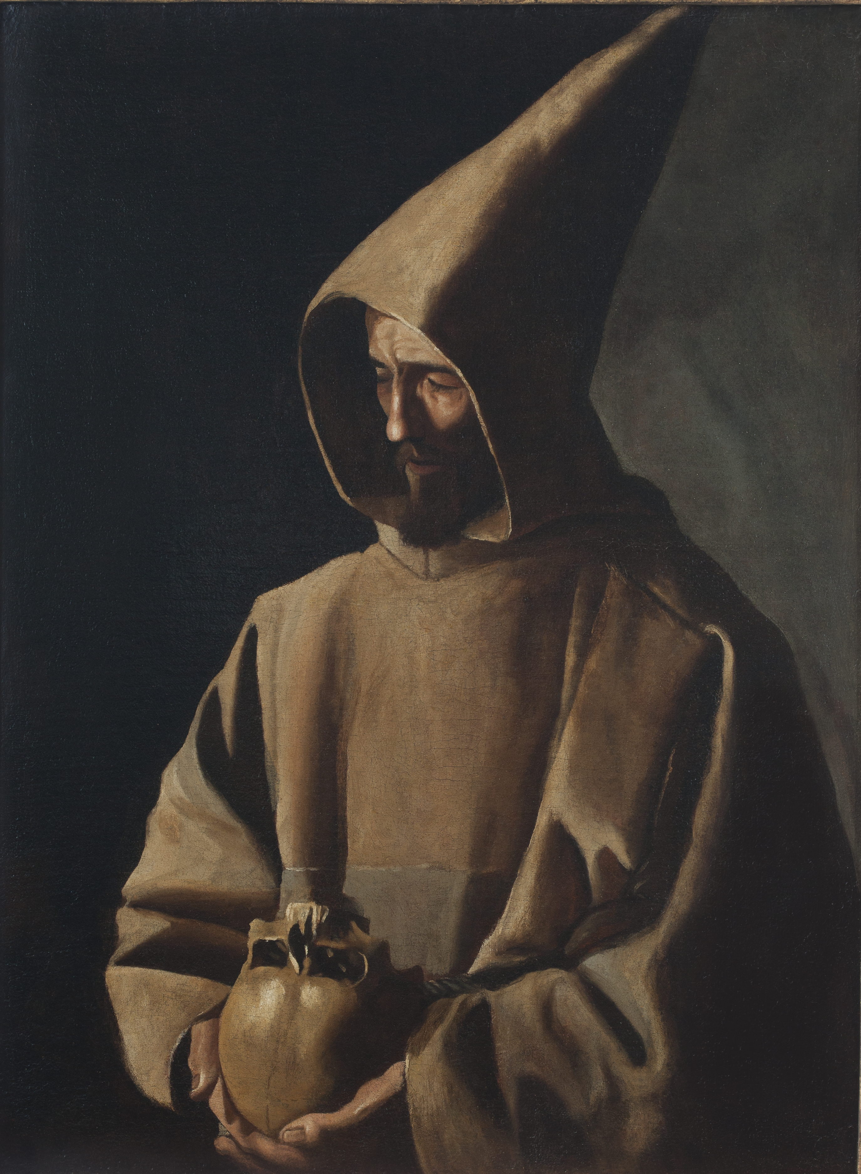
Giovanni di Pietro di Bernardone was born in Assisi, Italy, either in late 1181 or early 1182, the records are unclear. Shortly afterwards, the child was renamed Francesco, or Francis. Part of a prosperous family of merchants, Francis’s parents never particularly encouraged their son’s interest in spiritual endeavors. He ultimately renounced his wealth, however, and went into self-seclusion where various encounters helped sharpen his commitment to Christian faith. Soon after, he founded the religious groups that became pillars of the Franciscan Order: the Friars Minor, in 1210, and the Order of Saint Clare, also known as the Poor Clares, in 1212. Just two years after his death, in 1226, Francis was canonized by Pope Gregory IX.
Representations of St. Francis proliferated immediately after his death and included memorable works by Cimabue (c. 1240-1302) and Giotto (c. 1266-1377) whose stark frescoes recounting his life and miracles enliven the walls of the Basilica of St. Francesco in Assisi--if you haven’t seen them, they should be high on your post-pandemic travel to-do list. By the 1400s, Italian artists had largely codified the iconography by which St. Francis became instantly recognizable in numerous prints, sculpture, and easel paintings. One of the greatest of these is by Giovanni Bellini (1431/36-1516) whose shimmering panel, St. Francis in the Desert (1476-78, Frick Collection) is deservedly considered one of the most important examples of Renaissance art to be found in the United States.
Given this popular context, perhaps we should not be surprised by the fascination that the Spanish Baroque painter Francisco de Zurbarán (1589-1664) demonstrated in his namesake. Zurbarán painted St Francis dozens of times during his lifetime. These works were often made for the Franciscan religious orders who commissioned them as objects of devotion, but some may have also been for private individuals, too. There is an austere consistency with which the Sevillian artist represented the Saint, so fundamentally different from Bellini’s luminous approach of a century-and-a-half earlier. The Spanish artist reveled in the stark simplicity of his subject. Shown alone, deep in prayer or meditation, Francis frequently appears as a presence nearly lost among the shadows. Depicted wearing the dark robes of his order, he either looks up ecstatically toward heaven as he does in a work like St. Francis in Meditation (1635-29, National Gallery of London) or gazing downward with intensity, as he does in St. Francis Contemplating a Skull (c. 1635, St. Louis Art Museum) and in the Timken’s painting by the artist. Especially after 1634, when Zurbarán joined his rival Diego Velázquez (1599-1660) in Madrid, his busy studio churned out copies of these works for an eager market of the faithful.
The most recent acquisition to the Timken’s stellar collection, St. Francis in Meditation was acquired in 2015. There is a similar version of this work at the Santa Barbara Museum of Art, also worth a visit soon.
Work of the Week #44
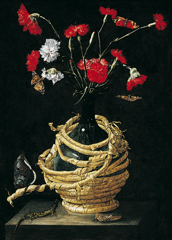
Unknown artist, Still Life, early 17th century
In what seems a lifetime ago, but really was only two years, I spent a careless morning strolling through London. I recall glancing into a gallery between St. James Square and Piccadilly--one of many on a street full of vendors of reputable old master paintings--when I was struck with an odd sense of recognition. Centered in its display window was a small floral still life in an elaborate gilt frame. The work was identified as being by Bartolomeo Ligozzi (1630-1695), an Italian painter of no remarkable importance, except that he was highly regarded throughout the seventeenth-century for depictions of brightly colored flowers. Often Ligozzi painted these blooms in vases set upon stone slabs, but in otherwise shallow, dark pictorial spaces. I stood in front of the window for what must have been a while studying the work. I took a picture with my cell phone. I committed the name of the artist to memory and thought to myself that I needed to do some follow-up research. I went to a meeting and promptly forgot about the encounter.
Sometime after I returned to my work in San Diego, I showed the cellphone image taken in London to an intern who was then assisting the Timken with organization of our curatorial files. The image was too full of reflections on the plate glass to convince her of what I had been thinking: “could this work be by the same artist who created the still life of flowers in a bottle at our museum?” Many attributions have been offered for that picture since it arrived at the museum in 1971. At first, some scholars hoped that it might be by Michelangelo Merisi da Caravaggio (1571-1610), or, more likely, by one of his followers, such as Guido Cagnacci (1601-1663). Why not Ligozzi, then? Sometimes settling questions about attribution is best done through the process of elimination. If we have no clear idea who was responsible for making a particular image--and in this case, we really didn’t--it is nonetheless helpful to rule out the names of artists who could not have done it.
In spite of the fact that we no longer know who made it, the Timken’s still life is painted with an indisputably charming naivete. Like the painting I studied from the sidewalk in London, it is lit from the left side. Stems of red and white carnations erupt in all directions from a low-necked glass wine bottle whose protective raffia covering is in the process of unraveling in a loose spiral. Our painting also includes depictions of several butterflies, a grasshopper, and a spotted lizard sprawled lengthwise across the grey shelf that supports the whole ensemble. That lizard cranes its neck up toward the bouquet above it, testifying to the artist’s skills at creating convincing, illusionistic detail. Depictions of insects and reptiles are staples of baroque still life practice, especially in Northern Europe. That iconography appears slightly less often in Italian work of the same moment, but it is not unheard of there, either. Comparisons between the Timken picture have been made to other early 17th-century works--for example the Museum of Fine Arts, Boston’s Poppies in a Wine Flask (https://collections.mfa.org/objects/33397/poppies-in-a-wine-flask?ctx=eff4655e-2825-4f86-b9f3-7b8c4e363898&idx=0) which shows similarly disordered bunches flowers and torn coils of raffia, but has no critters to speak of. At one time in its past, Boston’s painting was once attributed to Caravaggio. Today the artist is listed as unknown, although one scholar recently suggested Tommaso Salini (c. 1575-1625) as a possible maker.
I haven’t given up on our little painting, or the possibility of someday learning the name of its maker. If not Ligozzi (or Salini), then who? Careful analysis and comparison--the process of elimination at work--might clinch an identification. Or, this might happen by chance--something glimpsed while passing on the street, or on the wall of a museum, might lead to revelation. In any case, let’s just hope that the process doesn’t take another 50 years.
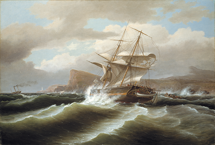
Thomas Birch, An American Ship in Distress, 1841
A truism of art history has it that any painted ship is also always a representation of the “ship of state.” For the British-born artist, Thomas Birch (1779-1851), that seems to have been a durable trope, one that served him throughout a successful career as a maritime painter. His father, William Russell Birch (1755-1834) was also an artist. Together, they set up shop in Philadelphia where they specialized in making engraved views of the city shortly after moving to the United States, in 1794. By the early 1800s, Thomas Birch began working independently of the family business and earned a modest reputation for the topographical landscapes he created of the Pennsylvania countryside. He is said to have painted at least 500 images throughout his career, the majority of them seascapes. Particularly after taking a trip up the Delaware River, in 1805, Birch became enamored of maritime subject matter which he imbued with an experienced sailor’s sense of accuracy. Eventually, he was considered to be a premier “portraitist” of American naval vessels, and battles, during the early 19th century.
While shipwrecks have fascinated Western artists since the Renaissance, Birch seems to have been mostly inspired by Baroque approaches to this sub-genre. Compositions like his Loss of the Schooner ‘John S. Spence’ of Norfolk Virginia, 1833 (LACMA) and the Timken’s American Ship in Distress, painted almost a decade later, are reminiscent of the dramatic and often large-scale images produced during the so-called Golden Age of Dutch painting by the likes of Simon de Vlieger (1601-1653) Ludolf Backhuysen (1631-1708), and Willem van de Velde (1633-1707). Birch balanced his depictions of heroic seamanship with careful attention to the rigging of sails and close observation of weather conditions to create a modern maritime idiom that appealed to collectors in the United States.
The War of 1812, which was itself triggered by disputes over maritime rights, was a source of inspiration for many American artists. Britain had been, up until that time, the greatest naval power in the world, but the United States’ much smaller Armada proved to be a worthy adversary to the much larger and better-equipped British fleet. For Birch, who was born in the Midlands of England, the topic of naval warfare between his home and adopted countries must have sparked conflicted feelings. A big canvas like American Ship in Distress remains vague about its maker’s commitments, except that the work is about being in a state of distress. The picture shows a vessel which has sustained significant damage to its main mast and, adrift in turbulent waters, is in the process of being abandoned by its crew. It is impossible to identify the ship with certainty--the name is effaced--but a depiction of George Washington and a flag on its stern serve to clinch its probable identity as an American warship. Michael Quick has argued that the distant coastline resembles England and that the boats that come to its rescue are likely British, too. If so, Birch might be assumed to give patriotic preference to his British roots in this invented image of risk on the open water.
An American Ship in Distress was acquired by the Putnam Foundation in 1973. Except for the scholarly entries written in the Timken’s 1983 and 1996 collection catalogues, surprisingly little research has been published about the painting. Birch’s picture counts among several noteworthy seascapes in the permanent collection--Fitz Henry Lane’s Castine Harbor and Town, 1851 (see Work of the Week #10) and Claude-Joseph Vernet’s A Seaport at Sunset, 1749 (Work of the Week #36) both hang nearby. These views of ships and harbors provide us with insights into the concerns of maritime painters over a period that stretched from the 1740s to the 1850s and the complex political claims of their time.
Work of the Week #42
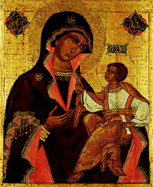
Moscow School, The Georgian Mother of God, Second half of the 17th century
The Timken’s Russian icons tend to be small, a reflection of their still recent private devotional purpose within the Putnams’ family home. Amy Putnam (1874-1958) acquired one unusually large image, The Georgian Mother of God, shortly before the end of her life, at a time when the work’s ultimate destination within a museum must have already figured in her imagination. In 1969, when the first significant catalogue of the Timken’s holdings was published, small mention, and an exception, was made for the display of Amy Putnam’s beloved Russian works. “In only one gallery is there color on the walls,” Agnes Mongan wrote. “That is the gallery which contains a remarkable collection of icons.” Mongan, who mostly advised the museum on its French acquisitions, explained: “It is the one that will be catalogued later. The golden backgrounds of the icons glow against a soft-green cut-and-uncut Italian velvet woven specially for the gallery in Florence.”
Those of us who enjoy the Russian icon gallery at the Timken know that it recently underwent substantial renovation. Wendy Salmond, a scholar of Russian art who teaches at Chapman University, was invited to reinstall the icons in 2017. In that way, Salmond partly fulfilled Mongan’s prediction. The 2017 display included additional works that had long been in storage and introduced new, thematic groupings to the space. In Salmond’s interpretation of the works depicting the iconography of the Virgin with the infant Jesus, including The Georgian Mother of God, she explained that “Icons of Mary . . . were among the first holy images brought to Kiev from Constantinople,” and that “the most important of these were the Hodigitria (“she who shows the way”) in which Mary points to her child as the way of Salvation, and the Tenderness icon, expressing maternal love.”
The Byzantine roots of Orthodox Russian art are clearly expressed in this large panel. The stylized, angular bodies and patterned, striated draperies are reflections of the essential differences that separate the world we live in from the divine realm represented through these expressly religious works. The fact that we do not know the name of the artist who made this big, impressive image is also telling: the maker is insignificant in comparison to the subject matter, which is awesome and holy. As a demonstration of the Hodigitria--Mary showing us the way--The Georgian Mother of God is an especially compelling example. At the same time, this complex painting still captures the sweet emotional bond between mother and child that surely appealed to Amy Putnam, and to tens of thousands of visitors to the Timken each year.
Work the of Week#41
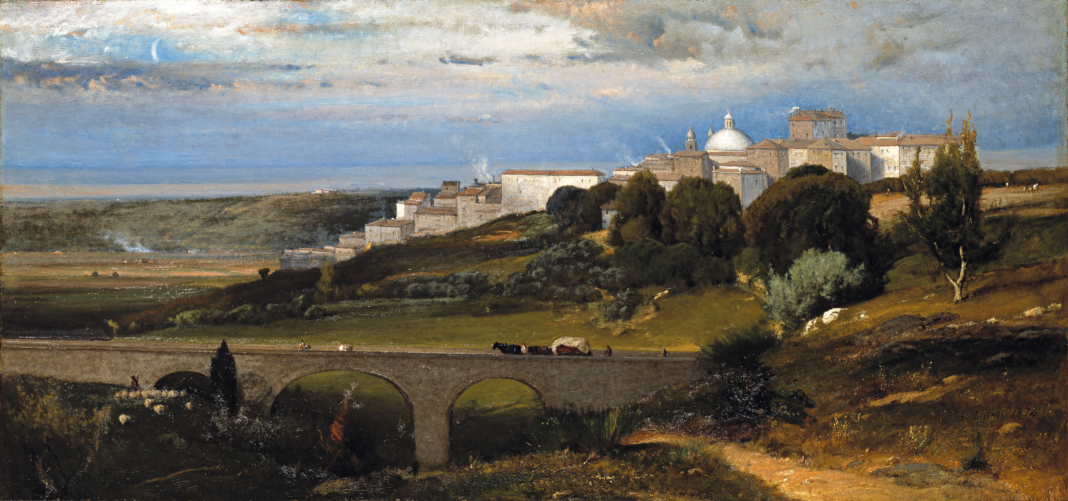
George Inness, Ariccia, 1874
George Inness (1825-1894) was born along the Hudson River, just below Poughkeepsie, but was raised in Newark, New Jersey. Despite his proximity to New York, Inness received hardly any formal training as a painter. Instead, he was hired as an engraver of popular reproductions by Nathaniel Currier (1813-1888), whose partnership with James Merritt Ives (1824-1895) resulted in one of the most prolific print publishing businesses in American history. Working for Currier and Ives, the young artist copied contemporary and historic works by notable European masters and, consequently, learned much about their techniques and strategies for composition. By the early 1840s, Inness started showing his own paintings in exhibitions and received positive critical responses to these works. Landscapes, like Lackawanna Valley, 1855 (National Gallery of Art, Washington), demonstrated the artist’s confidence in his oil painting skills, his subtle attention to topographical detail, and his deep, spiritual identification with American subject matter.
In addition to his explorations of American scenery, Inness traveled abroad repeatedly during his lifetime. He first went to Europe in 1851 and spent most of that trip in Italy, studying Renaissance artists in Florence and Rome. He crossed the Atlantic again, in 1853, stopping that time for extended stays in Holland and England. Upon returning to the United States, he moved his painting studio to Medfield, Massachusetts. A fierce advocate for the abolition of slavery, Inness was unable to serve in the Union Army because he suffered from epilepsy. Instead, he taught art classes to cadets at the Eagleswood Military Academy. Shortly after the Civil War, Inness moved his family to Europe and spent almost four years living there, working extensively in Italy. Ariccia was painted during this third sojourn.
The Timken’s painting presents a view of a town located on the southern outskirts of Rome. Sunset is fast approaching the Alban Hills. Ariccia, thought to be one of the oldest communities in the so-called Latin League, the ancient confederation of communities surrounding Rome that helped protect the city from foreign threats, offered artists a charming, and relatively safe, getaway from the city. The so-called “Roman fever,” or malaria, was prevalent in the late-19th century and was feared by visitors. The cooler elevations of Ariccia offered a respite from disease during the warmer months. Apart from this, it is easy to see why the physical site captivated Inness. The dome of the Church of Santa Maria dell’ Assunta, c. 1661-64, breaks the horizon just to the right of the picture’s center and its slender cupola is counterbalanced by the sliver of crescent moon at left. That Baroque church was designed by Gian Lorenzo Bernini (1598-1680) and was only one of the town’s attractions. The bridge in the foreground, known as the Ponte di Ariccia, was a comparatively modern construction. It was built from 1847 to 1854 to facilitate the flow of commerce, and tourism, to the hill town’s center.
The artist’s approach to this subject is notably soft and atmospheric, typical of his finest work from this period. As the American art scholar Irma B. Jaffe points out, Inness’s Italian paintings of the 1870s reflect both his conversion to Swedenborgianism, a neo-Christian sect which he adopted several years before, and his growing interest in “pictorial science.” The painter strove to flatten space and to treat it more diagrammatically. One sees this in Ariccia in the succession of planar elements--the long bridge in the foreground, the strict alignment of building elevations in the town itself, and the insistent linearity of hills and horizon beyond. This tendency toward abstraction is carried over to details within the composition, too: a herdsman with sheep in the lower left corner is rendered as pure pattern. Inness was not an Impressionist, per se, but Ariccia signals both his attachment to fleeting effects of light as well as his belief in the “science of geometry” and optical realism. This large painting predicts the later, tonalist works where distinctions between foreground and background elements all but vanish in Inness’s oeuvre.
Ariccia was the fourth American painting to enter the Timken Museum of Art. It was acquired in 1972, the very same year as Eastman Johnson’s Cranberry Harvest, Island of Nantucket.
Work of the Week #40
François Boucher, Lovers in a Park, 1758
As followers of this blog know, the Timken is temporarily closed. This is due to health concerns related to the pandemic. During this time, we have opted to undertake some critical improvements to our facility. When our museum re-opens to the public in 2021, the visible (and invisible) changes will make all of the forced distance from our collection over the past 40+ weeks seem worthwhile, I predict. About a week ago, however, I was reminded of what is at stake with the objects we steward for the public’s benefit when I encountered the museum’s painting by François Boucher (1703-1770) in storage. The crate that houses this work is enormous. It towered above me like a piece of minimalist sculpture. Outside of its protective container and ornate frame, Boucher’s canvas alone measures roughly 8 feet tall and 6 feet wide. Standing beside the box, I was reminded how this object must travel on its side in order to clear the bronze door jambs at the Timken’s entrance. We are accustomed to thinking about the art of our own time in monumental terms--think of Richard Serra’s rolled steel sculptures or Kara Walker’s theatrical silhouettes-- but in the mid-eighteenth-century, French artists had their own ambitious goals for grabbing attention and making heroic statements with their work.
It happens that Lovers in the Park was already on my mind when I bumped into its crate in storage. At almost the same time, the Timken’s registrar, Katherine Noland, received an inquiry about this picture from a British scholar. The researcher was interested in what we knew about the contents of a nineteenth-century country house that once belonged to the Rothschild family in Buckinghamshire, England. The Rothschilds’ sprawling property, known as Mentmore Towers, was designed by Joseph Paxton, the architect of London’s Crystal Palace, and George Stokes. Descendants of the original owners occupied Mentmore until the 1960s, by which time it had fallen into disrepair (maybe they needed a pandemic to force them into tackling the deferred maintenance), but not before being used to store some of England’s most precious art collections during World War II. The estate was sold in 1978 to The Maharishi Foundation and converted into a meditation/educational center. Subsequent owners tried unsuccessfully to convert the Jacobean-styled mansion into a six-star luxury hotel. Mentmore went back on the real estate market in 2010 with a price tag rumored to be £16 million. The elaborate structure continued to be used as a set for music videos and big budget films, including Batman Begins (2005) where it’s painting-festooned corridors stood in for the fictional haunts of Bruce Wayne.
Would it surprise you to know that Boucher’s picture was once an integral part of this grand country house? Purchased by Baron Mayer Amschel de Rothschild--better known to pals as “Muffy”--in 1851, Lovers in a Park was one of several works that were installed in the so-called “White Drawing Room” at Mentmore. We don’t know why, or for what setting, Boucher painted these works almost a century earlier, but we might presume they once formed an elaborate decorative ensemble in France. This painting and another nearly identically-sized one by Boucher called The Fisherman, 1759 (Hamburger Kunsthalle; https://online-sammlung.hamburger-kunsthalle.de/en/objekt/HK-785/der-angler?term=Boucher&context=default&position=0 ), hung on either side of a grand fireplace in the reception hall immediately to the left of the home’s garden entry. Three tall slender panels--L’Offrande à la Villageoise https://www.nationalgalleries.org/art-and-artists/5694/pastoral-scene-loffrande-%C3%A0-la-villageoise , La Jardinière Endormie https://www.nationalgalleries.org/art-and-artists/5695/pastoral-scene-la-jardini%C3%A8re-endormie , and L’Aimable Pastorale https://www.nationalgalleries.org/art-and-artists/5696/pastoral-scene-laimable-pastorale are all today in Edinburgh and likely hung nearby. Like Lovers in a Park, these works all depict young, happy couples in idyllic settings and remind us of a time when human interaction was a simple, even mindless thing. Scholars believe that they, too, shared walls in Mentmore’s drawing room with our composition and its companion image.
The Rothschilds’ descendant, Albert Edward Harry Meyer Archibald Primrose (not kidding), better known to the world as the 6th Earl of Rosebery, sold Mentmore’s most valuable contents at auction in 1964. Shortly afterwards, Lovers in the Park resurfaced in the London art market. The Putnam Foundation purchased the painting, in 1965, on the advice of Agnes and Elizabeth Mongan, two art historians who frequently advised the Timken’s board on collection matters. Boucher’s painting has scarcely left the building since. We should remember that despite its depiction of carefree idleness, it was once, and has been again lately, a picture on the move. While Boucher’s work will eventually make it back into the Timken’s French gallery, not without difficulty, it can’t be rehung there soon enough for me.
Work of the Week #39
Niccolò di Buonaccorso, Madonna and Child, 1387
Acquired by the Putnam Foundation in 1998, Madonna and Child Enthroned is an imposing image. It needed to be. Originally it formed the central element in a highly elaborate altarpiece. Toward the end of the trecento (fourteenth century) the whole ensemble would have been found in the church of Santa Margherita, in Costalpino, on Siena’s periphery. Art historians are not certain exactly when, or why, the altarpiece was disassembled. In 1922, an Italian scholar named Ettore Romagnoli identified the panel, along with two others, and suggested they were likely painted by the same confident hand: Niccolò di Buonaccorso’s. Romangnoli argued that together these fragments once comprised the polyptych commissioned by the parish in Costalpino for a building that appears no longer to exist.
A depiction of St. Lawrence with Patrons also by Niccolò is now held by the Pinacoteca Nazionale in Siena. That tall vertical panel almost certainly formed another element in the polyptych that was organized around our Madonna and Child. It would have appeared to the right of our image. Yet another similarly-sized painting of St. Paul is today in the collection of the Metropolitan Museum of Art in New York. It could have belonged to this ensemble, too. Nothing is simple, however. The St. Lawrence in Siena at some point in its past was extensively repainted, and someone moved it to a nearby church, Sant’Andrea a Montecchio. This might have happened as early as the sixteenth century. Archival photographs at the Frick Collection show both the original and overpainted versions of the panel, enabling us to witness St. Lawrence’s transformation into St. Margaret. The elaborate, cinquefoil architectural framework that we know so well from the Timken display, remained perfectly intact all the while (https://www.frick.org/blogs/photoarchive/st_lawrence_recovered).
Niccolò di Buonaccorso (c. 1348-1388) was one of many sophisticated painters to emerge from Sienese culture in the late 1300s. Afterwards, he was judged a minor artist by some scholars of Renaissance painting. Why? In addition to this extraordinary example of his practice, we have another work of Niccolò’s at the Timken, the so-called Virgin of Humility (c. 1370-75, see Work of the Week #16). That little triptych underscores just how polyvalent this artist was. Both works include demonstrations of the artist’s investment in symbolism--the single white rose that Christ delivers to his mother’s elongated fingers is a sign of her purity--as well as ordinary reality--the sewing basket in the little triptych was meant to convey Mary’s mundane preoccupations. The presence of both large and small, public and private devotional images, each managed with nuance and control, shatters any presumption that this artist was somehow limited to producing just one kind of work.
The Timken mounted a small show of religious works produced in Niccolò’s orbit, back in 1998. Called Art and Devotion in Siena after 1350, the exhibition was curated by Pia Palladino. Palladino makes a strong case for the importance of San Diego’s triptych and altarpieces. Further research needs to be done, but connecting the group of smaller panels already attributed to the artist, a list that includes the Metropolitan Museum of Art’s The Lamentation of the Dead Christ (c. 1380-88), The National Gallery of London’s Marriage of the Virgin (c. 1380), and the Uffizi’s Presentation of the Virgin at the Temple (c. 1380), might someday help associate them with other, contemporaneous polyptychs. Such panels may have comprised parts of a single altarpiece’s predella, or base, or else they formed independent sacred works. These circumstances are also worth exploring even as we contemplate the lasting, satisfying immediacy of a work of art painted more than 630 years ago.
Work of the Week#38
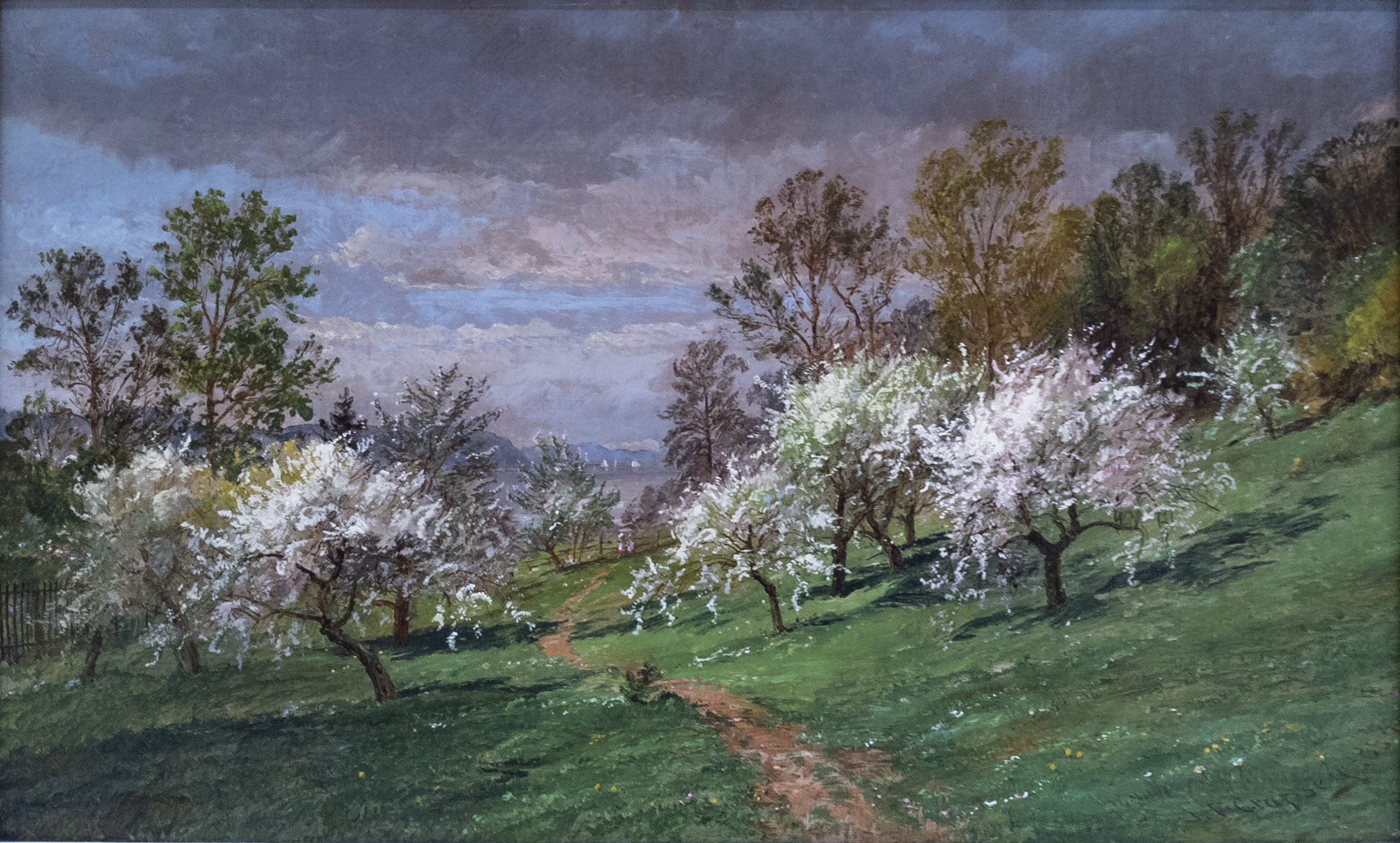
Jasper Francis Cropsey, Apple Blossoms, 1887
Landscapes make complex statements about the places they depict. In the Timken’s American gallery, the depictions are by the major contributors to this genre: George Inness (1825-1894), Albert Bierstadt (1830-1902), Thomas Moran (1837-1926), and Jasper Francis Cropsey (1823-1900). Together with Thomas Cole (1801-1948), Asher B. Durand (1796-1886), and Frederic Edwin Church (1826-1900), these artists suggested the principal directions for landscape practice in the United States that were closely followed by later practitioners. Cole and Church may have led the way in venturing up the Hudson River Valley to paint its relatively unspoiled vistas, but they were quickly followed by the likes of Cropsey and others.
The so-called Hudson River School painters are best known for their large-scale, dramatic depictions of conspicuously American scenery: Niagara Falls, the Rocky Mountains, and Yosemite, among other sites beyond the Catskills. These intrepid artists’ decision to record--oftentimes hyperbolically--the natural wonders of the United States became synonymous with elevated ideas about divinely ordained beauty as well as national doctrines of westward expansion and colonization. Painters like Bierstadt and Moran traveled West and, indeed, did not stop until they reached the Pacific Coast. Cropsey traveled to Europe on a couple of occasions--the first time was in 1847 when he took over Thomas Cole’s studio in Rome--but he seems only to have traveled as far West as Wyoming on the North American continent. The artist’s mature work reflects his taste for vistas informed by European attitudes toward the sublime, albeit matched to the settled splendor of the Mid-Atlantic region.
Cropsey was raised in a devoutly Christian family on a farm on Staten Island. He pursued an architectural career before committing himself fully to painting. In 1843, at age 21, Cropsey became the youngest member to be named an Associate of the National Academy of Design, achieving renown both as an exhibiting artist and as a teacher. His detailed observations and theatrical compositions earned him comparisons to contemporaries in England, such as the Pre-Raphaelites. This identification is not very surprising. Cropsey and his wife, the artist Maria Cooley (1828-1906), lived in London from roughly 1856 to 1863 where they befriended John Ruskin and others associated with that ultra-realist movement. Even while living abroad, however, he continued to paint subjects based in his memories of the American countryside. Large paintings like Autumn--On the Hudson River, 1861 (National Gallery of Art) were exhibited in England to much critical acclaim.
Later in life, having attained significant commercial and personal success, Cropsey opted to paint in a less obviously theatrical style. Sketches like the Timken’s Apple Blossoms belong to this moment in the artist’s long career. Our small picture shows the landscape near Cropsey’s home in Hastings-on-Hudson. The image conjures the glory that springtime offers rural communities without exaggeration or any invented effects. A footpath splits the composition’s verdant foreground in two and leads the spectator’s eye through a rustic apple orchard. Beyond the blossoming trees, a pair of figures can be seen walking together and, further on, we glimpse the Hudson River with its boats and hills beyond. It is a simple, harmonious scene, like many others from this period in the artist’s life, and markedly different from the spiritually-informed emotionality of his best-known works.
Work of the Week #37
Nicolaes Maes, Portrait of a Lady, 1677
Pictures can be puzzles, some more obviously than others.
Think of The Ambassadors by Hans Holbein the Younger (1497/98-1548). Standing before that monumental, nearly square portrait of two young men, we cannot avoid staring quizzically at the conspicuous, strangely elongated, grey form that hovers in the immediate foreground. This puzzling shape is just one of several rebus-like elements that the artist introduced to his large composition. When viewed from a steeply oblique angle, the anamorphic grey form resolves into the depiction of a skull, an emblem that overlays the entire scene with ominous dread. The two prosperous figures that flank the skull--ambassadors from France to the court of Henry VIII--may be surrounded by accumulated signs of knowledge but, like everyone else, they are destined to die. Holbein’s is a satisfying, if dismaying, puzzle to solve. I never visit the National Gallery in London without stopping in front of his masterwork for at least a short while to marvel at its pictorial invention and to ponder its maker’s lasting message about the ends of cultured experience.
The Timken has its own share of puzzling paintings that promise rewards if resolved. One example: I have spent a lot of time wondering about a small picture in our Dutch/Flemish gallery that is presumed to be the work of Nicolaes Maes (1634-1694). Portrait of a Lady was acquired by the Putnam Foundation as a gift, in 1986. The museum counts a few gifts in its permanent collection, but most of the works were purchased either by the Putnam sisters or else by the museum’s leadership in keeping with a strategic vision to bring the best possible representations to San Diego. Maes is a bit of an outlier. He was born in Dordrecht but moved to Amsterdam while still a teenager. Once there, he became a star pupil in the thriving workshop that Rembrandt van Rijn (1606-69) maintained. Maes started his career as a genre painter, producing scenes of everyday life for a burgeoning art market. By the 1670s, he shifted the focus of his practice to painting portraits of wealthy elites. Works such as his Portrait of Petronella Dubois, 1677 (Rijksmuseum), show off Maes’s skill at painting sitters surrounded by sumptuous materials and displaying natural expressions.
Scholars have speculated about the identity of the sitter in the Timken’s portrait, which remains a mystery. A few have argued that it could be a youthful portrait of Mary Stuart II, daughter of the Duke of York (King James II) and Anne Hyde, but without providing much convincing proof. If the date in the lower right corner of the painting is correct, Mary would have been fifteen years old at the time this work was completed. That date would further suggest that this particular portrait was done to commemorate Mary’s marriage to William of Orange, with whom she would eventually rule England, Scotland and Ireland. We know that Maes painted a pair of portraits of William and Mary around the same time (Blanton Museum of Art, Austin) but those depictions differ in that they are both smaller ovals and are bust-length. The Blanton’s Mary doesn’t look very much like the light-haired woman in the Timken’s picture. Ours better resembles a slightly larger work by Maes known as Portrait of a Lady as Diana (art market) which once belonged to the Dutch royal family. Both that picture and the one in San Diego feature the same woman with blonde curls and smiling face.
Puzzling over these resemblances sent me back to our curatorial records. Maes’s painting appeared in two early auctions. The first was held from July 26th to August 16th 1859, at which the entire contents of “Lord Northwick’s Extensive and Magnificent Collection of Ancient and Modern Pictures” were offered to the public in London. Indeed, Baron Northwick (born John Rushout) was a great collector who, among many other works, owned a portrait of the Duke of Orange. But lot #1791 in his estate describes a “Portrait of a Princess of the House of Orange, with a Dog.” The catalogue identifies the artist responsible for this painting as “G. Netscher,” not Maes. Caspar Netscher (1639-1684)--also known as Gaspard Netscher--was Maes’s contemporary who lived in the Hague. Netscher specialized in portraits of well-to-do women placed against dramatic backgrounds, as well. A second record of the Timken’s painting appears almost a half-century later, in 1907. By that time the work belonged to the Massey-Mainwaring Collection, which was dispersed by Messrs. Christie, Manson & Woods “at their great rooms” on St. James Square over a six-day period. The auction catalogue includes a reference to the picture as lot #17. “Portrait of a Princess of the House of Orange,” now attributed definitively to Nicolaes Maes, is described as follows:
Small, three-quarter figure, standing in front; her right arm rests on a table, on which is a small spaniel; a column and red curtain in the right background, landscape on the left. Signed and dated 1677.
This seems to be a match to the picture in San Diego. Annotations in the catalogue margins suggest that the painting sold on March 16, 1907 for £183.15. Its provenance is listed there, too: “From the Northwick Collection.” For me, the failure of both British auction houses to identify the sitter as Mary Stuart is surprising. She was the Queen after all. Could this be another female member of the House of Orange, then? I also wonder under what circumstances did this Portrait of a Princess of the House of Orange, change attribution (and perhaps acquire a signature and date) between 1859 and 1907? Small puzzles, perhaps, but worth pondering if we hope to understand this work’s place in our collection, and in history.
Work of the Week #36
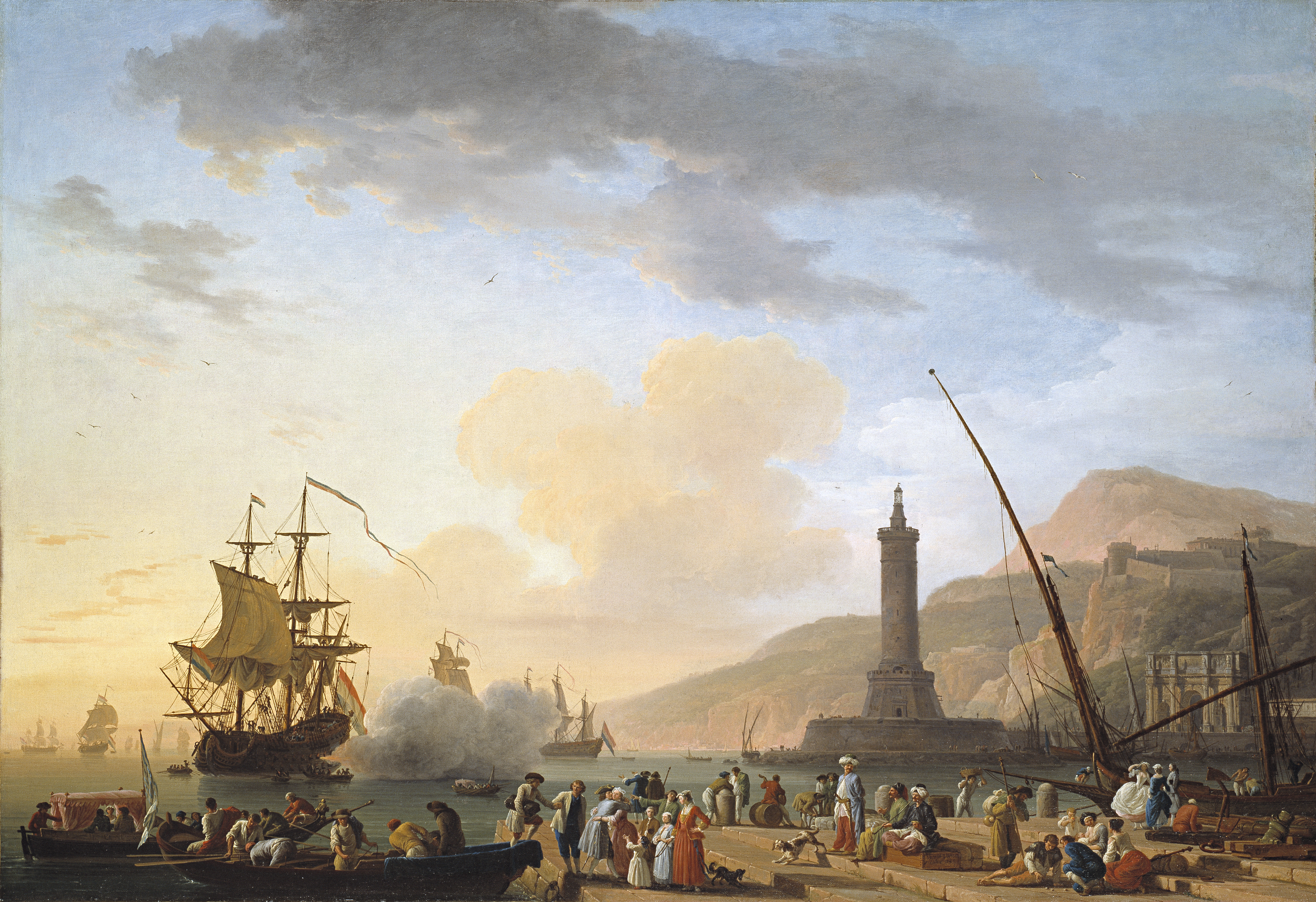
Claude-Joseph Vernet, A Seaport at Sunset, 1749
Even at the end of the day, it is a busy port. Shadows are lengthening and dusk begins to settle, but a variety of figures are spread across a broad stone pier. A landing party has evidently just arrived and family members rush to embrace a young man who disembarks from the small dinghy. Visitors in exotic costume converse and take casual note of the reunion while sailors distract themselves by playing games of chance. A couple of dogs snarl at each other on the steps. In the middle of the bay, a Dutch warship has just fired a shot--a friendly salute--and plumes of orange and grey smoke billow from its stern. What does all of this signify? Why did Claude-Joseph Vernet (1714-1789) paint this particular view?
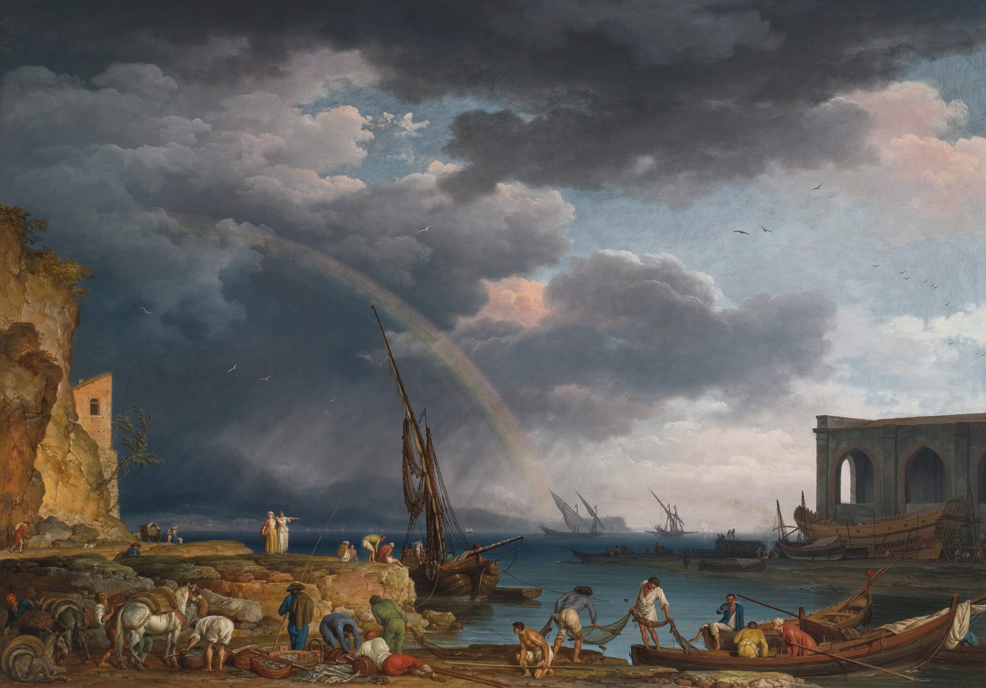
In all likelihood, this is an invented scene. Cecil Gould, writing for the Timken’s 1996 collection catalogue, suggested that the picture depicts the port of Naples. But Gould points out there is scant topographical evidence to clinch this as a portrait of that Southern Italian city. A Seaport at Sunset was completed in Rome in 1749. In fact, Vernet painted numerous views of Naples during his long, successful career. Many of these were done for wealthy grand tourists who craved dramatic proof of their cultured travels. An entry in Vernet’s notebook written around this time records the commission for a pair of seascapes by Charles-Louis Beauchamp, better known today as the Comte de Merle. The Comte was a French diplomat, as well as a connoisseur of painting and sculpture. The sale of his personal collection in Paris on March 1, 1784 was a noteworthy event and was extremely well documented. One catalogue included a long entry, #22, on a pair of works by Vernet:
Two paintings representing different aspects of Naples from its port; one shows the sun setting and the arrival of a sailor who is announced by a cannon shot; a group disembarks from a launch and is welcomed by men, a woman and child. Numerous figures of different nationalities are scattered throughout the foreground, some sitting, some occupied with transporting merchandise. To the composition’s right, a lighthouse stands at the entry to the canal while in the distance we see the prosperous port itself. On the same half of the composition, one notes the tall mountains that surround Vesuvius. A warm sky tops this magnificent picture with its 46 major figures, made as beautifully and as well arranged as could possibly be desired.
The other painting, also a view of the port of Naples, represents a great body of water. Through the rain, at left, we glimpse a building which appears to be an Admiralty. On the opposite side, on sees a massive rock protruding into the sea itself. Before it, one counts about 20 figures, some busy loading mules and horses with a variety of goods, the others are fishermen preoccupied with their catch. A rainbow, ingeniously placed, floats in an admirably clouded sky. These works were signed in 1739. [Alexandre-Joseph Paillet, Catalogue des Tableaux qui Composent le Cabinet de M. le Comte de Merle, pp. 14-15]
Except for the mis-dating, it seems likely that the Timken’s Vernet is the first of the two works described in this catalogue of Beauchamp’s art. Paillet further observed that the two works had “details drawn so precisely [they] could by their charm of color hold their own next to the finest [by] Claude [Gellée (1604-1682)].” The paintings were sold as a pair in 1784 but they did not remain together. For the better part of two centuries, our canvas by Vernet ended up about a dozen miles outside of Dublin, Ireland, at Luttrellstown Castle, where it was displayed until the 1970s, after which it was purchased by the Putnam Foundation for San Diego. Its partner went through a series of owners in France and ultimately came to be known as L’Arc en ciel: An Italianate Coastal View with a Rainbow, Fishermen and Peasants at an Inlet in the Foreground, a Shipwright’s Yard Beyond. That darker, but identically-sized work re-emerged at auction in New York, not too long ago.
Work of the Week #35
Master of the Magdalen and Unknown Florentine painter/s, Madonna and Child with Two Angels and Twelve Scenes from the Passion, c. 1300
The oldest painting at the Timken Museum of Art is simultaneously one of its most delicate and mysterious. The work I am thinking of is a dossal--an ornamental image that was intended for display behind the altar of a church. Early on, devotional icons like this one were painted on fabric. During the Renaissance, however, they were more likely to be painted on wood panels and were precursors to increasingly elaborate altarpieces whose popularity spread throughout Europe. Scholars believe that this particular dossal was made in Florence. Less certainly, it seems to have been produced for the Augustinian convent of Santa Maria dei Candeli, founded in the early 14th century. That church was significantly enlarged in the 16th century and ceiling frescoes by Niccolo Lapi (1661-1732) and a new altarpiece by Carlo Sacconi (active 1692-1747) were added to it in the early 18th century. In the trecento (i.e., 1300s), however, Santa Maria dei Candeli must have been a small, austere space. If this dossal was present there at the beginning, it would have stood out as a resplendent image within an otherwise spare interior.
We have lost track of the name or, more likely the names, of those responsible for the Timken’s dossal. In an essay published in The Burlington Magazine in 1930, the San Francisco-born art historian George Martin Richter, likened it to known works by Meliore di Jacopo (act. 1239-1284) based on purely stylistic grounds. Richter suggested that the hand that painted this particular dossal belonged to a slightly later moment, however. Subsequent experts have concurred with Richter. The central depiction of Mary holding the infant Jesus in her lap and flanked by angels looks Medieval--flat, stylized, and heraldic in color. Precious stones were originally inlaid in Mary’s crown but these were removed long before the dossal ever came to San Diego, in 1967. Just imagine these jewels glinting near the composition’s middle whenever the dark, horizontal picture was illuminated. Twelve smaller scenes from the Passion surround the Virgin and Child. In contrast to the stiffer, more Medieval treatment of the central group, these images are highly animated and demonstrate their maker’s growing knowledge of perspective. As in the work of leading Florentine artists of the trecento, such as Giotto (1266?-1337), bodies and spaces in these subsidiary rectangles are treated more volumetrically as the artist struggled to represent the world in three dimensions.
How can we make sense of such contrasting approaches within the same work of art? It seems likely that more than one artist could have worked on the Timken’s dossal. This would explain the difference in treatment between the central image of the Virgin and Child and the flanking scenes. It was not unusual for artists to collaborate in this era. They often worked together in allied workshops. Some scholars have speculated that the dossal was begun in the late-13th century by one artist, who presumably died, only to be finished in the early-14th century by another. Anne Derbes, in a 1996 book about Passion iconography in early Italian art, associated the Timken dossal with the names of two little-known artists: the so-called Master of the Magdalen (active 1265-1290) and the Master of San Gaggio (active 1300). Such an explanation rationalizes the divergent pictorial strategies employed in the center and sides of the same work. Careful scientific analysis might suggest firmer answers. For the time being, recognizing this multiple authorship goes a long way toward making sense of the work’s divided appearance.
Further complicating this puzzling situation, our image has been transferred from one support to another. We think this happened in the 18th century and, if so, that would roughly coincide with the renovations that took place at Santa Maria dei Candeli. The effort to preserve the painting--already 400 years old--by mounting it on a fresh wooden panel was accompanied by the appearance of a new inscription: an 18th-century text on the back of the work identified the dossal as a gift of the Capponi family. Francesca Teresa Capponi (1705-1775) was the abbess of the Augustinian convent of Santa Maria dei Candeli. The same inscription attributes the picture to Cimabue (c. 1240-bef. 1302) who, in addition to being Giotto’s teacher, is typically given credit for having inaugurated many pathbreaking pictorial conventions of the Renaissance. Today, no one thinks the inscription is accurate, but it underscores the hopefulness that surrounds this--and so many other--important devotional works of the trecento.
Work of the Week #34
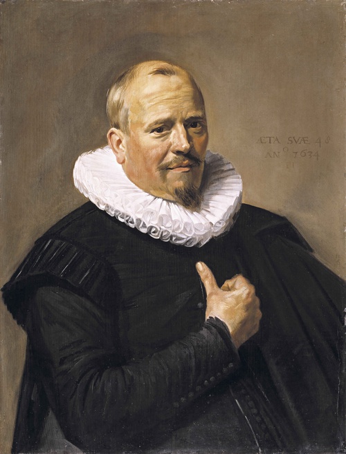
Frans Hals, Portrait of a Man, 1634
What is there to say about an unidentified portrait?
The Timken Museum of Art has only a couple of these in its permanent collection. It is a curatorial mission, or maybe a folly, to work toward firm identifications of such works. Let’s call the unnamed man in our painting by Frans Hals (c. 1581-1666) Mr. X, just for the time being. In addition to his ingratiating demeanor, we know precious few things about him and his seventeenth-century existence. For instance, we know his precise age at the time he was painted: 48. That number appears prominently on the surface of Mr. X’s portrait, at upper right, above the date and Hals’s own initials. He wears the dark costume that was typical of Dutch community leaders, or regents.
We are pretty sure that he was married, too. His wife had her portrait by Hals painted at the same time. She is displayed--also as an “unnamed” sitter--at the Detroit Institute of Arts. Both of these paintings are on identically-sized oak panels (actually, the measurements provided on the DIA’s website suggest that the Timken support is 1/8 of an inch taller). In contrast to Mr. X’s solicitous look, Mrs. X stares contentedly back at the beholder, hands clasped tightly her lap in proper Dutch fashion. She was 14 years younger than her husband when their likenesses were created. Like him, Mrs. X wears an intricate lace collar of a kind that would make Ruth Bader Ginsburg envious. At some point in their past, the couple split into two different directions. It appears that Mr. X was sent off first to an auction in Amsterdam, in 1873, and Mrs. X ended up in a private collection in Cologne, Germany, until 1912, after which she also entered the art market. We can only wonder why they went separate ways: ungrateful heirs would be one guess.
Since we are speculating, we might further surmise that this couple once lived in Haarlem. Although he was born in Antwerp, Frans Hals worked in that town near the North Sea from roughly 1611 until his death. A picture dated 1634, like this one, would have been created right in the middle of the Thirty Years War, not an especially propitious time. Haarlem was still recovering then from the associated economic turndown of the 1620s. By 1634, having been at it for more than two decades, Hals had nonetheless earned a reputation as Haarlem’s leading portraitist and prosperous clients in the region likely sought him out first. He managed a vibrant studio and even counted Judith Leyster (1609-1660) among his many now-famous students. Leyster went on to become the first female member of the Guild of St. Luke in Haarlem, in 1633, chiefly as a result of her time spent training with Hals. It is possible that Leyster helped with the stream of portrait commissions coming into the studio, but scholars believe that Hals kept the best projects for himself, busying his assistants with the production of genre paintings or copies of his most popular works, for example, his “rough manner” depictions of Dutch types such as Malle Babbe (1633, Gemäldegalerie, Berlin) or The Merry Drinker (1628-30, Rijksmuseum).
Mr. X is not a type. We gaze upon his face from slightly below and recognize that it depicts a real person. Like another memorable portrait by Hals that long ago lost its personal identification, The Laughing Cavalier (1624, Wallace Collection, London), we sense immediately that this was a particular human being, possessing a sense of humility and certain foibles that may remain unknowable to us, but which endeared him to his friends. Hals’s flair for brushwork enhanced this feeling of affability. I imagine Mr. X approaching Hals in his busy studio and striking a bargain with the artist over the paired portraits he thought would help commemorate his life. There is, perhaps, a notarized paper in an archive somewhere that captures this transaction. When it is located, we will learn Mr. X’s name, perhaps his wife’s identity, the date he commissioned the work, and the amount of money he paid Hals to produce these likenesses in oil paint on heavy oak panel. Everything will be just a little clearer. In the meanwhile, we can marvel at the subtlety of the artist’s method, his skills at conjuring personality with a few swiftly applied daubs of paint. As the art historian E. P. Richardson put it, Hals was in demand for his ability to “catch the revealing momentary gesture--the characteristic glance, smile, or gesture of the hand.” In looking at the Timken’s picture, we can’t help but agree that these were the artist’s enduring strengths.
Work of the Week #33
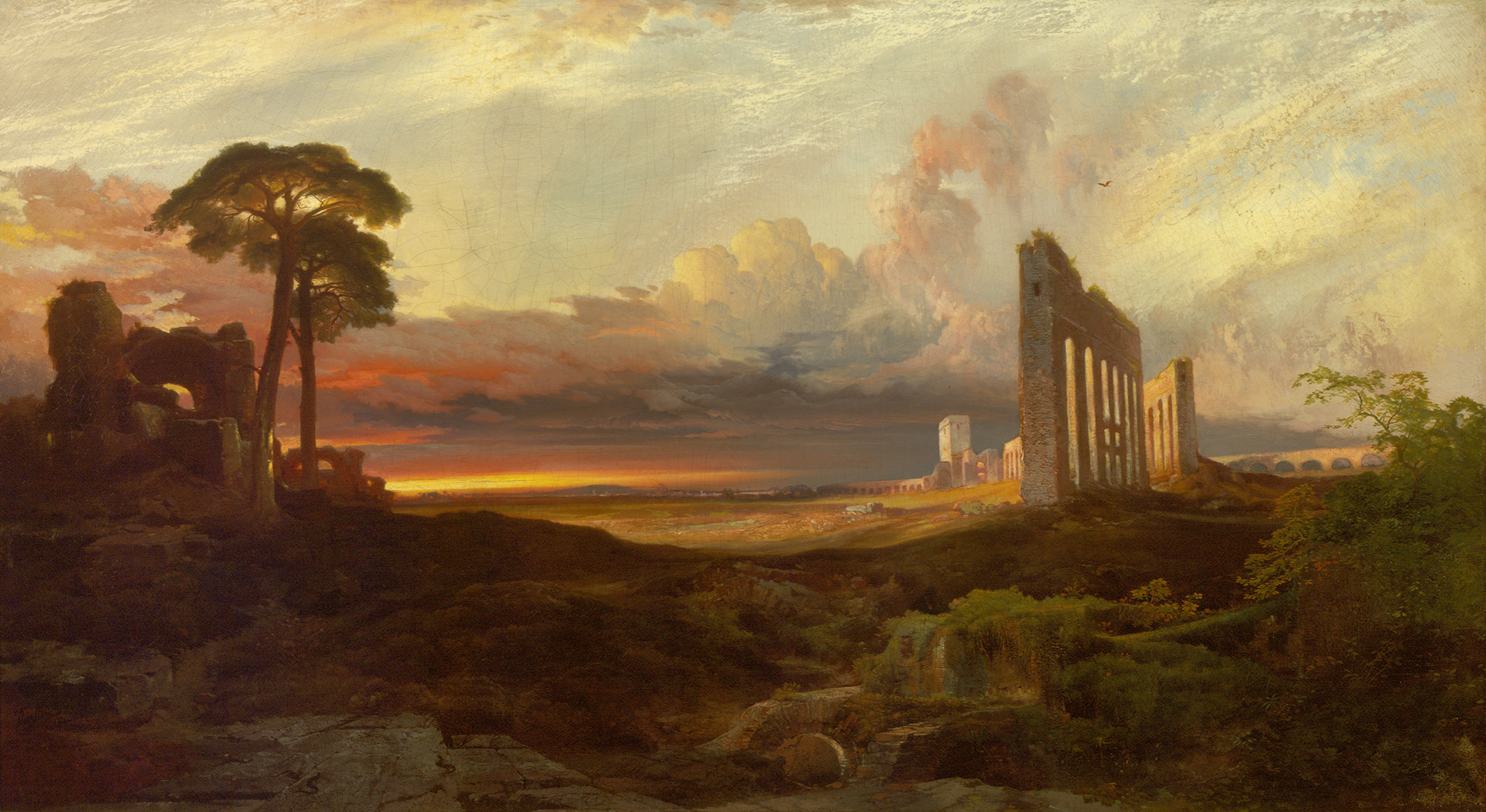
Thomas Moran, Opus 24: Rome, from the Campagna, Sunset, 1867
Thomas Moran (1837-1926) cared deeply about artistic legacy. His own self-identification with specific works of art was important to him. Late in life, Moran began pressing his thumb into still-wet oil paint to prove that he was the maker of those representations. Another demonstration of this can be seen in the running list the artist kept of his noteworthy efforts. The English-born landscapist referred to this unique record as his “Opus List.” During the mid-1860s, Moran enumerated 42 works as worthy of this designation. He appended to the document detailed notes about these paintings’ ownership, as well as the prices that collectors paid for them. The Opus List is today kept in the Archives of the Gilcrease Museum in Tulsa, Oklahoma along with more than 200 works by Moran. The manuscript provides an important key to the artist’s private judgments. Occasionally, Moran transcribed “Opus” numbers onto the objects themselves, usually adjacent to his signature, as a means of confirming their significance.
As its formal title and numeric inscription indicates, Opus 24: Rome from the Campagna, Sunset (1867) belongs to this special category within Moran’s broader oeuvre. The picture dates from just after the Civil War, and was the first major work that Moran completed in his Philadelphia studio after returning from the second of his multiple visits to the European continent. This particular sojourn started in Paris and lasted from June 1866 to May 1867. Scholars have shown that Moran passed several weeks in the countryside South of Rome, exulting in the spare beauty of the campagna and studying its traces of ancient civilization before sailing back to the United States via Liverpool. Opus 24: Rome from the Campagna, Sunset is likely based on a highly finished drawing called Rome near the Claudian Aqueduct dated March 6, 1867. That drawing can be found today at the East Hampton Library on Long Island. Like the Timken’s painting it depicts a series of fragmentary aqueducts to the right. These hulking forms lead our eye back to Rome, visible in the distance, just as those structures conveyed water to the city in the historic past. Instead of lizards scrambling over the rocks in the foreground, as we see in the Timken picture, the drawing depicts a solitary figure taking in the vista. If one looks carefully at both the sketch and the painting, the dome of Saint Peter’s Basilica can be glimpsed breaking the horizon line near the works’ compositional centers.
Moran’s moody, romantic view epitomized what many Americans considered to be a classic European landscape. As the decades passed, however, he became more renowned for painting the American wilderness, although wonders of the Old World--especially Venice--remained important to him. Of the 42 works he transcribed onto the Opus List, only about a half dozen depicted England or Continental Europe. The rest are forest scenes set in the eastern United States, works that are indebted to the aesthetic principles of the Hudson River School. As Nancy Anderson has pointed out, by 1867, the artist had not yet experienced much of his adopted country beyond the shores of Lake Superior. Moran’s celebrated practice of painting the western landscape--Yellowstone, the Grand Canyon, and Yosemite--were yet to come. After his artist-wife, Mary Nimmo Moran (1842-1899), died suddenly, he traveled restlessly. Moran relocated to California with their daughter, Ruth, where he spent the last decade of his life. He settled first in Pasadena, then in Santa Barbara. We know that Opus 24: Rome from the Campagna, Sunset sold in the 1880s for $75.00, and it too eventually came West. The painting has been in San Diego since 2005, thanks to an ancestor of the original buyer, who donated it to the Timken Museum of Art.
Work of the Week #32
Nicolas de Largillière, Portrait of Marguerite de Sève, Wife of Barthélemy-Jean-Claude Pupil and Portrait of Barthélemy-Jean-Claude Pupil, both 1729
If you were “somebody” in early-18th-century France, you definitely wanted to have your likeness painted by an important artist. As proof of noble lineage and evidence of high social standing, portraits counted among essential décor in that country’s elite households. Should you happen to be in Paris, and were not a member of the royal family, it would have been in your best interest to approach Nicolas de Largillière (1656-1746) for this task. Otherwise you headed to the studio of Hyacinthe Rigaud (1659-1743). Largillière’s solid academic training meant that he was skilled at depicting courtiers in environments that communicated their prosperity and prestige. And because he lived for a long time, this painter was familiar with his sitters’ expectations for both grand manner portraiture of the late-Baroque period and more modern, Rococo sensibilities. Depending on your taste and outlook, a cosmopolitan flatterer, like Largillière, was equipped to provide a wealthy married couple with everything they desired in self-representation.
Let’s take Largillière’s portraits of Barthélemy-Jean-Claude Pupil and his wife, Marguerite de Sève, as examples. How did this couple wish to be seen? Monsieur Pupil opted to be portrayed in a relaxed, yet professionally-determined demeanor. Wearing a long, powdered wig, known as a peruke, and dressed in black satin judicial robes with red cape, he gazes back at the viewer with impartiality and quiet confidence. His right forearm is draped casually over an oversized, leather-bound legal text. He was a prominent jurist, after all. Pupil had several years earlier married his social superior, Marguerite de Sève. As a consequence of that marriage, he was awarded a series of increasingly prestigious legal appointments in Lyon. By contrast with her more soberly-dressed, upright husband, Madame Pupil, poses while garbed in a shimmering red gown, rimmed with fur sleeves. She wears an ornamental cuirass, or armored breastplate, from the top of which freshly cut carnations burst. She has sprigs of flowers in her hair, too, and she wields a silver fan in her hand. Scholars have observed that the sheet music she fingers in her other hand relates to a popular drinking song. A slight smile--we might even call it a smirk--enlivens her heart-shaped face. Part goddess of war and part party animal, it is hard to escape the notion that Marguerite de Sève was a full partner in Largillière’s creation of a likeness at once full of vitality and suggestive of the sitter’s potential for mischief.
Presently, I am reminded of a question posed by Jacques Derrida: “What is a pair?” Writing about van Gogh’s depiction of empty boots in his book entitled La Vérité en peinture (1978, The Truth in Painting), Derrida asked provocatively, and repeatedly, what makes us think that any presumed visual coupling is, in fact, a pair? Employing a mock-dialogue format that epitomizes his deconstructivist method, the French philosopher blazes through a set of matched groups--laced and unlaced, right and left, presence and absence, male and female--and dismisses them as more-or-less misguided judgements. Implied pairings are misleading, Derrida insists, and our hasty conclusions about these identities must always remain indeterminate and provisional. Could we say the same thing about Monsieur and Madame Pupil?
There’s no doubting that the two large portraits at the Timken were intended to be shown side by side. They descended together through the Pupil family tree until 1969, after which they were acquired by the Putnam Foundation for this museum. According to the rhetoric of their time, they were unquestionably and determinedly a pair. Indeed, Monsieur and Madame Pupil appear to be a nearly perfect couple; their canvasses are sized the same and, respectively, they possess the complementary gendered stereotypes that 18th-century French society conferred upon them: he is a “man of laws” and she is a “creature of culture.” Temperamentally, however, they could not look more different. I ask everyone: “at the end of a long period of social isolation, who would you want to lead us in song?”
Work of the Week #31
One of the smallest objects that can be found at the Timken Museum of Art is an intricate Russian icon. The one I am thinking of is easy to miss. Typically, it gets shown on a narrow travertine column in the corner of the gallery that has long been dedicated to Amy Putnam’s personal collection of these devotional works. Although unsigned and inconspicuous--it is less than 10 inches tall and under 8 inches wide--this double-sided representation is actually quite complex and worthy of close study.
On one side of this two-sided work, a 15th-century Russian artist has painted a crowded scene of shirtless male figures in a barren landscape. This scene is known to Orthodox believers as The Forty Martyrs of Sebaste and the story it tells is believed to have taken place around 310-320 C.E. The thin panel depicts a group of Roman soldiers who, upon refusing to observe the pagan rites of their Roman leaders, are tortured by their leaders in an effort to force them to renounce their faith. Christ, who appears in gold robes in the half-mandorla at the top of the scene, encourages the men to remain united. Among the successive punishments these soldiers endure, they are made to stand on a frozen lake in Sebaste, Cappadocia, which explains the stylized treatment of the icy water beneath their feet. The Feast Day that celebrates their martyrdom takes place on March 10th.
On the opposite side of the thin sheet, we find a contrasting scene. This time, the artist chose an Old Testament narrative from the Book of Daniel that is sometimes referred to as Four Men in the Fiery Furnace. It is another story of over-the-top cruel punishment and it also relates to the refusal to worship pagan deities. This time it is heat, not cold that characterizes the torture of the faithful. The Assyrian King, Nebuchadnezzar, has been provoked by his advisers to cast three just men--Shadrach, Meshach, and Abednego--into a flaming pit because they will not renounce their Jewish faith. Specifically, they won’t kneel before the golden idol that is shown in the composition’s upper right. Instead of perishing in the intense flames, however, the men are seen dancing with a fourth figure who miraculously appears in the furnace with them. Theologians debate whether this fourth presence should be interpreted as an angel, or the son of God: in this instance, the Russian artist treats the figure as an angel. The feast day of Daniel and the so-called Holy Youths is celebrated on December 17th.
The close association of this object with two dates in the Orthodox calendar reveals its function. Especially in Novgorod, where this particular icon was made, artists produced works like this one called tabletki (little tablets). These images were intentionally lightweight. instead of being painted on heavy wooden supports, they were painted on sheets of laminated and gesso-ed fabric; this one is on linen. Tabletki were designed to be easily transported to small easels that would be prominently placed on an altar when celebrating mass for a specific Saint’s day or feast. In the case of the Timken’s small devotional image, we ought to imagine that it was part of a much larger sequence of images that would have been displayed throughout the religious year within a Russian Orthodox church. The artist’s choice of two chronologically distinct iconographies--both in terms of their biblical history and the time of year when they would have been displayed--might seem confounding at first. But such works are joined by shared iconographical messages. Both sides of the tabletka demonstrate the triumph of deep belief over the intolerance of unjust leaders and, like two sides of the same coin, they communicate a common currency in the minds of the faithful.
Work of the Week # 30
Guercino (Giovanni Francesco Barbieri), The Return of the Prodigal Son, 1621
Images of abiding compassion and forgiveness are always welcome. From the Renaissance forward, representations of The Return of the Prodigal Son have addressed that need. The biblical narrative tells the story of a young man who accepts an early inheritance only to squander it. After a long, reckless spree, he returns home full of repentance. His father mercifully takes him in again. Memorable treatments of this iconography are today scattered throughout the great museums of the world: Jacopo Bassano’s hangs at the Prado in Madrid; Rembrandt van Rijn devoted himself to this emotional subject on several occasions but his best-known painted version is at the Hermitage in St. Petersburg; Pompeo Batoni’s can be found at the Kunsthistorisches Museum in Vienna; Bartolomé Estebán Murillo’s has been at the National Gallery in Washington, DC since 1948; Romare Bearden’s modernist collage of this scene is today at the Albright-Knox Gallery. Among the Timken’s masterworks there is an especially moving example of this New Testament parable. Ours is by the great Baroque painter, Guercino (1591-1660).
The Italian artist’s given name was Giovanni Francesco Barbieri, but he was known to all as il Guercino, which translates to “the squinter” in Italian. The cruel nickname is thought to relate to the painter’s condition of having been born cross-eyed. Although he came from a very poor family in Cento (mid-way between the vibrant art centers of Bologna and Ferrara), Guercino’s talents were recognized early on. He went to work for Pope Gregory XV in Rome when he was still in his twenties. In Rome, Guercino had access to advanced art of the past and from there he traveled widely. During this time, his style shifted from its early taste for severe chiaroscuro to a softer, more voluptuous style. After success painting religious works at the Vatican for about a decade, he returned first to his home in Cento and, then, to Bologna, where he became a primary artist in that Northern city.
Guercino worked on the Timken’s version of The Return of the Prodigal Son while in Bologna.
According to the London-based gallerist, Patrick Matthiesen, who sold the Timken its painting, in 1983, ours is the last of seven different versions of The Return of the Prodigal Son that Guercino painted between about 1617 and 1655. The nearly square composition represents the magnanimous father clasping his son by the forearm and extending his cloak over the younger man’s shoulders in what we foresee will soon become an embrace. The son--proverbially “lost and now found again”--wipes away the tears that stream down his face. It is an expression that mixes shame with relief. In the background, another figure pulls back a drape to admit the family back into their private realm. As spectators, we witness simultaneously the sinner’s regret and the humility with which he is received.
San Diego’s version of The Return of the Prodigal Son bears a striking resemblance to another version of this parable by Guercino, one which dates from a similarly late moment in the artist’s career. Both versions were made in early 1650s, but the version painted in 1651 is slightly smaller than the Timken’s and was originally commissioned by a Venetian nobleman. Today, that work belongs to Poland’s Diocesan Museum in Wloclawek (http://muzeum.diecezja.wloclawek.pl/plan-muzeum/barok/). In that scene, Guercino depicts the same bearded father in virtually the same costume, but the prodigal son is represented in pure profile and collapses directly into his father’s chest. Our version was painted about three years later for the Archbishop of Bologna. It shows this same youth frontally, as if addressing viewers first and foremost. He hesitates before receiving his family’s private welcome. It is a noteworthy compositional shift and one that enables Guercino to make a dramatic point: all of this--great contrition followed by extraordinary forgiveness--is intended to educate us.
Work of the Week #29
Pieter Claesz., Still Life, 1627
It is hard to prove it just now, but the Timken’s small panel by Pieter Claesz. (1597/98-1660) talks to Jacob van Ruisdael’s (1628/29-1682) canvas in our gallery (see Work of the Week #7). The two paintings hang about two feet apart on the walls of the museum. Both men lived in Haarlem and both were leading artists in their respective genres in that city by the North Sea. Claesz. was widely regarded as the preeminent still-life painter of the early 17th century and Ruisdael occupied the same rank when it came to topographical landscapes, albeit a generation later. Claesz. was born in Belgium but moved North with his family to Haarlem in 1620. Ruisdael was born in town. Claesz. joined the painters’ union, the Guild of St. Luke, in 1621; Ruisdael became one of its members in 1648. The still life specialist died in Haarlem just a few years after the landscape painter left the city for greener pastures in Amsterdam. Haarlem was not so large a place that the two men could have easily avoided each other during their time in this vibrant art center.
What do these works say to each other when they are in dialogue? We know that Claesz. specialized in a type of picture that his countrymen called ontbijtjes (breakfast pieces); Rusidael’s views were known as Haarlempjes--it helps if you know a little Dutch! Breakfast pieces are comprised of ingredients from an ordinary, informal meal. If you are familiar with other 17th-century still life imagery from the Netherlands--the kind that depicts banquet tables heaped with exotic carpets, monumental vases and tumbling glassware, festooned with fruits and flowers, maybe a squawking parrot--this is not that sort of image. Instead, Claesz. gives us a few simple elements: smoking supplies, a goblet of dark beer, a brazier glowing with hot embers, arranged around the pewter plate in the foreground. Across that grey disc a couple of smoked herring are splayed inelegantly. That basic meal hangs over the table’s edge and casts a shadow into our space. Hungry?
Claesz. knew about sumptuous meals, too, and he painted them on occasion. Often those images came laden with moralizing messages: “all of this is fleeting; enjoy it while you can.” The humble spread shown in the Timken’s picture suggests different ideas. There are no glistening oysters, exotic citrus, or carelessly dented silver platters to contemplate here. Whoever consumes this meal doesn’t necessarily need to be reminded that the good life only lasts a little while. This particular example of the ontbijtjes genre represents what ordinary life in Haarlem might have been like for its typical residents. The clay pipe, tapers, and lidded container of tobacco suggest that the likely consumer is male and, however spare, this is all good enough to satisfy him.
Haarlem was a prosperous place in the early Baroque period. Middle-class folk might even have had the means to afford a painting or two. They decorated their narrow, tidy homes with representations like this one. Claesz’s crisp realism strikes a balance between rigorous concern for composition--tight circles, abutting diagonals, and hard edges--and his preference for a coloristically-subdued palette. These qualities appealed to an emerging group of connoisseurs. Those same collectors would likely have found Ruisdael’s depiction of quotidian work in the linen bleaching fields at the town’s periphery equally compelling. Claesz. and Ruisdael shared an appreciation, after all, for the unremarkable. The pleasures they observed may be simple, but they are attainable. These 17th-century works are charged with reassurances about the solidity of things, the genuine-ness of everyday life. They communicated subtle beliefs that the world was in order and that fundamental pleasures would be shared equitably throughout their hardworking community.
Claesz’s Still Life and Ruisdael’s View of Haarlem have plenty to say to each other. Even though the museum has been closed for 7 months now, we might still eavesdrop on their chatter.
Work of the Week #28
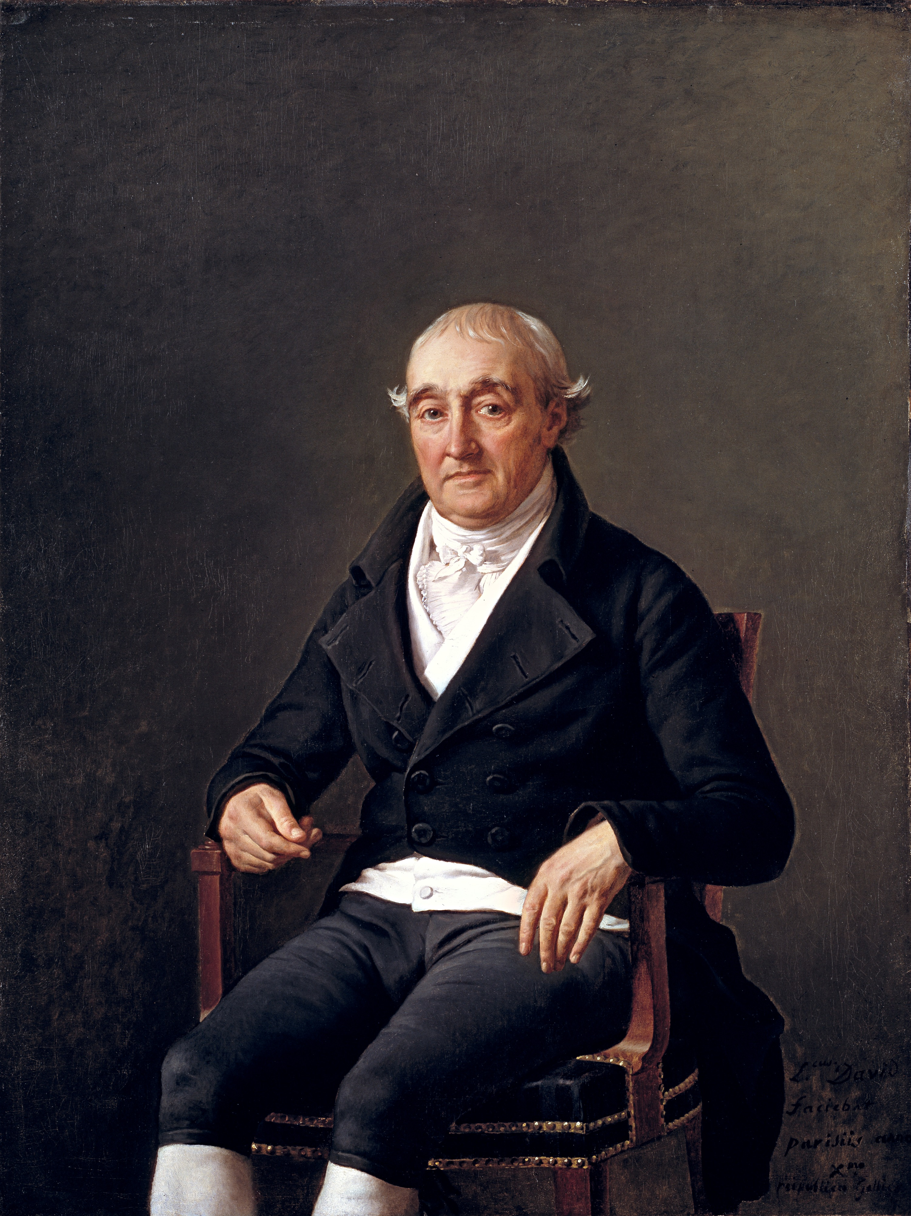
Jacques-Louis David, Portrait of Cooper Penrose, 1802
I have sometimes wondered “what would someone like Cooper Penrose make of his portrait’s current situation?” As someone who lived much of his adult life outside of blustery Cork, the Irishman presumably would enjoy the better weather that Southern California provides. I am less sure that Penrose would appreciate the stark architectural setting of the Timken. Our space could not be more different than the grand manor house, Woodhill, that he and his wife Elizabeth, spared no expense first buying and then refurbishing in a neoclassical style. Although clearly not the smiling type--he was at one time a practicing Quaker--Penrose would find some amusement at being surrounded by likes of Monsieur and Madame Pupil and Guy XVII, Comte de Laval. I am guessing they would strike him as much too “ancien regime” for his progressive tastes. Or maybe not. He once bought a billiard table, which raised the eyebrows of his Quaker friends. Despite his religious beliefs, Penrose was a man who clearly appreciated fashionable things. Having a portrait made by the leading painter in France, Jacques-Louis David (1748-1825), was another example of Penrose’s determination to make himself look cool.
As it happens, we know something about the circumstances of this commission. Descendants of Cooper Penrose recalled that it took some convincing before David agreed to paint their ancestor. In the end, the famous French artist relented. Archives kept by the Timken include copies of correspondence between David and Penrose which suggest that after being approached by Penrose in Paris, David agreed to do this portrait for “two hundred gold Louis,” a significant sum at the time. The artist further believed that the result “will be a monument that will attest to Ireland the virtues of a good family man and of the painter who has rendered them.” We may assume that Penrose was both flattered by these words as well as by the final image. Not everyone felt that way, however. David reportedly showed the work-in-progress to a visiting English painter, Joseph Farrington (1747-1821), in late 1802. Farrington disliked it a great deal and noted in his diary that Penrose had been “painted in a very poor manner” by the fabled artist of the French Revolution.
Regardless, David signed and inscribed the work boldly with his name in the lower right corner. He also dated it monumentally in Latin: “anno/ Xme/ republicae Gallicae”--the tenth year of the new French Republican/revolutionary calendar, which David himself helped inaugurate in 1792. Penrose was eager for the painting to assume a place of honor in his home. A highly successful timber merchant when he commissioned the picture, he pressured David to complete the work at least partly because he wanted to show it off on the just-finished walls of a newly expanded Woodhill, c. 1800. Penrose died in 1815 but the picture remained with his family until the 1930s when they quit Ireland and moved to London. Amy Putnam purchased the portrait for her future museum in far off San Diego, in 1953. The portrait has been shared generously with museums throughout the world since that time, but it always comes back home to the Timken, where Cooper Penrose looks slightly uncomfortable but, all things considered, pretty satisfied with his surroundings.
Work of the Week #27
Bartolome Esteban Murillo, Christ on the Cross, 1660-70
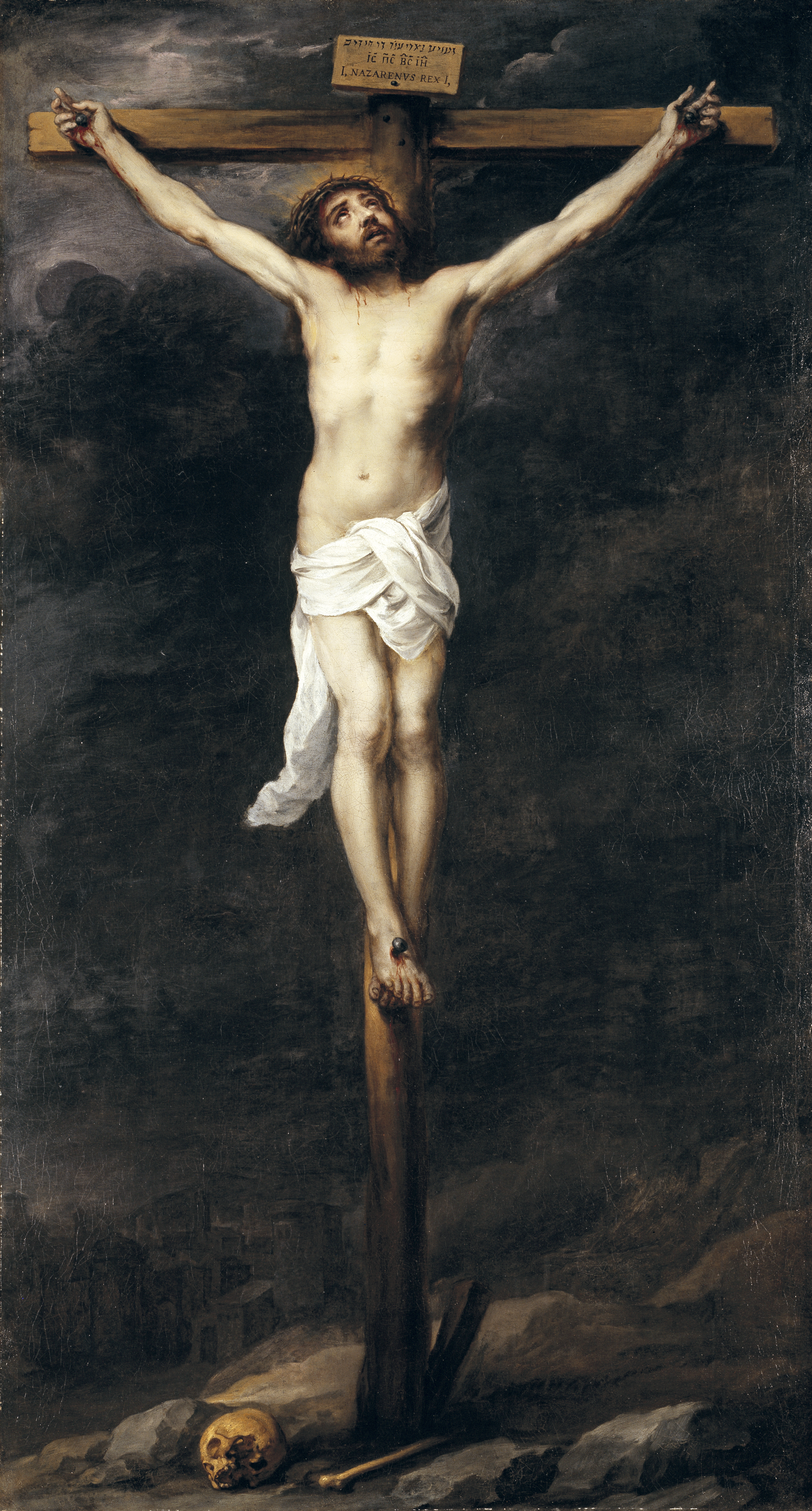
When it comes to covering the art of Spain, the Timken’s claims are modest. This has been true from the very beginning. When the museum first opened to the public, in October 1965, only a single work by a major Spanish artist existed in the permanent collection. While that number has since doubled, the Spanish school remains a fairly conspicuous gap in our survey of memorable European art. That gap gets addressed, albeit obliquely, by the fact that the Flemish master, Peter Paul Rubens (1577-1640), worked for a period of time in Madrid both as a court painter and diplomat. Is that enough of an explanation?
It is likely more complex than that. Our first great patrons, Amy and Anne Putnam, were happy to acquire numerous Spanish works during their highly philanthropic lives in San Diego. They were financially responsible for the purchase of Still Life with Quince, Cabbage, Melon, and Cucumber, c. 1602, arguably the finest picture that Juan Sánchez-Cotan (1560-1627) ever made. They gave that painting to the Fine Arts Gallery (now the San Diego Museum of Art) in 1945. Less than two years later they donated another stunning work to the same institution, this one--Agnes Dei, 1635-37--by Francisco de Zurbáran (1598-1664). Nine years before that, the Putnam sisters donated a portrait by Francisco José de Goya y Lucientes (1746-1828), Vicente Maria de Vera de Aragon, Duque de la Roca, c. 1795, after Reginald Poland, the Fine Art Gallery’s director, asked them nicely for the required funds. There were others, too. Perhaps the sisters believed the next phase of their acquisitions should pursue a separate trajectory? We can delve further into that question once I have access again to the Putnam archives. While I am kept away from those documents by the pandemic, it is worth considering their last selection of a significant Spanish painting, the one they purchased in 1955.
Christ on the Cross is big. It measures almost 7 feet tall and 4 feet wide. It is a dark, imposing image. From out of a murky background, a glowing figure emerges. His arms are spread wide apart and the body is clearly ravaged with pain. He gazes upward. A crown of thorns is placed on Christ’s brow and a faint suggestion of a halo illuminates the head from behind. At the base of the cross, skeletal remains are scattered among the rocks and barren earth. The skull is an iconographical reference to Adam, whose original sin Christ’s own death redeems. We are given direct, privileged access to the final moments of this sacrifice and the artist asks us to contemplate its significance. The work belongs to the last phase of its maker’s successful career as a devotional painter. Made in Seville in the late 17th century by Bartolomé Estebán Murillo (1618-1682) it counts among the most consequential works to come from that important Spanish art center. A similar work by Murillo, Christ on the Cross, 1675, can be found at the Museo del Prado. The main difference between the Prado’s and the Timken’s pictures is Christ’s suffering has ended in the Madrid version.
Murillo went to Madrid for extended periods throughout his life, but returned to his home in Seville around 1660. Christ on the Cross epitomizes the interests of Murillo’s final period when his works balanced unflinching realism with an appreciation for the fundamental mysteries of the Christian faith. If you could have only one Spanish Baroque work for your collection, Christ on the Cross stands out as an excellent choice.
Work of the Week #26
Raphaelle Peale, Cutlet and Vegetables, 1816
It is open to debate, but I am not alone in thinking that perhaps the most beautiful of all early nineteenth-century American paintings is today in San Francisco: Raphaelle Peale’s Blackberries (c. 1813). It is a small, almost perfect work of art. A dish of freshly picked fruit, some unripe and still on the thorny vine, are placed in a low porcelain bowl that is set on a grey soapstone counter. The berries glint in delicate light that the artist closely observes, but most of the panel’s surface is cast in shadows. The painting once belonged to John D. Rockefeller, III but since 1993 it hangs in the M.H. de Young Museum along with almost 150 other works from that distinguished collection of American art.
I first got to know Peale’s masterpiece when I was still a graduate student, serving as the National Endowment for the Arts Intern at the Fine Arts Museums of San Francisco. I was fortunate to work for Marc Simpson, who was their curator of American paintings, and who established for me what remains a durable example of excellence in museum work. Shortly after being acquired by the Putnam Foundation, in 2000, the Timken’s leadership invited Simpson to analyze Peale’s Cutlet with Vegetables (1816). He called it “one of the artist’s most singular and ambitious panels.” In a now hard-to-find publication celebrating a handful of recent Timken acquisitions made around this time, Simpson--who also curated the Timken Museum’s landmark exhibition about Eastman Johnson’s Cranberry Harvest, Island of Nantucket--noted the work’s critical relationship to a series depicting cuts of meat arrayed with fruits and vegetables on kitchen counter planks. The artist made these in his hometown, Philadelphia. The Timken’s image is inscribed with both a precise date--May 1816--and its place of manufacture. Peale confronts us, phenomenologically and unbeautifully, with the sullen, obdurate present-ness of things. Indeed, Simpson connects this work to the sad biography of the artist; all of these paintings were made shortly before Peale’s death, in 1825.
This same image by Peale has also been vigorously explored by Alexander Nemerov in terms of its connection to “anatomized still life.” In his book, The Body of Raphaelle Peale: Still Life and Selfhood, 1812-1824 (2001), Nemerov associates Peale’s slightly morbid interest in butchered animal flesh with the rise of scientific illustration within Philadelphia’s medical community. Peale, whose family was firmly ensconced in the city’s elite culture, would have been aware of latest advances in anatomical dissection and its representation in some recently published textbooks. It was only natural for the artist to bring some of that new graphic specificity back to his own still life practice. Nemerov keenly draws attention to the way that the raw onion stalks are treated like tendons in Cutlet with Vegetables. He ends up devoting an entire chapter in his book to the overlapping fields of medicine and art in early nineteenth-century Philadelphia. The Timken’s painting becomes a main character in that unexpected and well-told drama.
I conjure these two distinct interpretations of the same object because, when it comes to great works of art, it seems important to appreciate how more than one satisfying explanation is possible. Simpson and Nemerov happen to be two of the most gifted scholars that the field of American art has to offer. I am always interested in what they have to say about compelling objects. In the end, the “blackberries” painting in San Francisco will likely remain my favorite work by Raphaelle Peale. However, the work we have here in San Diego, while difficult for vegetarians to look at, is truly something to ponder and a marvel in its own lasting, visceral way.
Work of the Week #25
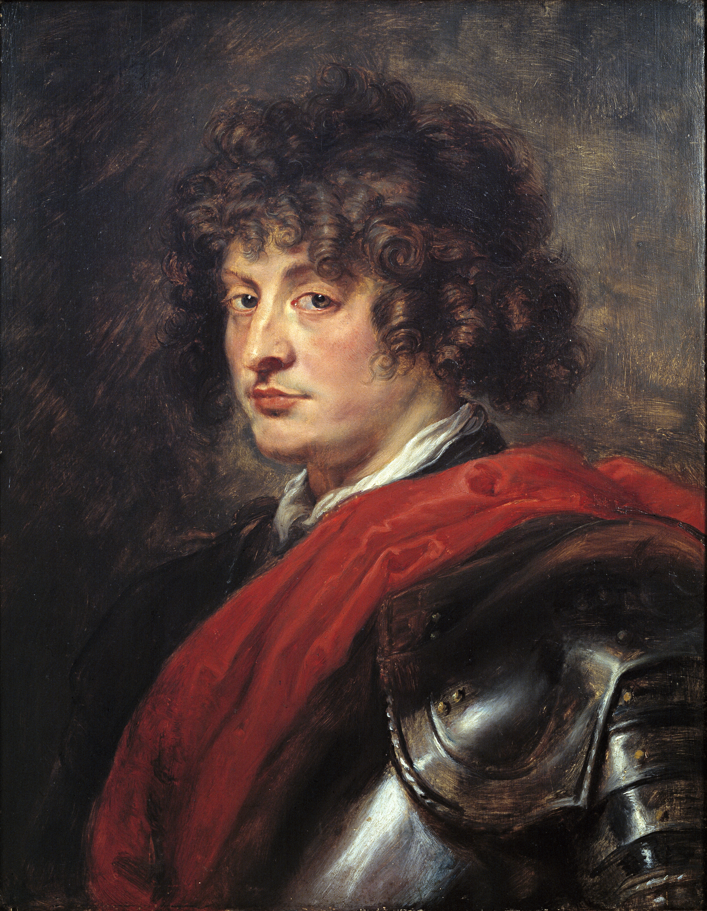
Peter Paul Rubens, Portrait of a Young Man in Armor, c. 1620
The Timken Museum is full of memorable faces. In the first two dozen of these weekly, brief descriptions of our permanent collection, we’ve encountered many of these portraits already. Some may even recall that I started this series by speculating on the source of Mrs. Gage’s inscrutable expression in the great picture that John Singleton Copley painted hastily at the onset of the American Revolution. Perhaps my favorite likeness of all hangs in the Dutch/Flemish gallery. It is the one by the legendary artist Peter Paul Rubens (1577-1640).
There was a time when scholars felt sure that this was a youthful depiction of Francesco IV, the future Duke of Mantua. When the Putnam sisters acquired the picture, in 1952, they certainly believed Francesco to be the sitter. There is documentary evidence that Rubens painted the eldest son of Vincenzo and Eleanora de’ Medici. We also know that such a painting was displayed as part of the collection of Charles I, who was the artist’s great patron starting in 1629. This is not that painting, however. An article published in Burlington Magazine in 1961, by Michael Jaffé, argued convincingly that the Duke’s likeness by Rubens still hangs in Saltram House, near Plymouth, in Devon, England. The picture the Putnams acquired was instead likely the one described in Rubens’s household inventory at the time of his death as number 129, “a man in armour with a red scarfe”.
So what if this is not a portrait of a Duke? It remains a marvelous example of what Rubens did best: paint a compelling look with a casual flourish, all the while capturing distinct senses of personality and materiality. Scholars since Jaffé have suggested that the image is best understood as a tronie--the Dutch term for “face”—a sample image that portraitists used to show off their creative skills to potential clients. Rubens scarcely needed to advertise his skills. By the 1620s, he was already established as a preferred painter of church altarpieces and commissions for tapestries flooded his busy Antwerp studio. Wealthy collectors clamored to have Rubens paint their family members, and not just in Flanders. He painted the Duke of Bavaria and Anne of Austria around the same time he took time to paint this handsome face. If any further proof of the image’s appeal is needed, at least two later copies exist: a pencil drawing based on the picture was formerly in a renowned British collection and another is today at the Indianapolis Museum of Art. Just over a year ago, a similarly sized work by Rubens, on oak panel, appeared showing a young man with the same rumpled curls and what looks like it might be the same suit of armor. The face looked quite a bit younger and had a less obviously self-assured appearance than the Timken picture. It sold at a London auction house for a little over £3 million.
Let’s be happy that the Putnam sisters had such great taste and, even if they were misinformed about the identity of this particular sitter, they knew--as the painter surely did--when an image had swagger to spare. Because of them, Rubens is well represented in San Diego and we get to study his talents in the strongest possible context at the Timken.
Work of the Week #24
Philippe de Champaigne, Christ Healing the Blind, 1655-60
We live in an extraordinary moment that is hastening to find cures: for the current pandemic, for systemic injustices, for the despoiled environment. It can be hard to focus on so many issues at once, they all seem urgent and overwhelming. Time spent contemplating a work of art can have the effect of slowing us down, however, teaching us to pay better attention and to investigate the signs around us, as well as their causes. Occasionally, this practice offers a message of abiding hope.
Take a painting by Philippe de Champaigne (1602-1674), Christ Healing the Blind, as an example. The large, carefully composed picture invites the viewer to take in a vast landscape that includes wooded countryside, calm waterways, a precise townscape, and tall mountains merging with the clouds in the hazy, atmospheric distance. Our eye is led into this convincing pictorial space by a brightly lit figure who occupies the lower left corner of the scene. Similarly-robed figures follow this young man in a serpentine procession that extends into the composition’s middle ground. His raised right arm, however, indicates a direction forward, away from the various emblems of human achievement—archways, bridges, and domed structures atop rocky escarpments—that provide the landscape with its overall charm. His gesture, deliberate as it is, ends up being a feint. If we follow it, we will likely miss the main event, which occupies a space further back in the column of figures. Fourteen bodies behind, we encounter another individual robed in purple and blue who makes a reciprocal gesture with his right hand. That figure is Christ. He is performing a miracle.
Surrounded, or more precisely, led by his apostles, Christ stops to heal two blind hermits who emerge from a rude cave at the far-left edge of Champaigne’s canvas. Arms raised, these men—one young, one old—are helped from their dwelling by another colorfully clad figure who guides them to the waiting Christ. The forward motion of the procession abruptly halts at this point and a sense of suspense builds around the impending cure. Already the leaders of the march are separating themselves from the miracle. They are simply unaware of what is taking place right behind them.
Champaigne was born in Brussels, but left Flanders in 1621 to study in Paris. He was likely drawn there by the presence of Peter Paul Rubens (1577-1640) who was then working in the French capital. Champaigne went on to become a trusted member of Louis XIII’s court, painting numerous works for the king, as well as for Cardinal Richelieu (Armand-Jean du Plessis). Richelieu served as First Minister and was the primary patron of the arts during the second quarter of the seventeenth century. Among his many public acts, he created the Académie Française, to which Champaigne was invited to become a founding member of the painting and sculpture division in 1648. Champaigne was an avowed Jansenist, however. This Catholic sect, which flourished throughout Western Europe, was opposed to Richelieu. By 1655, or so, the artist withdrew from court and, consequently, no longer enjoyed a steady flow of portrait and religious commissions. During the last two decades of his life, Champaigne painted landscapes in a classicizing manner indebted to the ideas of his famed contemporary, Nicolas Poussin (1594-1665), then living in Rome.
Christ Healing the Blind belongs to this later phase of Philippe de Champaigne’s career. A subtly dramatic work, charged with hope, it repays patient vision.
Work of the Week #23
Luca Carlevariis, The Piazzetta at Venice, c. 1700-10
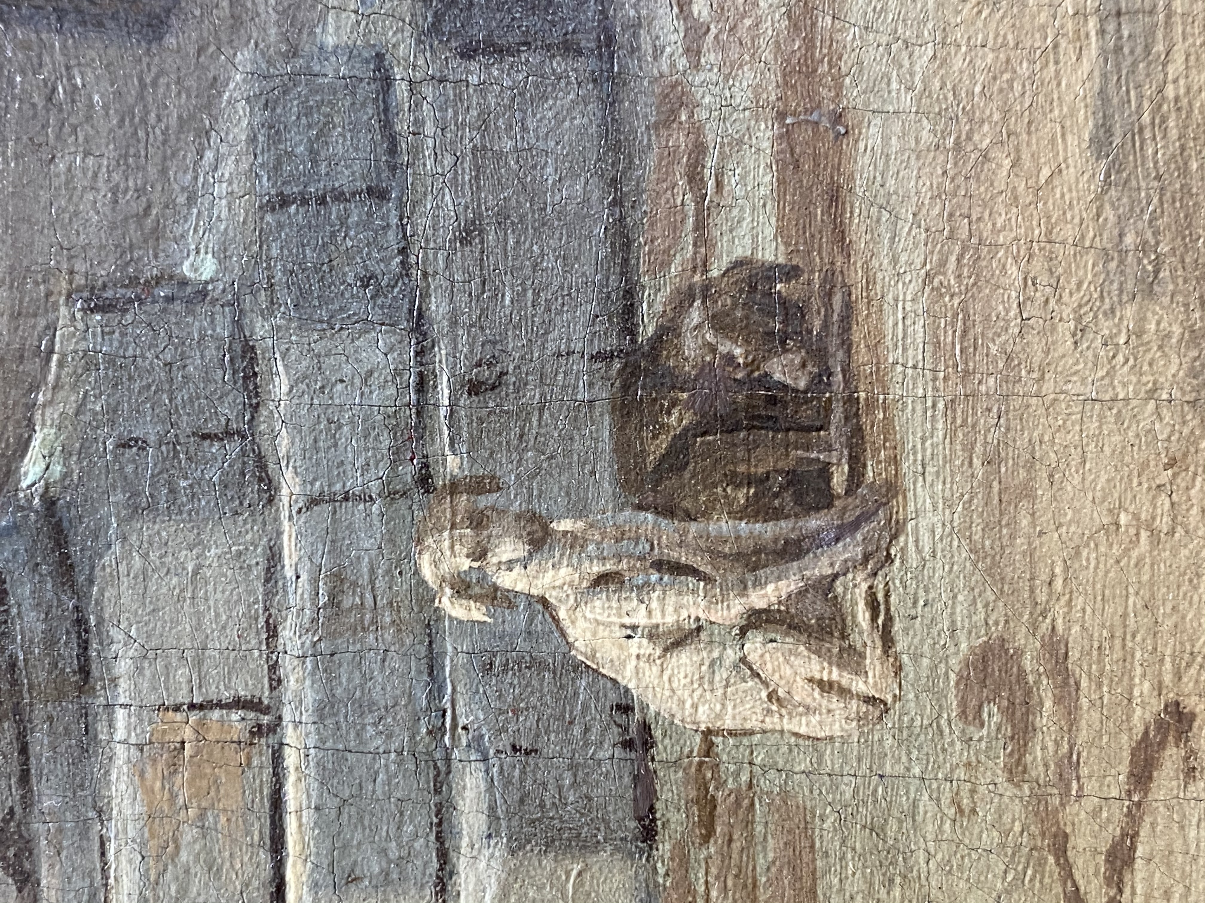
.png)
Interest in Italian subject matter spread in Europe throughout the eighteenth century. Scenic views--or vedute--of cities and the countryside were prized by those who were on the Grand Tour. Like college students on a study abroad program, these privileged men and women traveled throughout the continent in search of pre-selected cosmopolitan experiences and general intellectual refinement. Venice, with its storied past and scenic situation, was one of the most appealing destinations for the Grand Tourists. Catering to well-heeled travelers, many eighteenth-century artists soon specialized in painting highly realistic scenes of the city, its lagoons and canals, as well as flattering portraits of the young visitors to the region. These commercially-minded artists gladly opened their studios to the wealthy travelers and made a good living producing pictures on demand, or else allowing clients to choose from vast, existing inventories. The career of Luca Carlevariis (1663-1729) provides an instructive example of this circumstance.
Carlevariis was born into a creative family. His father--Giovanni Leonardo (b. 1614)--was an architect of some note in the province of Udine, northeast of Venice. By the time he was 16 years old, Luca Carlevariis moved to Venice where, in 1708, he became part of the Fraglia della Pittori--the guild of painters. Membership in this prestigious society was essential to accessing the flourishing art market in Venice, based as it was in individual reputation and satisfying a fickle clientele in transit. At the time he painted the Timken’s work, known as The Piazzetta in Venice, Carlevariis was considered the top painter of vedute in the city. He held that rank firmly until his younger follower, Antonio Canal (1697-1768--better known to us as Canaletto) supplanted him as the preferred painter of Venice among mid-eighteenth-century English and German collectors.
The Timken’s painting offers a familiar perspective: the view of the Piazza di San Marco as seen from a vessel in the Grand Canal. Many of Venice’s primary attractions are visible. To the right we glimpse St. Mark’s Basilica in the distance, along with its namesake column, and the façade of the Doge’s Palace; to the left we recognize the Sansovino Library, the base of the Campanile, and a corresponding column of St. Theodoric. The plaza in the composition’s middle is crowded with citizens, foreign merchants, tourists, and stray dogs. It is a large painting and its purchase would have constituted a significant investment. At one time, this work was thought to have belonged to an English connoisseur named Christopher Crowe, who owned four views of Venice by Carlevariis. Provenance research has shown that not to be the case, however. For his part, Carlevariis also made highly detailed engravings of similar scenes in Venice for travelers who could not afford a picture the size of the Timken’s. A nearly identical, still larger painting of the Piazzetta by the same artist can today be found at the Cranbrook School in Bloomfield Hills, Michigan (https://center.cranbrook.edu/discover/things-cranbrook/carlevarijs-piazzetta-venice). Slightly more vertical in orientation, that canvas shows a bit more of the surrounding architecture, but fundamentally follows the same strategy that Carlevariis demonstrated in our image. In 2001, the Timken mounted a large exhibition of these views of Venice, curated by Charles Beddington, a scholar of eighteenth-century Italian landscapes.
Work of the Week #22
Arthur Wesley Dow, Bayberry Hill, Sunset, 1907
The scene is nuanced but simple. A layered landscape recedes into soft, muted colors. Pinks, purples, and greens predominate. The horizon line is indistinct. From an elevated, grassy place, the foreground splits into a creek bed, leading our eye down the slope onto a marshy plain. Scattered across that middle ground, the silhouettes of twin grain stacks rise out of the haze. To the composition’s right, a stand of trees extends toward the center and screens the waning sunlight. From a spot not far from here we imagine the sunset must be spectacular. In the end, this seems more a suggestive sketch than a finished painting, more like a haiku than an epic poem. Nonetheless, this handsome, self-assured work epitomizes the sensibility of the artist who created it.
Arthur Wesley Dow (1857-1922) was many things: a painter, printmaker, photographer, art theorist, and respected connoisseur of Japanese aesthetics. For this reason, in 1896, he was named curator of Japanese Art at the Museum of Fine Arts, Boston as the replacement for his mentor, Ernest Fenollosa (1853-1908). Perhaps his most lasting influence in the United States grew out of his role as an influential educator, however. Dow taught at Columbia University and wrote several books on art-- Composition: A Series of Exercises in Art Structure for the Use of Teachers and Students (1899) and Theory and Practice of Teaching Art (1912); the former is still available in print and is referenced by artists today. Georgia O’Keeffe (1887-1986) and Charles Sheeler (1883-1965) are counted among his many successful students. Although Dow devoted considerable energy to his teaching practice, he set aside time each summer to devote his full attention to creating his own highly personal landscapes, such as the small canvas that was recently donated to the Timken Museum of Art.
Dow painted Bayberry Hill, Sunset in Ipswich, Massachusetts, where he was born, and where, with his wife, Minnie Eleanor Pearson--also an artist--he operated a summer art school from the mid-1890s through the first years of the 20th century. A painting from this period, very similar to the Timken’s in terms of color and viewpoint but physically larger, called The Tidal Empire (Ipswich Marshes), 1917, can today be found at the Jordan Schnitzer Museum of Art at the University of Oregon. As a practicing artist as well as a teacher, Dow appreciated designs based on subjective interpretations of the observed world. He advocated that “the student should make many studies from nature” but he looked down on images that seemed to offer little more than a replication of visible phenomena. Interestingly, rather than place emphasis on one particular method over another, Dow advocated for whatever technique produced the most beautiful effect in a finished work of art. With influences taken from Japanese ukiyo-e prints and Impressionist painting, Dow embraced the changes taking place in American art toward the end of the 19th century and is today championed by both admirers of the Arts and Crafts movement and tonalism. At the same time, in early-20th-century works like Bayberry Hill Sunset, Dow proposes a radical simplification of forms and puts forward a modern version of the New England landscape.
We are grateful to Jane Kirkeby, former trustee, for her many generous gifts to the Timken, including this resonant work by Arthur Wesley Dow.
Work of the Week #21
Rosa Bonheur, A Pony and a Donkey, c. 1880 (private collection)
Above Image from Kevin Rowe 
A year ago, before social distancing, protective masks, and museum closures were imaginable circumstances of daily life, the Timken’s leadership resolved to dedicate 2020 to a yearlong celebration of women through public programs and displays. There was good reason for that commitment: in two weeks--August 18th--we will commemorate the 100th anniversary of the 19th amendment to the U.S. Constitution which guaranteed women the right to vote. Beyond this, let’s remember, too, that our museum was founded by three remarkable women and two women have already served ably as the institution’s executive director. For the past several years, we’ve made efforts to include women artists--from Marguerite Gérard (1761-1837) to Ella Ferris Pell (1844-1922) to Kiki Smith (b.1954)--in virtually every exhibition that the museum presents.
Still, there are no works of art by women in our permanent collection.
This is not because women artists can’t be easily identified between the early-sixteenth to late-nineteenth centuries, the timespan of the Timken’s greatest strength. To the contrary, in Italy, we think immediately of Sofonisba Anguissola (c. 1525-1625) and Artemisia Gentileschi (1593-after 1654); in Holland, let’s recall the contributions of Judith Leyster (1609-1660) and Rachel Ruysch (1664-1750), in France, Elizabeth Louise Vigée-LeBrun (1754-1842) and Anne Vallayer-Coster (1744-1818) both achieved renown in their own lifetimes; and Edmonia Lewis (1845-after 1911) and Mary Cassatt (1844-1926) made numerous memorable works that would significantly enrich any museum’s survey of American art. I haven’t begun to exhaust the names that merit possible inclusion with such a brief list either. The program in 2020 was slated to address their absence and all three temporary displays were conceived around the theme of women’s significant contributions to art history. I don’t need to remind the audience that reads this post however, the museum is currently closed, blunting those good intentions.
The good news is that many of 2020’s curatorial projects are in the process of being rescheduled. Not everything that had been planned can still take place. For the work of the week, I’m sharing a painting that was slated to be on view as I write, but which regrettably we won’t have a chance to present to the public in 2021. Rosa Bonheur (1822-1899) was a leading figure in nineteenth-century French art. Born in Bordeaux to an artistic family, she achieved early success and showed her work at the Salon when she was just 19. Bonheur is best known today for her heroic depictions of animals, the most famous of which is The Horse Fair (1852-55, Metropolitan Museum of Art). It has been suggested that Bonheur sometimes dressed as a man in order to access the spaces--stockyards and auctions--that were useful to her career as an animalier. This strikes us as demonstrably unfair since her male contemporaries rarely faced such problems (think of Degas's access to ballet dancers in their dressing rooms). In any case, Bonheur overcame the obstacles placed before her, and today we remember the quality of her realist works, not the hindrances to their production.
A Pony and a Donkey likely dates from late in Bonheur’s career. She spent her lifetime making complicated compositions of animals. By contrast, this sketch has the appeal of seeming effortless. Small works, such as this, likely served as studies for Bonheur’s more elaborate exhibition pictures, or else were opportunities to refine her technique. A wax seal on the back of this particular one indicates that the work remained in the artist’s studio until after her death. It became part of an important sale of Bonheur’s estate held at Galerie Georges Petit in Paris, in late May and early June of 1900. Pictures of domestic animals--especially horses--were popular with collectors throughout the nineteenth century, so it is not surprising that this study was purchased out of that sale. In the twenty-first century, the working donkey in the picture’s foreground might strike us as somewhat less beguiling than the unharnessed chestnut brown horse to the right, but it appears that these two animals served each other as good companions--as well as good sitters for the artist. Another work by Bonheur called Donkey, 1880, can be found at the Portland Art Museum today. I seize this chance to thank the private owners of this work for sharing it--such as we can these days--with the public here in San Diego.
Work of the Week #20
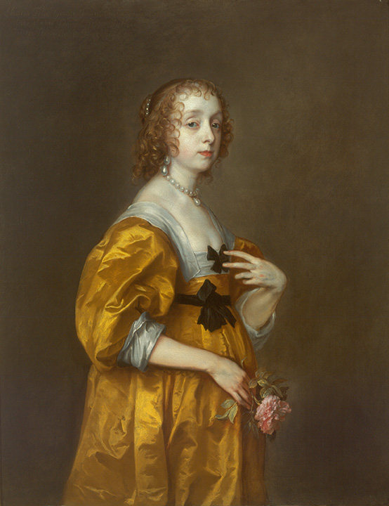
Anthony van Dyck, Mary Villiers, Lady Herbert of Shurland, c. 1636
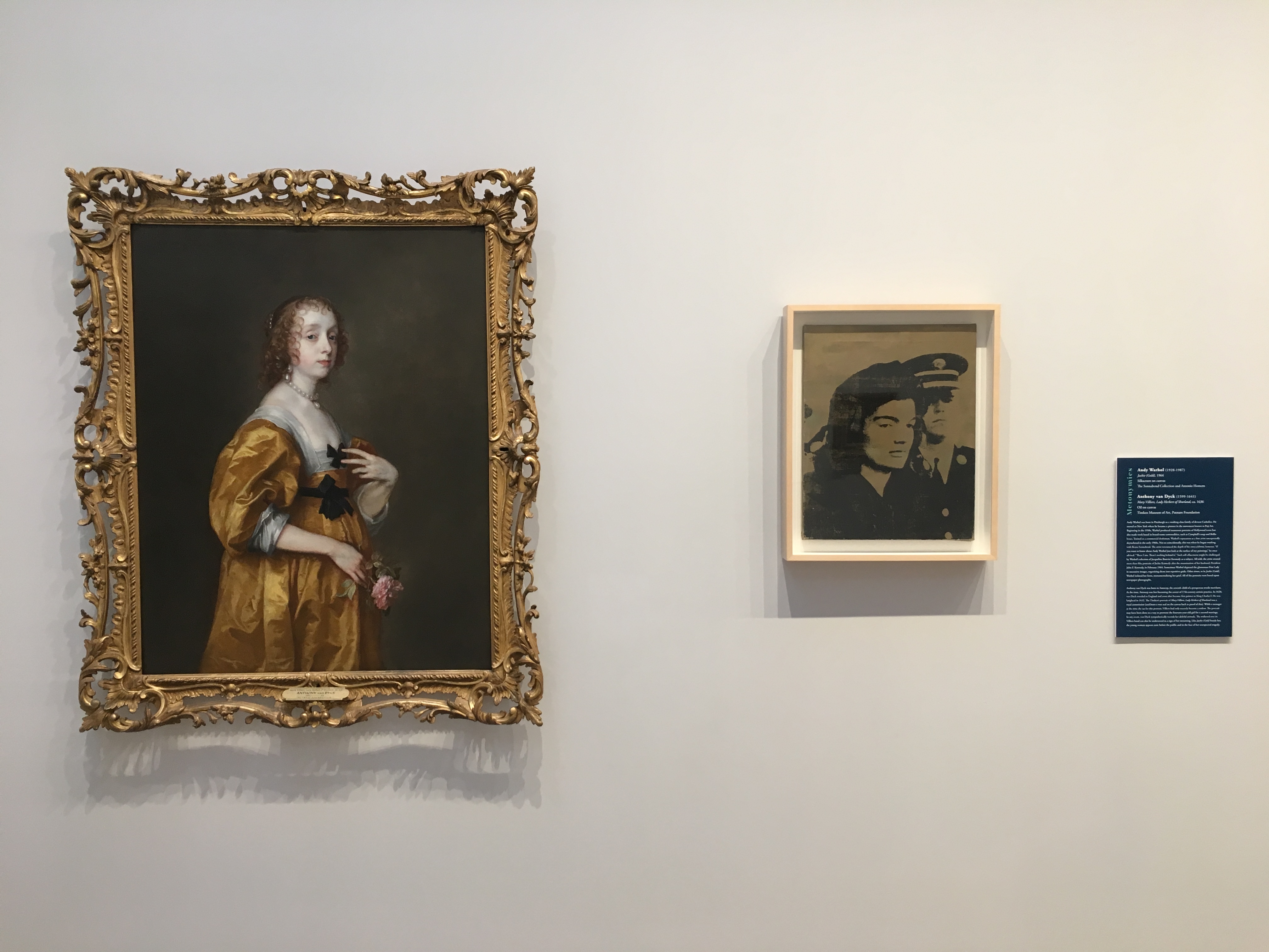
The photo was taken from the Timken Museum of Art, Metonymies Exhibition - Spring 2019 with Jackie (Gold) 1964 by Andy Warhol next to Timken's Anthony Van Dyck, Mary Villers, Lady Herbert of Shurland, 1636.
Because of the success he enjoyed throughout his career, we know a lot about the life of Anthony van Dyck (1599-1641). He was born in Antwerp, the seventh of twelve children in a prosperous, devoutly religious home. When he was ten-years-old, van Dyck went to study with Hendrik van Balen (1575-1623 who headed Antwerp’s professional organization of painters, the Guild of St. Luke. Van Dyck likely spent the next several years learning his craft there. By the time he turned eighteen, van Dyck found new employment in the busiest of all painting studios in that city, the one led by Peter Paul Rubens (1577-1640). Rubens once referred to van Dyck “the best of my pupils.” The two men ultimately shared many traits: a passion for travel--especially to Italy, bravura draftsmanship, interest in the commercial benefits of printmaking, and a keen instinct for pleasing their royal patrons. There was admiration, but also competition, between these two leaders of the seventeenth-century Flemish art world. In 1621, Rubens received the commission to paint a monumental cycle of decorative paintings from Marie de Medici, now at the Louvre. During the same year, van Dyck was invited to England where he went to work for King James I.
In 1632, still in England, van Dyck was knighted and became the principal painter to Charles I. Although he made regular trips back to the European continent, van Dyck called London his home and died there. It is estimated that in the course of his final decade he painted the King and Queen of England perhaps 70 times and produced another 30 or so portraits of members of their court. One of those paintings has been at the Timken since 2005. Mary Villiers, Lady Herbert of Shurland has a wax seal on its back indicating it was a royal commission. Like the artist who painted this work, we know a fair amount about the person on the front of the canvas. Mary Villiers was about fourteen years old when she sat for this particular portrait. If Villiers seems joyless, it is with good reason. Her husband of just two years, Charles, Lord Herbert of Shurland, succumbed to smallpox in 1636, the same year in which we presume the painting was made. Mary holds a single downturned rose in one hand while her other hand points to the black, mourning ribbons on her dress. Van Dyck relied on symbolism of this kind; for example, he uses the same shattered pink rose petals to signify the end of a life in his portrait of Venetia, Lady Digby on her Deathbed (1633, Dulwich Picture Gallery).
Although she appears poised in her resplendent gold dress, there is something pained, yet indisputably heroic, about this depiction of a young widow. Scholars speculate that Villier’s family commissioned the Timken’s portrait to share with prospective suitors. Indeed, van Dyck painted Mary Villiers again, about a year later (Lady Mary Villiers, c. 1637, North Carolina Museum of Art), in a lighter mode, shortly before she married the King’s cousin and became the Duchess of Richmond and Lennox. He would paint her again after this marriage. The most touching of all the portraits that van Dyck made of Mary Villiers, however, is the one in San Diego. Reeling from grief, the fallout from a pandemic, and bracing for an unknown future, this depiction of Mary Villiers models a form of grace under pressure that merits not just our sympathy, but admiration as well.
Partly for this reason, when the Timken displayed works on loan from the Sonnabend Collection in its galleries, a little over a year ago, I hung Andy Warhol’s Jackie (Gold) (1964) alongside van Dyck’s painting. Separated in time by more than 325 years, and vastly different in terms of technique, these two portraits share a sensibility about private grief in the face of public scrutiny that suggests their lasting alignment.
Work of the Week #19
Russian Icons
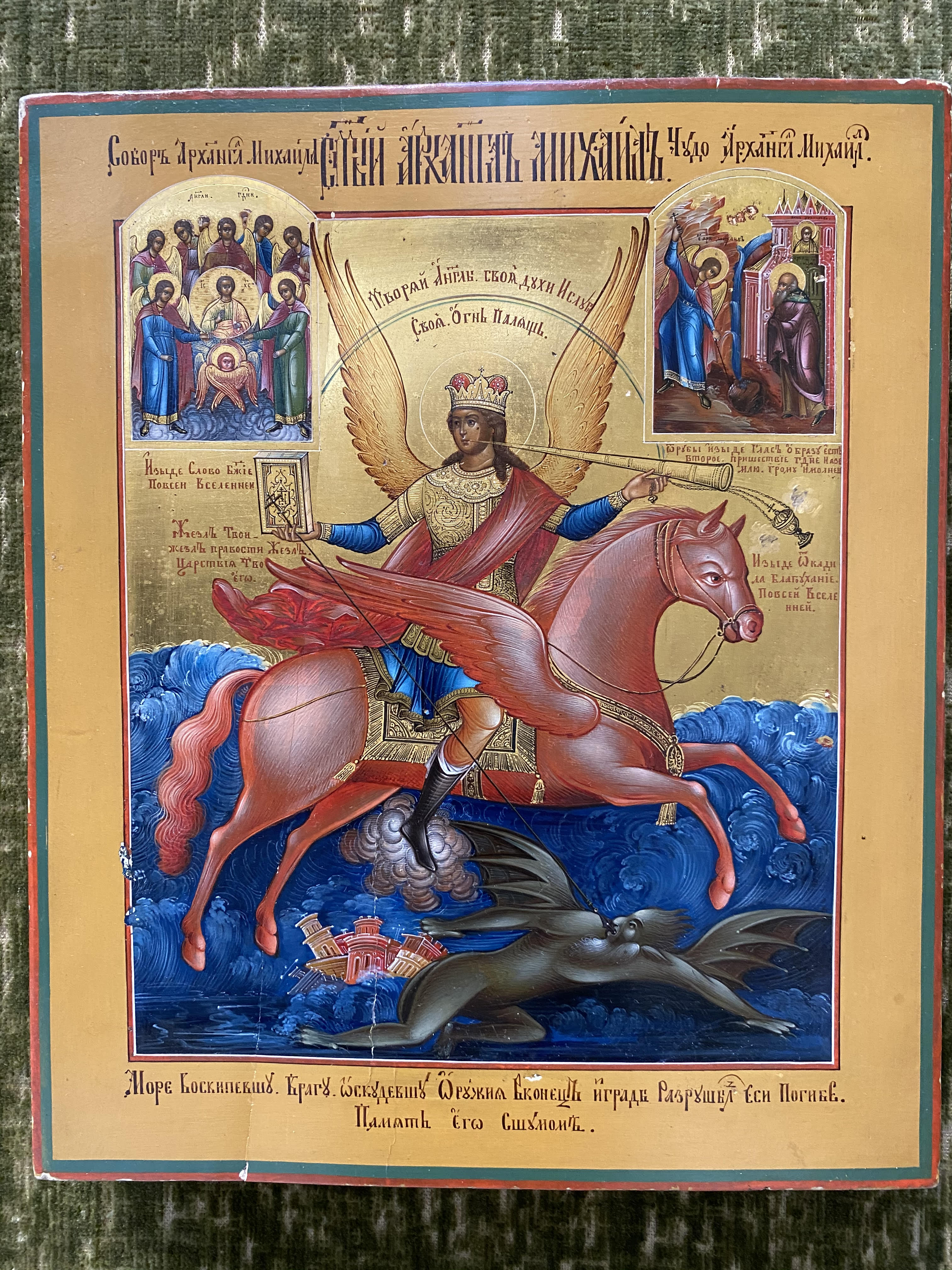
Anonymous Russian, The Archangel Michael with Deeds, 19th century - Collection of Miss Amy Putnam 1963.150
.jpg)
Anonymous Russian Artist, "Literacy is the Path to Communism," c. 1920 (Duke University Libraries.)
Amy Putnam (1874-1958), the youngest of the three Putnam family members who founded the art collections at the Timken, was an ardent admirer of Russian culture. In 1918, Amy began her studies of Russian language and literature at Stanford University. That academic interest likely contributed to her later decision to collect Russian religious icons as a hobby. By one account, the private rooms of Putnam’s grand residence at Fourth and Walnut Streets in San Diego were covered with more than 300 of these mostly small-scaled works. Unfortunately, we don’t have a clear sense of what Amy’s older sisters--Anne and Irene--thought of the icons and their proliferation throughout the house. There is no question, however, that the room devoted to the Russian icons at the museum stands as the most faithful representation of Amy’s refined, highly individual taste. Even the green flocked wallpaper against which the glittering panels are set today is said to have been her choice.
Apart from being able to read some of the less-ornate Cyrillic script that appears on these intricate works, I have virtually no useful expertise when it comes to interpreting the Russian icons now in San Diego. The Timken has been fortunate, however, to rely on outside scholars to provide insights into this numerically significant part of its permanent collection. In 2017, Wendy Salmond, a noted scholar of late-Imperial Russian Art who teaches today at Chapman University, reviewed the entire collection and proposed a completely new installation of the works. Partly because that recently refurbished gallery is not currently available for public view, I want to underscore how improved the space seems and credit Dr. Salmond fully for this achievement. Her reinstallation plan includes a more robust interpretive framework for many of Amy Putnam’s favorite works, as well as some subsequent gifts to the museum. We are immensely grateful for her assistance with this project.
Let’s remember that Amy Putnam chose to launch her studies of Russian culture at the outset of the Bolshevik Revolution, which began in October 1917. Because the Soviet propaganda machine made canny use of familiar imagery, her professors at Stanford must have been alert to the ways in which Orthodox religious iconography was being actively retooled for new ideological purposes. Did Amy consider any of these problems while reading the novels of Tolstoy and Dostoyevsky? Her appreciation of small devotional works, like the one celebrating the triumph of Archangel Michael over a demon, or truth trampling evil, is noteworthy. But what would she have thought about an anonymous Russian revolutionary artist’s conversion of that Orthodox iconography into a message that “Literacy is the Path to Communism”? Amy’s awareness of the contemporary “culture wars” that stood behind her beloved study of things Russian might have made for lively dinner table conversations with her older sisters. I only wish we had the advantage of sitting in on one of those evenings. Even a single opportunity to eavesdrop would cast tremendous light on the motivations of these indisputably cultured, yet fundamentally mysterious (to us) women.
Work of the Week # 18
Albert Bierstadt, Cho-Looke, The Yosemite Fall, 1864
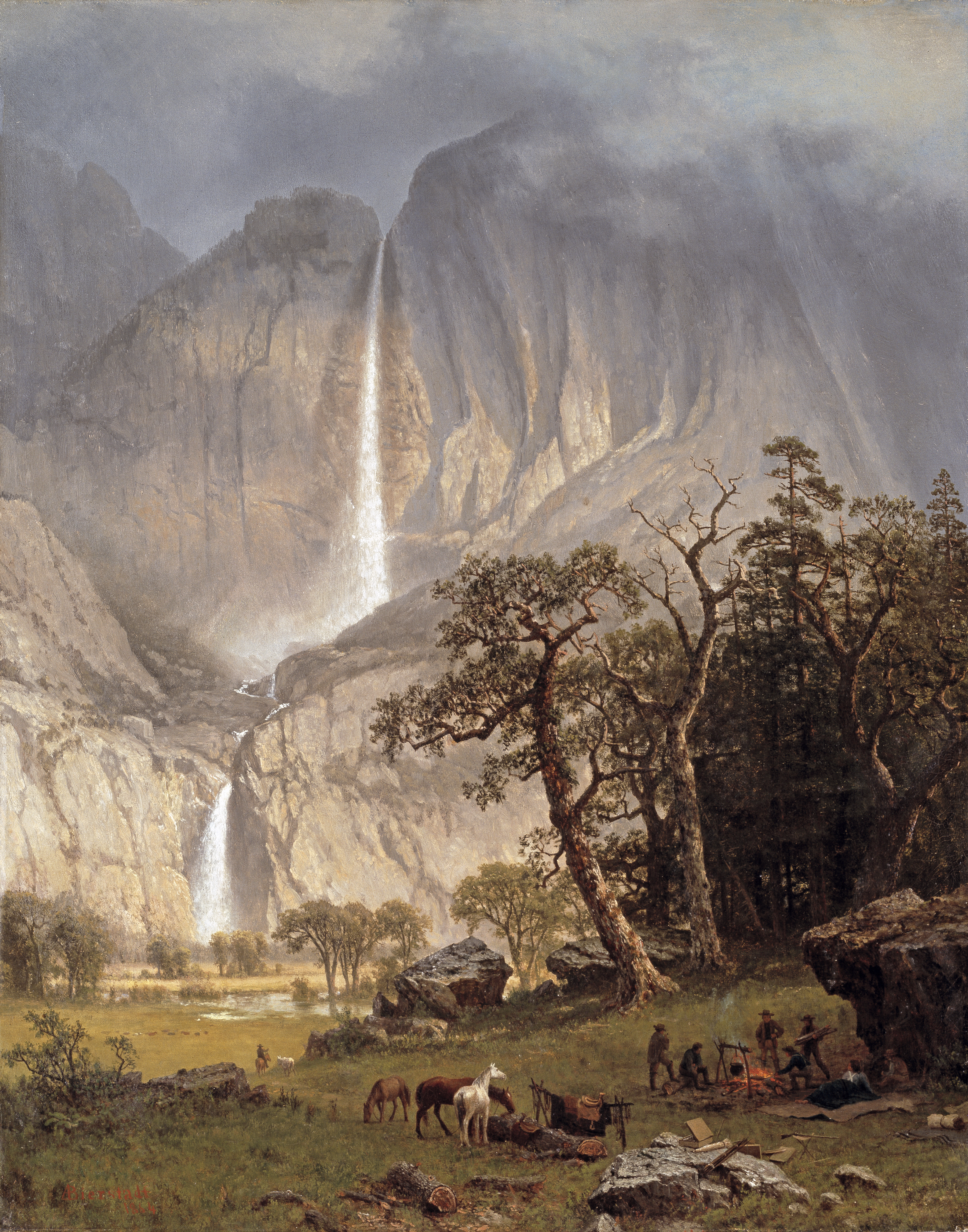
Certain art objects are familiar because we recognize their subject matter and we understand the historical circumstances that surrounded their creation. This week’s entry is about one such work.
Although born in Germany, Albert Bierstadt (1830-1902) moved with his family to Massachusetts as a child. He first ventured west in 1859 as part of Frederick W. Lander’s “Oregon Trail” expedition, but made it no further than the Rocky Mountains on that trip before returning home. In April 1863, Bierstadt started again overland toward the Pacific Coast, arriving in San Francisco by mid-July. By August, the painter was in Yosemite, just in time to learn he had been drafted into the Union Army. Like many privileged Northerners, Bierstadt opted to pay his way out of performing military service, but could not extract himself from Yosemite’s splendor for several more weeks. He was enamored with the raw physical beauty of the pristine, “Edenic” valley. Along with two artist-friends, Bierstadt filled his sketchbooks with observations that he would later use to compose large-scale paintings back in New York City. One of those landscapes was Cho-Looke, The Yosemite Fall, an exhibition picture which a journalist called out as “one of the artist’s best” during a studio visit in June of 1864. That same month, President Abraham Lincoln signed a bill that granted Yosemite status as a State Park. A quarter century later, President Benjamin Harrison signed the congressional act that permanently established the site as a National Park.
It has become an art historical commonplace to assert that 19th-century artists’ and writers’ representations of Yosemite, Yellowstone, and the Grand Canyon helped convince legislators to preserve these lands for public use. With its sweeping upward view of the falls and verdant valley, we can easily imagine how Cho-Looke might contribute to that effort. Still, when these western landscapes were first shown, it is worth recalling the incredulity of some sophisticated art audiences. Were these faithful depictions or creative exaggerations? The question was a fair one since Bierstadt was not alone in his tendency to embellish scenes of nature for dramatic effect. Only after seeing these places in photographs--Bierstadt’s brother, Charles, was one of many camera operators who documented the West in stereographs and other mass-reproduced formats--were audiences fully convinced that the towering waterfalls, rare geologic formations, and expansive river valleys really did exist. Indeed, photographs of Yosemite Falls taken from roughly the same point of view as the Timken picture, suggest that Bierstadt might have relied on his brother’s commercial images to help him finish his painting.
The thorough scholarship of Nancy Anderson, and other leading curators of American art, has meant that we know a lot about Bierstadt’s western itineraries. Together with his wife, Rosalie, he spent roughly a year in California from 1872-73, stopping in Yosemite for another two weeks. The artist returned again to San Francisco, in 1880, but it’s not clear whether he went back to Yosemite on that particular trip. In 1889, hoping to recreate his youthful success as part of survey expeditions charting the path of railroads, Bierstadt set off through Canada to Alaska. He travelled as far South as Portland, Oregon on that excursion but seems not to have crossed into California. Each of these encounters resulted in grand landscapes that were displayed publicly, but without the sensationalism that accompanied his initial Yosemite pictures. In the end, fascination with the western wilderness fell out of favor with progressive art audiences. By the start of a new century, Bierstadt was nearly forgotten.
Heroic representations of the American west, such as Albert Bierstadt’s Cho-Looke, The Yosemite Fall, are essential to understanding the complex cultural and political developments of the late-nineteenth century. We should pay attention to their claims of wonder as well as the ways that they also claimed physical space. If you find yourself in Washington, D.C. anytime soon, plan to visit the Smithsonian American Art Museum’s current exhibition, Alexander von Humboldt and the United States: Art, Nature, and Culture, and see the Timken’s landscape in another compelling context.
Work of the Week #17
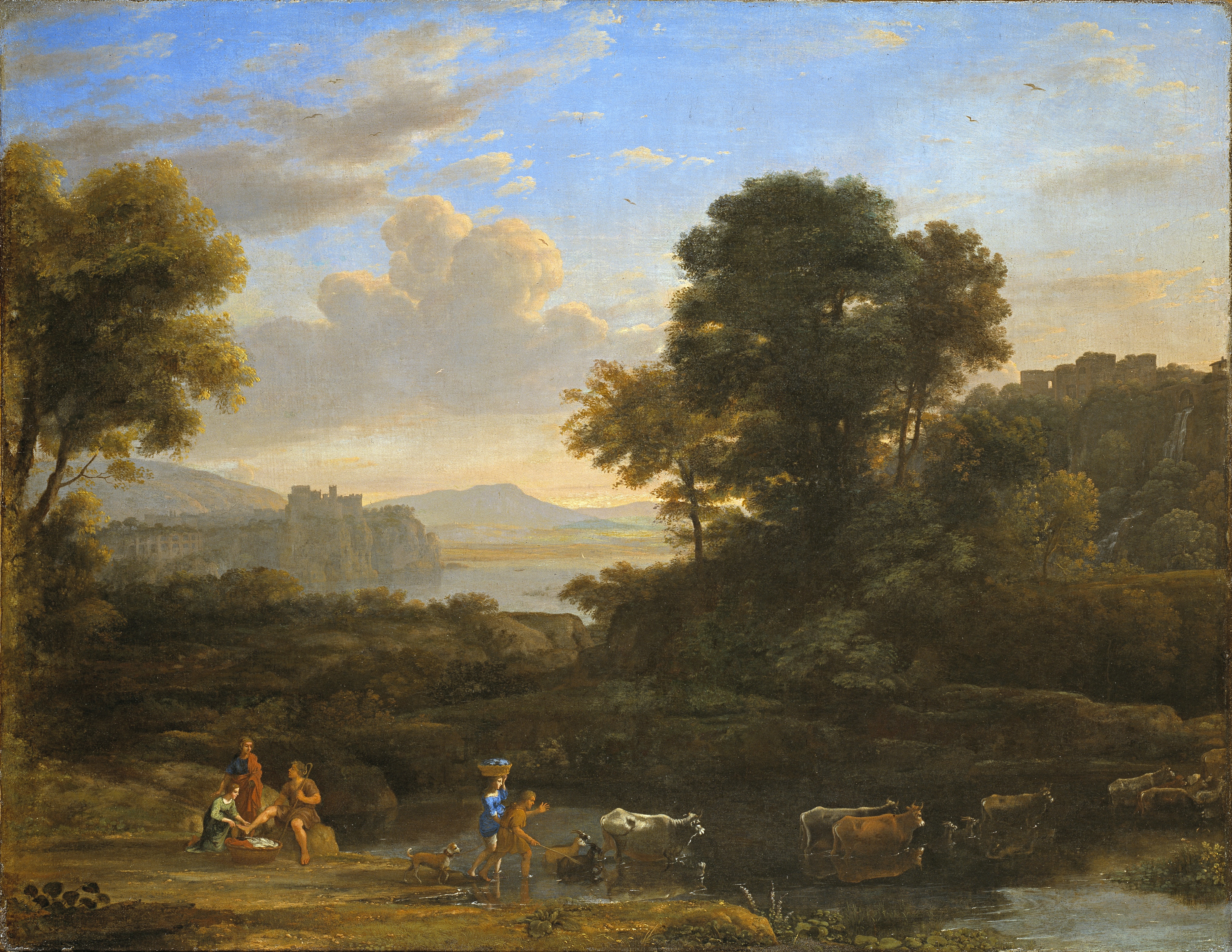
Claude Gellée, Pastoral Landscape, 1646-47
The essential trick of the old pastoral, which was felt to imply a beautiful relation between rich and poor, was to make simple people express strong feelings . . . in learned and fashionable language.
William Empson, Some Versions of the Pastoral (1974)
A broad, slightly elevated view of the countryside, framed by tall trees on either side, includes five figures, a dog, a herd of cattle, mixed together with sheep and goats. Seven birds also glide above the earth in a cloud-streaked sky. Ruined buildings appear on rock outcroppings in the composition’s middle ground, while in the distance a golden-hued river valley gives way to silhouetted mountains. The direction of the scene moves unhurriedly from left to right. The two men and three women in the foreground are dressed rustically. Their identifying attributes are straightforward: the men carry shepherd’s crooks and the women share large baskets of laundry. Two female figures converse with a male shepherd, seated on a rock. One of these women kneels before him, preparing to wash or, more likely, dry his uplifted foot. Her companion balances the other basket of clothing atop her head, gathers her blue dress to her knees, and starts across the river, steadied by the herdsman to her right. The couple’s limbs, like the bodies of the animals before them, are reflected in the slow-moving current. Everything appears to be in perfect balance.
This mature painting by Claude Gellée (1604-1682)--perhaps better known to us colloquially as Claude Lorrain--is a mainstay of the Timken’s French collections. The artist, who was born to a poor family in Northeastern France, travelled to Italy as an adolescent where he studied with Agostino Tassi (c. 1579-1644) and probably others. Claude went back home to the Vosges region in the mid-1620s, but eventually returned to Rome where he flourished as an artist specializing in grand compositions like this one. Along with his near contemporary, Nicolas Poussin (1594-1665), Claude’s work came to epitomize a balanced classicism for scholars sorting through the many different forms of Baroque art. Our painting’s generic title, Pastoral Landscape, confers a sense poetic idealization upon its subject, as does its prevailing structure of comforting order. Nothing bad could happen in this self-consciously pleasing view of an imagined harmonious past in the Roman Campagna.
Claude made a good career producing scenes like Timken’s picture. In the mid 1630s, he began keeping sketches of finished works. At the end of his life, either studio assistants or the artist himself, assembled these drawings into a book called the Liber Veritatis (Book of Truth). Today, that album is kept at the British Museum, having belonged to a succession of important British connoisseurs from the early-18th until the mid-20th centuries. Pastoral Landscape appears in that authoritative compilation as “number 103” along with a small study of the sitting shepherd and woman at left. Another pen and ink sketch of the herdsman, laundress, and dog can be found at the Morgan Library in New York, while still other seemingly related drawings of castles and figures are today in the collection of the Cleveland Museum of Art. These studies help us piece together Claude’s methodology: the synthetic pastoral imagery that brought him renown was itself a collection of fragmentary notes. Through these vignettes Claude suggested that the rural countryside was carefree and timeless, when in fact we know that it was full of hardship and subject to ongoing transformations. As the British literary critic, William Empson, suggested about pastoral poetry, 17th century pastoral landscapes were staged fictions, providing viewers with reassurances of stability and prevailing atmospheres of goodness that, in everyday life, were hard to find.
Work of the Week #16
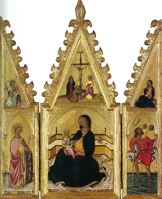
Niccolò di Buonaccorso, The Madonna of Humility with St. Catherine of Alexandria and St. Christopher, The Annunciation, and the Crucifixion, c. 1370-75
The Timken’s collection, while small, has numerous strengths. One of those strengths is the quality of its Sienese gold-ground panel paintings. Having just written that sentence, I feel a little like a baseball enthusiast who raves about the promising left-handed pitchers being developed in the farm system of a major-league club. Such specialized knowledge isn’t apt to register significantly with general audiences, but it communicates something of value to dedicated followers, and it means a lot to professionals. In our case, this fact translates into an awareness that few museums can tell the story of the early Renaissance better than the Timken. Especially when it comes to the innovative group of artists who worked in Tuscany starting in the late 13th and through the 14thcenturies, our collection offers uncommon insights.
Let’s start with the triptych of The Madonna of Humility that has been in San Diego since 1967. The artist who painted this devotional work was one of several leaders to emerge from Siena during the trecento (1300s). Following in the large footsteps of Duccio (c. 1255-1319) and Simone Martini (c. 1284-1344), and likely trained in the workshop of Jacopo di Mino del Pelliccaio (active 1344-1389), Niccolò di Buonaccorso (c. 1348-1388) had a brief but well-documented career in which he received commissions to paint everything from book covers to frescoed ceilings. He made chapel decorations for Siena’s main cathedral and images for nearby churches, such as the one in Costalpino completed shortly before his death. His work can be found in major museums throughout the world today. For example, elements from a single large altarpiece dedicated to the life of the Virgin are scattered in collections at the National Gallery (London), the Metropolitan Museum of Art (New York), and the Uffizi Gallery (Florence). The Timken owns a large panel, The Madonna and Child Enthroned (1387), by the artist--acquired in 1998--which likely was once part of a major, multipart decoration. Together with The Madonna of Humility, its presence in San Diego provides a rare opportunity to compare works in different scale from two different moments in the career of a Sienese artist.
The Madonna of Humility is small and intense. This little triptych--a three-part, hinged image--was almost certainly intended for private use by a wealthy patron. Its interior is divided into six zones: Saints Catherine and Christopher are painted as fully modeled, colorful figures occupying the two wings while reciprocal narratives of the Annunciation and Crucifixion frame the upper register of this ornately gabled composition. The main, central scene shows Mary and the infant Jesus in a domestic interior. We appreciate the early Renaissance artist grappling with how to represent space in convincingly illusionistic terms. The presence of a basket of sewing on a low bench behind the figures gives the work its iconographical title. Mary is represented as having just put down her humble, daily chores to attend to the baby in her lap. It is worth noting that, most of the time, this glimmering image would not have been seen, even by its owner. The triptych would have been closed like a book except when being used as a focus for prayer. The exterior of the triptych is painted with a simple trompe l’oeil (trick the eye) decoration that belies its resplendent interior.
If trecento scholars are correct, Niccolò di Buonaccorso was in his early twenties when he painted this enduring work of art. Today, 650 years later, his work remains something powerful to behold. Like a rookie southpaw striding out of the bullpen for his big-league debut, The Madonna of Humility signals youthful confidence and promises great things to come.
Work of the Week #15
Gabriel Metsu, A Girl Receiving a Letter, c. 1658
We probably all have some familiarity with the situation pictured here. Waiting to receive word from a loved one, we seek to control our outward appearance but, internally, a sense of anxious expectation pervades. In our mind’s eye, we can imagine the other person, physically apart, but psychologically in sync with our thoughts. Reading their words promises to bring us close again. Even in our own era of instantaneous communication, the ellipses that foretell a coming text message are charged with their own version of this anticipation. Exchange maintains the important relationships in our lives. This is certainly the case today, when we are socially distanced from each other due to a pandemic and a few words of encouragement from our friends provide welcome reassurance.
Gabriel Metsu (1629-1667) seems to have understood these conditions. In his small--about 10 inches square--precise, painting entitled A Girl Receiving a Letter, the 17th-century Dutch artist uses his considerable pictorial skills to underscore the ways in which bodies are joined by words. In this case a simple letter is exchanged. The missive has yet to be fully transferred, however. At the left a young boy, too young to be the likely author of the letter, steps onto a covered porch and presents the sealed correspondence. A neatly-dressed woman looks up from her bible, and takes the letter in her delicate fingers. Ink is visible on the outside of the paper and she likely recognizes the handwriting. We sense the contents matter to the recipient. Tension circulates within the brightly lit scene--even the flowers in the stone urn at left arc inquisitively toward the impending hand off. The boy gazes at the woman with something like concern in his eyes. She looks only at the folded paper. Is its message the one she is hoping for?
The Timken picture represents a part of a larger story. Another painting, virtually the same size, is now at the Musée Fabre in Montpellier, France. In that work, Metsu depicted a man seated at a table, drafting what might well be the letter that appears in our painting. To his right, a female servant holding a candle illuminates the dark scene. The expression on the writer’s face is intense. He seems not to mind the clutter around him. We sense his earnestness and that he is lost in his thoughts while he crafts the sentiments that will soon be read by his beloved. A leading scholar of Metsu’s work, Frank Robinson, has argued that the Man Writing a Letter (also c. 1658) and A Girl Receiving a Letter must be understood as a pair. Indeed, according to Robinson, and others, Metsu represented himself as the man in the Montpellier painting and his wife, Isabella, was the model for the woman who now lives in San Diego. Both are exemplary works of the fijnschilders (fine painting) tradition of the Leiden School into which Metsu was born and in which he was trained, at least until he was in his mid-twenties, before he moved to Amsterdam. In both works, the careful observation of minute details of everyday life is typical of the artist. Metsu painted letter writers, and letter readers, on numerous occasions.
When Man Writing a Letter and A Girl Receiving a Letter were first created, they were understood to be in deep dialogue with one another. The two works might have been arranged on a single wall, a few feet between them at most, as they signaled their interest in sharing thoughts across time and space. Now, they are separated by oceans. Their messages, while unknown, seem full of purpose and strive to connect us still.
Work of the Week #14
Martin Johnson Heade, The Magnolia Blossom, 1888
Artists, like all of us, are prone to repeating what works. For the nineteenth-century American painter, Martin Johnson Heade, this meant returning time and again to certain successful subjects. For instance, he painted the salt marshes around Newburyport, North of Boston, more than 100 times, starting in the late 1850s. Those works followed a nearly identical formula of long horizontal composition, the bottom third of which was a view of the marsh, crossed by tributaries of the Merrimack River. Dramatic cloud formations dominated the sky above. Later, Heade turned to depictions of colorful hummingbirds in their native habitats. By contrast, these were often short, vertical rectangles in which the painter redeployed the sketches made during three separate trips to Central and South America in the 1860s and 70s. Dozens of works document that particular, long-lived artistic investigation. Heade did execute a few portraits commissions, and lovely seascapes in a style appropriately indebted to his Hudson River School predecessors, but we likely would not remember him nearly so well if he made only those works.
The Timken’s painting by Heade, The Magnolia Blossom, was the first American work to be acquired by the Putnam Foundation, in 1965. The wisdom of that selection is mirrored in this practiced representation of artistic confidence. Magnolia Blossom belongs to the larger series of tabletop floral still life that Heade pursued throughout his career, starting with local apple blossoms before moving on to exotic orchids. Magnolias appear increasingly after he moved to St. Augustine, Florida, in 1883. Like the salt marshes and hummingbirds, numerous excellent treatments of this subject exist-- at least fifteen in all. I can conjure the ones in major museums that rival the Timken version in terms of their simple, direct beauty: Magnolias on a Gold Velvet Cloth, c. 1888-90 (MFA, Houston), Giant Magnolias on a Blue Velvet Cloth, c. 1890 (National Gallery of Art, Washington, DC), Magnolia Grandiflora, 1885-95 (Museum of Fine Arts, Boston), Magnolias on Light Blue Velvet Cloth, 1885/1895 (Art Institute of Chicago) and Magnolia, c. 1885-95 (St. Louis Art Museum). The last of these works most resembles the one in San Diego. The red velvet drape descends from the upper left corner in St. Louis’s work by Heade, not the right. Apart from this, the orientation of the magnolia blossom and the canvas size is virtually the same.
What makes the Timken’s magnolia blossom special, in the end, is the delicate balance between the pearly petals and the surrounding green- and rust-colored leaves, all of which are set against the sumptuous fabric field. The red background resurfaces along the edges of the flower itself. Museum conservators have observed this in other works and declared it a deliberate strategy (see the article by E. L. Fulton, R. Newman, J. Woodward, and J. Wright, “The Methods and Materials of Martin Johnson Heade,” Journal of the American Institute for Conservation, 2002). Heade sought this subtle chromatic vibration so that the ivory-toned blossom would take on a more three-dimensional appearance. A snapshot of a backyard blossom, while satisfying in its own way, can’t compare with the artist’s well-studied, carefully constructed image. Heade worked hard to get it just right.
Work of the Week #13
Jean-Honoré Fragonard, Blindman’s Buff (Le Colin-Maillard), c. 1775-80
Imagine we are together in a park. At least a dozen of us have made the trip. The sun is out so some in our group have brought along big pink parasols, in case they are needed for protection from the heat. Overall the daylight seems soft, however, and the atmosphere welcoming. It’s getting a little late in the day. Everyone is relaxed and we converse in small groups. From behind us, we hear the sound of water cascading from a large fountain set into a semi-circular niche. A few friends have gathered together around its basin. Another couple fans themselves while propped against a block of stone. A cluster of young men and women are playing a party game.
It looks like the competition is just getting started. A young man in a light grey coat is being blindfolded while, before him, a small girl in a yellow dress tugs at his left arm. She is checking to make sure he can’t see. For his part, he is adjusting the cloth that has just been stretched over his eyes. He might be trying to sneak a peek--the cheater! Or else something is happening in front of him and he is momentarily distracted from the game and wants to see what it is. Necks crane around him to catch a glimpse, too, and we sense the atmosphere is changing to one of increasing concern. The game is interrupted. Is our pleasant afternoon ending?
My description of Jean-Honoré Fragonard’s painting, called Blindman’s Buff, only begins to signal its spontaneity and complexity. I haven’t yet mentioned the glorious, moss-covered tree in the right foreground and its ascending network of bifurcating branches, or the sense of anticipation that seems to hang over the entire composition like moisture in the air. And what about the silhouetted form that tops the fountain in the distance? It looks to be an imposing figure: seated, female, with her right arm outstretched. If she had a scale hanging from that hand, we’d guess she was a monumental allegory of justice. As it is, the artist gives us only enough information to leave us wondering about her identity.
I’ve waited for the right moment to write something about Fragonard’s little painting at the Timken, in part because it is a favorite of so many people, but also because in a period of social distancing, it seemed mean-spirited to recount the Rococo picture’s open endorsement of physical contact. As we anticipate Balboa Park reopening in a few days, the time seemed right to explore it afresh. The work’s title, Blindman’s Buff, refers to a popular game among the ancien regime’s young and beautiful. The blindfolded player’s goal was to search for his favorite, listening intently to the voices around him, before reaching out to touch another body without fear or sanction.
Throughout his career, which stretched across the entire latter half of the 18th century, Fragonard painted numerous scenes like this one. He specialized in parklike settings where couples are shown swinging gleefully, riding see-saws, or playing la main chaude (a still more intimate game where one player kneels with head buried in the lap of another, while the rest of the group swats at an open palm that is held up behind their back). Indeed, at least three other versions of Blindman’s Buff by this artist are known: one is at the National Gallery of Art in Washington, D.C., one at the Toledo Art Museum, in Northern Ohio, and another small version at the Louvre in Paris.
The Timken’s version of Blindman’s Buff is slightly different than the others. More loosely painted, it is imbued with a sense of both mystery and impending drama. Scholars have suggested that the painting may have been cut down (on its left side) prior to its acquisition by the Putnams, in 1954. We don’t know for sure if that’s accurate or why someone would deliberately trim Fragonard’s composition. Something meaningful is happening just outside of the pictured space, regardless. It has begun to attract everyone’s attention and our once-carefree circumstance has been transformed.
Work of the Week #12
Giovanni Vendramini, Vision of Saint Catherine, 1820 (Harvard University Art Museums)
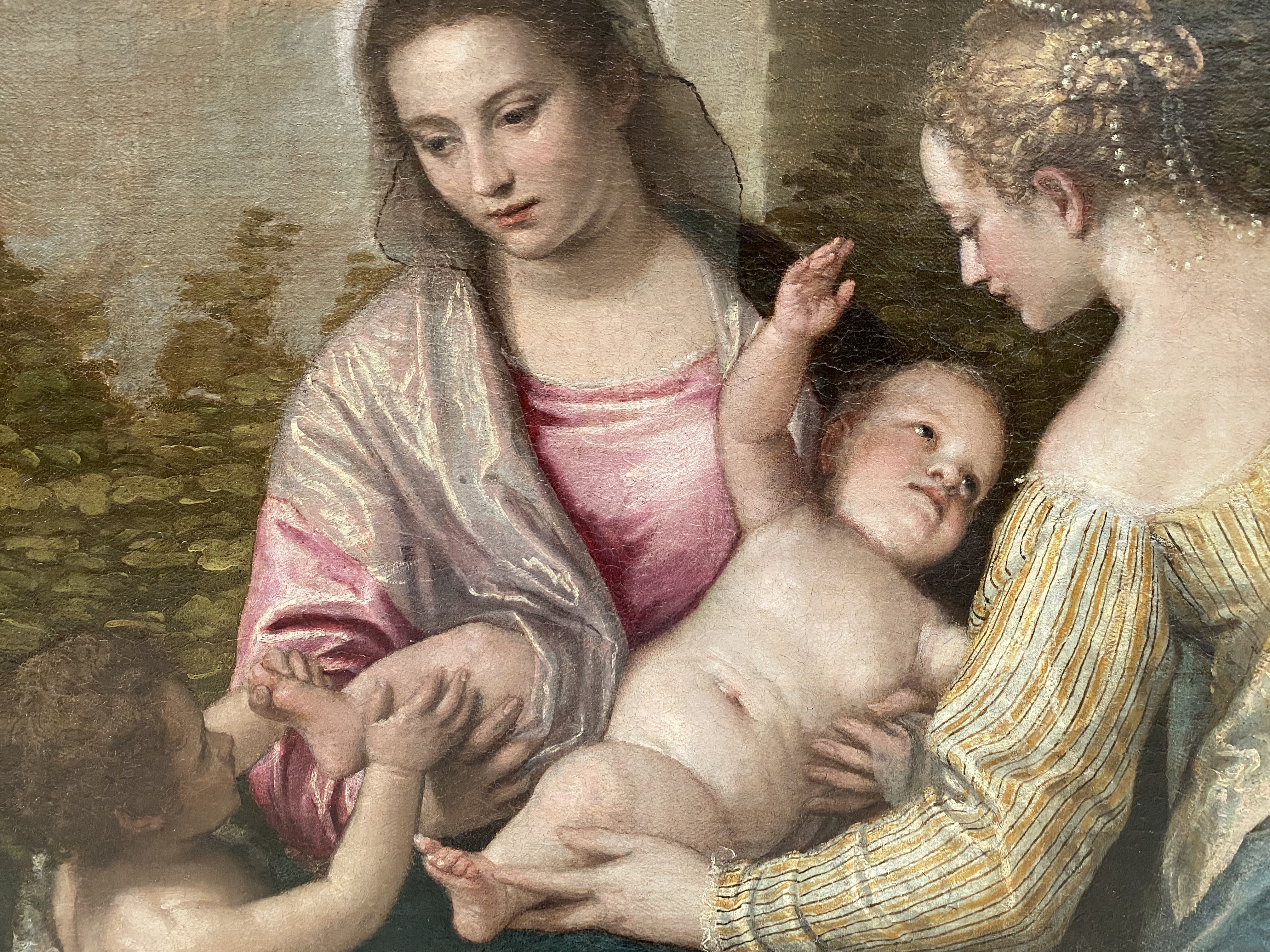
Paolo Caliari, called Veronese, Madonna and Child with St. Elizabeth, the Infant St. John the Baptist, and St. Catherine, c. 1565-70
The most recent comprehensive catalogue of the Timken’s permanent collection appeared almost a quarter-century ago, in 1996. That publication was the professional capstone of Nancy Ames Petersen’s career as director of the Timken, a role she performed from 1980 up until that year. I have been thinking about Nancy because she passed away peacefully last week. Everyone who cares about this institution owes her a debt of gratitude. Nancy was a decisive, impactful leader at a time when very few art museums were led by women. She was an ardent supporter of art historical research. I feel honored to have known and worked with her.
One goal for the “Work of the Week” series has been to reflect on the permanent collection in advance of writing a new handbook for this museum. Due to Nancy’s ingenuity, a significant number of Timken’s artworks were made the focus of internally-generated exhibitions, or else, because of the generous loans she enabled, they appeared prominently in the research of renowned curators throughout the world. For this reason, I have chosen as “works of the week” the objects that we still don’t know well enough.
An example might be our work by the Italian artist Paolo Caliari, better known to the art historical community as Veronese. Although he was born in Verona, as his nickname suggests, Veronese is best remembered for the grand-scale, theatrical frescoes and flattering portraits of nobility that he painted in Venice during the late 16th century. His easel pictures of biblical and mythological subjects have been celebrated by numerous exhibitions, most recently at New York’s Frick Collection (2006), Sarasota’s Ringling Museum (2013), and London’s National Gallery (2014).
The Timken’s devotional painting by Veronese had been previously known as Madonna and Child with St. Elizabeth, the Infant St. John the Baptist, and St. Justina. While its subject matter is a familiar one in Renaissance art--Italian artists from Raphael to Bronzino produced images of the Holy Family--the scholars involved with the Veronese exhibition held at Ringling Museum argued that the painting had been misidentified at the time of its acquisition. Indeed, the female figure at right was previously thought to be St. Justina, a somewhat obscure 5th-century saint from Padua, while their research suggested that this was, in fact, a representation of St. Catherine. A later engraving of the San Diego picture also identifies this figure as St. Catherine.
This is just to say there is always new work to be done when studying great paintings in our collection. That is, after all, the pleasure of art historical research. As we seek to understand this image more fully, it is worth keeping in mind the impressive women who brought it to San Diego. Amy and Anne Putnam, first and foremost, deserve to be credited, but also Nancy Petersen, who established high standards of interpretation that will guide our future efforts.
Work of the Week #11
Marianela de la Hoz, Penelope, 2019
After Antoine Caron/Faubourg Saint-Marcel Workshop of Marc de Comans and François de la Planche, Stories of Queen Artemisia, c. 1620
It’s been a while, so let’s remember that the Timken’s central space is ringed with heroically-scaled art. Four large tapestries are often overlooked by visitors to the museum who come to see the museum’s renowned paintings collection. In our contemporary moment, we have lost the habit of considering objects like these carefully. Decorative textiles of this kind were once compulsory parts of palatial settings. Their dense fabric helped warm often-chilly interiors and their sumptuously-colored narratives provided much needed visual distraction. Made from precious materials including silk, silver, and gold thread, these intricately designed works occupied a privileged place in European art history from the late Medieval period through, at least, the mid-nineteenth century. Unlike traditional murals, which were fixed permanently to the wall, a tapestry could be rolled up and transported to another location, which made them useful to wealthy property owners but difficult to track over time. Important artists such as Rubens and Boucher participated in their creation. Well-known examples can still be found in major museums throughout the world, including the so-called “Unicorn Tapestries” at the Metropolitan’s Cloisters in New York City, and The Hunts of Maximilian cycle at the Louvre.
The four tapestries that hang in the Timken’s central hall were produced in Paris around 1620. Based on drawings made by Antoine Caron (1521-1599), these were created in the legendary Faubourg Saint-Marcel workshop of Flemish artisans established by Marc de Comans and François de la Planche. The original cycle, of which San Diego has only a part, may have been comprised of as many as twenty separate scenes. The Italian-born Duke of Savoy, Charles Emmanuel I (1562-1630) most likely commissioned the ensemble to commemorate the wedding of his son, Victor Amadeus, to the daughter of Henry IV and Marie de Médici, Christina of France, a first cousin. The consolidation of power that this marriage sought is reflected in the narrative itself. The tapestries tell a popular, apocryphal story of Queen Artemisia, a benevolent ruler who was, in fact, a composite of several historical women. Artemisia’s character was understood in the late 16th century to function as a tribute to Catherine de Médici. The panels at the Timken recount two distinct episodes from the epic poem about Artemisia. One pair illustrates the fundamental goodness of the queen as she takes into account the concerns of her subjects from all ranks of life--The Requests of Citizens and The Petitions--while the other shows her sharing the spoils of conquests fairly--Distributing the Booty and A Group of Soldiers. The Duke must have hoped that his own son would enjoy the ear of the regent and be the recipient of similar demonstrations of generosity as a part of the royal household.
Revisiting these works of art and their messaging about wise, powerful women reminds me how nicely they set the stage for the next curatorial project at the Timken Museum of Art. Shortly after we re-open to the public, Marianela de la Hoz’s summer residency will inspect real and mythical women in similarly revealing fashion. While Marianela’s paintings tend to be small, detailed, and vividly colored, her interest in narratives of female heroism connects her work directly to the Faubourg Saint-Marcel artisans. The title of the forthcoming exhibition--Destejidas (Unweaving)--takes its name the myth of Penelope, who wove a tapestry during the day and took it apart every evening as part of a strategy for keeping unworthy suitors at bay. During her residency, visitors can watch Marianela while she completes a painting on site. With the Artemisia tapestries hanging nearby, Marianela’s work provides an unexpected, but welcome reference point for reconsidering the place of women in art at the Timken.
Work of the Week # 10
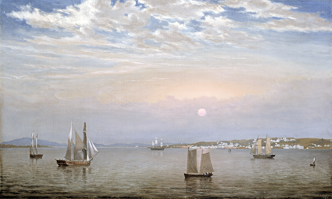
Fitz Henry Lane, Castine Harbor and Town, 1851
The water is calm and distant mountains are bathed in soft light. A nearly perfect sphere just to the right of the compositional center lets us know we are looking west. Judging by the layered pink and purple clouds, it promises to be a spectacular sunset. Daylight is waning, but the waterways formed by the meeting of the Bagaduce River and Penobscot Bay are surprisingly active. At least twelve boats of varying sizes and purposes are under sail in this scene. Clusters of straw-hatted men and bonneted women sit in the sterns of their pleasure craft. Solitary crew members stand on the decks of the commercial vessels, too. In the middle distance a patchwork of white, grey and mauve rectangles stretches across the hillside, at once mimicking the sails in the foreground and suggesting the neatly-organized village nestled around a quiet harbor. No doubt people are still at work there. Some might head home soon as a late summer day ends in Castine, Maine.
Fitz Henry Lane knew the pleasant rhythms of this place. Although he lived in Gloucester, Massachusetts, and had a disability since childhood that made travel over long distances hard, Lane went to Maine surprisingly often. The first record of his time in Castine dates from 1850. His closest friend, Joseph Lowe Stevens, Jr., was born in the shipbuilding community and Lane accepted an invitation from him to spend the summer there. He must have enjoyed the sojourn. Over the next decade, Lane returned on multiple occasions and produced dozens of works--lithographs, drawings, as well as large and small oil paintings--that celebrate the coastal town which was first settled by French explorers in the early 17th century and was later occupied by British forces during the War of 1812. The Museum of Fine Arts in Boston owns a large watercolor of Castine by Lane dated August 1851. Pieced together from two sheets of paper, it depicts the central section of our picture. We know from an inscription on the sketch itself that this particular view was made on a point of land directly across the estuary from the picturesque little town. The watercolor was judged so successful that it led to an important commission: the Timken’s painting by Lane.
For more than 125 years, Castine Harbor and Town was displayed in the local public library. Since its acquisition by the Putnam Foundation, in 1986, the work has hardly ever left San Diego. Once, in 1993, it traveled to a major retrospective of Lane’s work at the National Gallery of Art. Except for the small community of 19th-century American art specialists, not too many people know this particular work or its historic associations. Lately I have been imagining a focused exhibition dedicated to some of the artist’s finest images. Hopefully such a project would confer on our painting the kind of broad recognition that his other New England seascapes customarily receive. My dream project is on hold, temporarily, because of the current health crisis, but that fact does little to dampen my enthusiasm for this particular celebration of a summer evening. When we finally see Lane’s picture in context, surrounded by other similarly impressive representations, Castine Harbor and Town’s serene beauty will be magnified.
Work of the Week #9
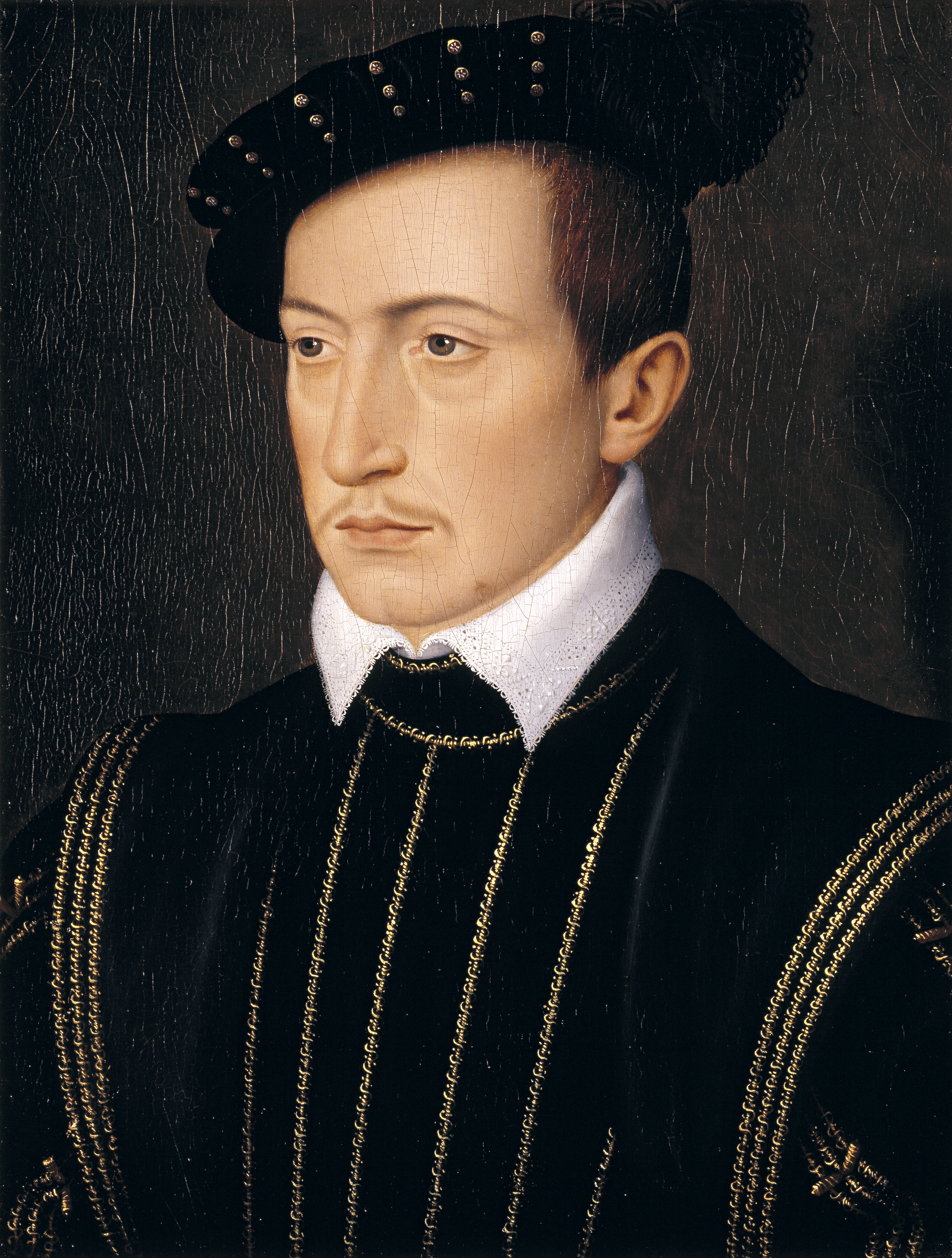
François Clouet, Guy XVII, Comte de Laval, c. 1540
A modest portrait, one measuring about the size of a common sheet of paper, might be easily missed by visitors to the Timken’s French room. The fact that it is made by an artist known primarily for his depictions of sixteenth-century royalty doesn’t help it garner attention today. We generally aren’t drawn to stiff, early-modern types and who can blame us? This one’s dour expression won’t win him many “likes” on social media. Swipe left! Furthermore, in a space filled with imposing representations by the likes of Claude Lorrain, Jean-Honoré Fragonard, Jacques-Louis David, and Jean-Baptiste-Camille Corot, a smallish panel, no matter how finely rendered, is prone to being overlooked by the crowds that flock to the museum to enjoy its highly recognizable masterworks.
I confess that it took me a little while to warm up to François Clouet’s portrait of Guy XVII, Comte de Laval. Now, I can’t help but admire its meticulously drawn facial features and the mesmerizing details of his costume’s lacework and embroidery. My first really close look at the painting was inspired by a communication from a scholar raising questions about its attribution to Clouet. If you look up Guy XVII (known to his friends as Claude de Montfort-Laval) on Wikipedia, the Timken’s portrait is what you’ll see as his identifying image, however. I tell my students never to trust what they find on the internet, so I continue to puzzle over this question from time to time. The picture was first attributed to Clouet, and identified as being Guy XVII, by Agnes and Elizabeth Mongan, two sisters who were highly regarded as art historians. Agnes spent her professional life as a curator at Harvard’s Fogg Art Museum, eventually serving as that institution’s director from 1969 to 1971; Elizabeth also worked as a curator for important private collectors, but later taught art history at Smith College, and authored numerous exhibition catalogues of early prints and drawings for the Art Institute of Chicago and the National Gallery of Art. I would not presume to doubt their considerable expertise when it comes to 16th-century French things.
The Mongans’ belief that the Timken’s panel should be attributed to Clouet (c. 1516-1572) was based on connecting it, as only they might, to several autograph drawings of Guy XVII by the artist. One of those drawings was in a private collection in Cambridge, Massachusetts when the Mongan sisters advised the Putnam sisters to buy this picture back in 1955. Another work closely resembling it lives now at the Musée Condé, within the Chateau of Chantilly, near Paris. Both of those images on paper show a young man, maybe 18 years old, posed very like--but not strictly identical to--the sitter in our painting. The slight moustache, high hairline, large ear, and pronounced nose all look convincingly interchangeable. I am inclined to agree with the Mongans about most things and, in this case, don’t find much reason to doubt their attributions based on decades of connoisseurship and intense scholarly research.
What is of greater interest to me is the intersection of Claude de Monfort-Laval’s somewhat sad storyline with François Clouet’s contrastingly prosperous trajectory. If this work was completed around 1540, as the Mongans surmised, the artist would have been roughly 24 years old when he painted it. Clouet was not much older than the sitter, therefore. Both young men were then at crucial, if diverging, junctures in their lives: François had just replaced his father, Jean, as the First Painter to the King of France, and Claude, whose own father passed away not quite a decade before, leaving him with his formal title, had finally been given responsibility for what remained of his family’s once-substantial wealth. Both young men were Gentilhommes de la Chambre (Gentlemen of the King’s Bedchamber), a title given to the loyal group of courtiers who enjoyed close physical proximity to Francis I. Despite these obvious advantages, Claude received the short end of fate’s stick. He died just a few years after the three, closely-observed portraits Clouet made of him were finished. Today, it is unclear whether he was murdered because of his debts or he succumbed to some sudden, but equally deadly malady. In any case, Claude left no heirs and maybe that is why his tragic-looking likeness lost its clear identification. Clouet proceeded to become one of the most revered portraitists in Renaissance Europe. Take a good look at his inconspicuous, yet skillful work when you next visit the Timken. Hopefully, that won’t be long.
Work of the Week # 8
Giovanni Girolamo Savoldo, Torment of St. Anthony, c. 1515-20
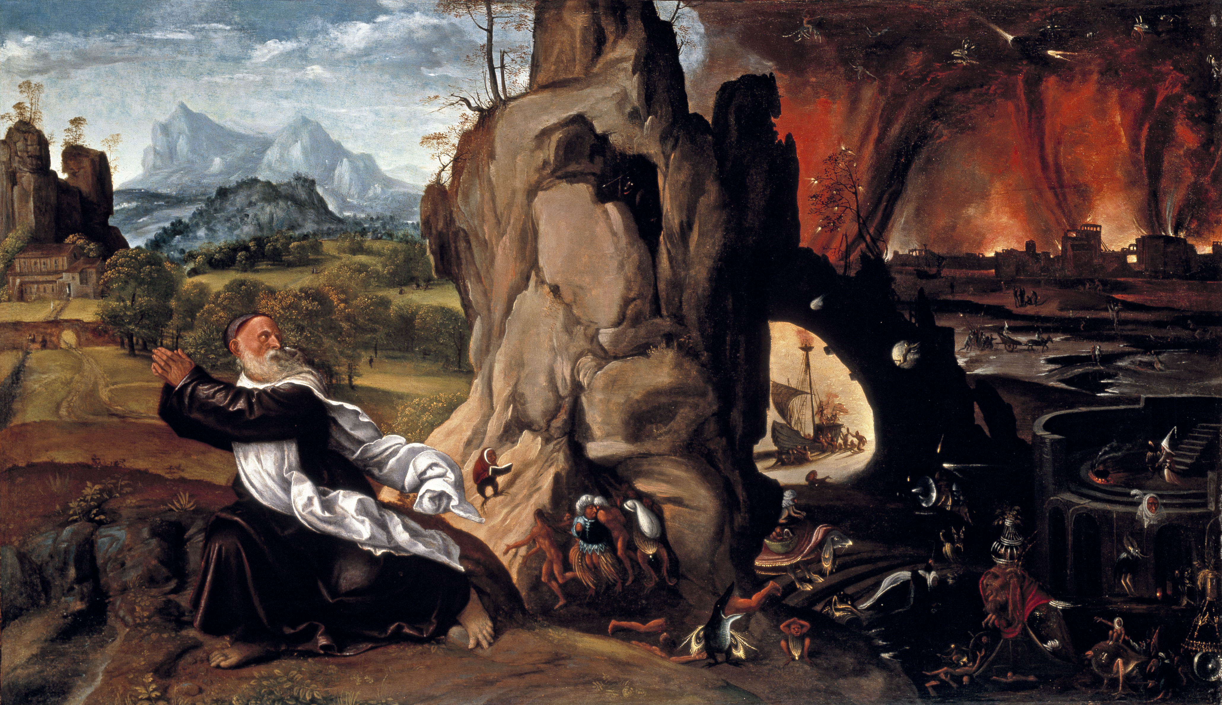
Click here to visit the Pushkin Museum of Fine Art website. ![]()
Giovanni Girolamo Savoldo, The Temptation of Saint Jerome, Pushkin Museum of Fine Art
Discussions of Giovanni Girolamo Savoldo almost always begin by asserting how little is known about this Northern Italian artist. The agreed-to details of his biography can be summarized in just a few sentences. Scholars believe Savoldo was born around 1480 in Brescia, but did not spend much time there. Traces of his presence appear in painter’s guild records in Florence, in 1508, and he had some commissions in Milan, in the early 1530s, but he seems to have remained in Venice for the vast majority of his career and probably died in the Veneto sometime in, or shortly after, 1548. Savoldo’s reputation among other Venetian High Renaissance painters was swamped by competition with the likes of Titian and Giorgione. Giorgio Vasari, the great mid-sixteenth-century biographer of Italian painters, sculptors, and architects summarized Savoldo’s legacy in a terse paragraph which praised his work as “fanciful and sophisticated,” but which ultimately dismissed him because “he executed no large works.”
Savoldo deserves more than a paragraph. Today his works can be found at the Uffizi, the Metropolitan, the Getty, and the Timken among other prestigious collections. Our panel (not large enough to catch Vasari’s eye, apparently) depicting the Torment of St. Anthony is popular with San Diego audiences. Like the artist’s other impressive paintings, such as Elijah Fed by a Raven (c.1510) at the National Gallery in Washington, DC, the Timken’s composition pivots around its depiction of an aged, robed figure in a landscape. The attention to flaring draperies and the dramatic contrasts between light and dark elements remind me of a similarly haggard St. Jerome (1525) by Savoldo that hangs at the National Gallery in London. But unlike these other solitary representations of prophets and saints, the Timken’s composition is divided into two distinct parts. The hermit hurries toward a pastoral landscape at left, led by his praying hands, but turns his head to stare back at the hellish inferno behind him. The assortment of demons and tortures occupying the right half of the panel looks as if it could come from no other source than Hieronymus Bosch, while the countryside is rendered as a pure, Venetian High Renaissance scene.
It is possible Savoldo studied works by Bosch firsthand in Venice, but he was unlikely to do so before 1521. He painted a remarkably similar composition, The Temptation of Saint Jerome (after 1515) which is today at the Pushkin Museum. That painting suggests more or less direct knowledge of Bosch, or Pieter Bruegel, among others (Michael Jacobsen points out that the closest actual source is a woodcut by Lucas Cranach), so much so that it was acquired by the Moscow museum as a work by an anonymous Netherlandish painter. The Pushkin’s St. Jerome was mistaken for an image of St. Anthony at one point, too. Subsequent iconographical studies of the image identified the figure as St. Jerome because of his red Cardinal’s robe. Like the Timken’s slightly larger panel, the Pushkin’s image is separated into two roughly equal parts: one “light/good,” the other “dark/bad.” Both Saints look up to the right toward a fiery menace; Jerome recoils as a large, nearly nude figure carrying a decaying body moves toward him; St. Anthony bears the same terrified look on his face.
Another thing that the Saints Jerome and Anthony have in common is their association with pandemics. St. Jerome is credited as an early recorder of bubonic plague in his translation of the Greek bible to Latin. Similarly, a common, but devastating, illness known as St. Anthony’s Fire (today thought to be caused by fungus in grain supplies) ravaged Medieval Europe. Furthermore, the so-called Black Death was a recurrent part of Venetian life--at least 23 outbreaks were recorded in Venice between 1348 and 1528. Savoldo’s interest in these tormented saints seems highly self-conscious, therefore. Direct experience of human suffering during these repeated health crises must have informed his choice of subjects as well as his imagination. The many small inhuman threats that bedevil St. Anthony are somewhat baffling to us today, but Savoldo insisted on their real, terrifying presence. Not usually admired for understatement, maybe this is what Vasari had in mind when he characterized this artist as fanciful and smart.
Work of the Week # 7
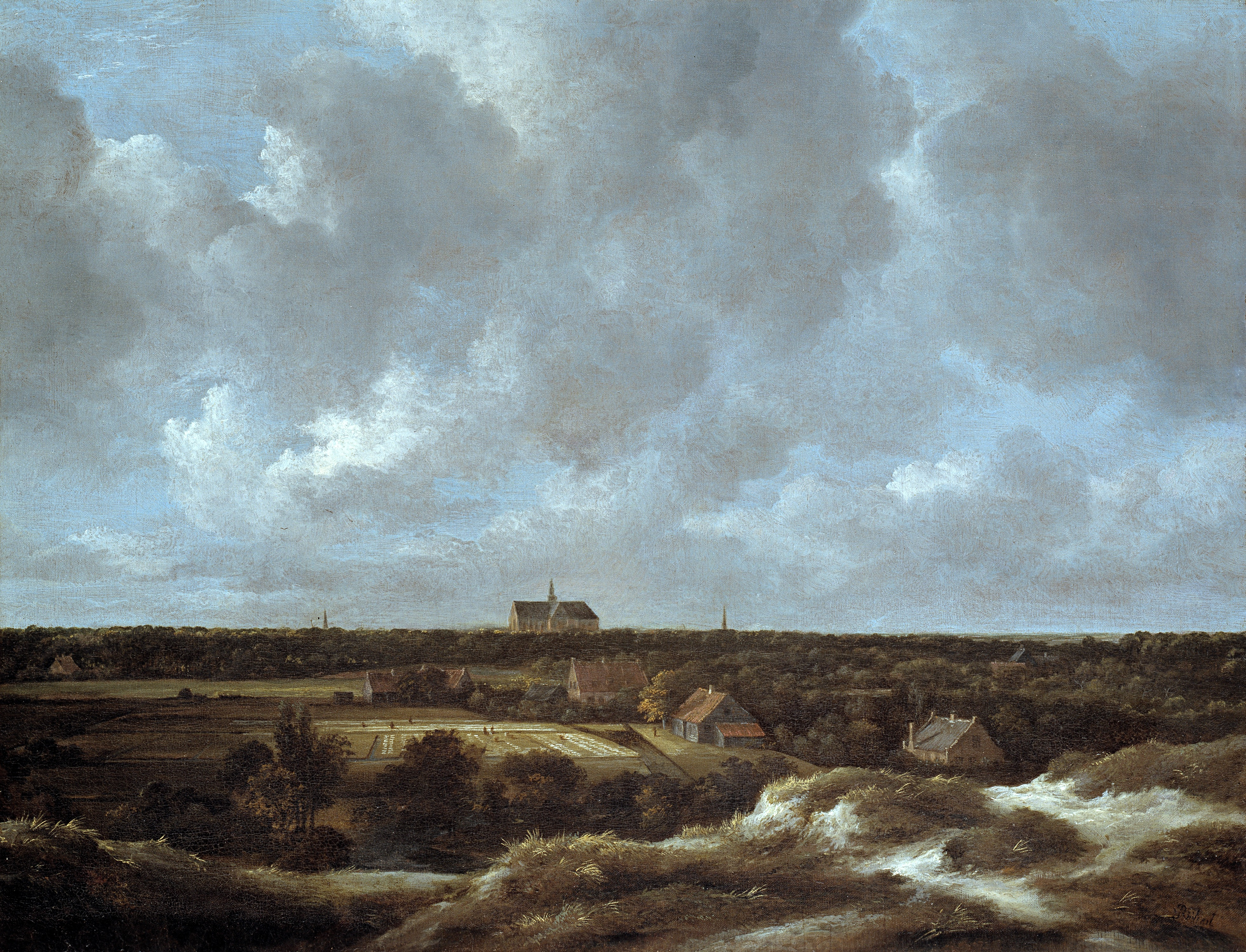
Jacob van Ruisdael, A View of Haarlem and Bleaching Fields, c. 1665-70
About a year ago, the Timken took an excursion through the “low countries” with supporters of the museum. These are fun trips, made even more memorable by the expansion of friendships while looking at great art. On this occasion, I was part of a group that toured both large and small museums in Brussels, Amsterdam, the Hague, and Antwerp. It was spring, and being Northern Europe, it rained virtually nonstop. Perhaps that is why I recall so well a brilliantly sunny day in Haarlem. We passed tulip fields starting to bud en route to that coastal town. Wandering through the central pedestrian zone at mid-day, I was instantly reminded of the Timken’s painting by Jacob van Ruisdael, A View of Haarlem and Bleaching Fields. Ruisdael was born to an artistic family in Haarlem (either in 1628 or 1629, scholars are not sure) and he is buried there, too. His grave is in the Grote Kerk of Sant Bavo, the hulking silhouette of which occupies a central point on the horizon of the Timken’s picture.
Ruisdael made almost a thousand works during his lifetime. Many are topographical landscapes depicting the area around his hometown and the Dutch call these works Haarlempjes (little views of Haarlem). These canvasses are typically divided into a format that Ruisdael repeats again and again: the bottom third records the flat countryside from a slightly elevated perspective while the top two-thirds of the composition is devoted to the sky and billowing clouds. Haarlem shows up neatly, but discreetly, in these formulaic views and the Timken’s picture is no exception to that rule. The artist provides hardly any clues to Haarlem’s considerable charms. If you want a sense of what the place might have been like around Ruisdael’s time, you’ll need to consult Gerritt van Berckheyde’s The Great Market with St. Bavokerk Seen from the West (1696) which hangs today in the Frans Hals Museum. What captivated Ruisdael was the surrounding agricultural fields and dunes, located to the west of the city, and the changing weather that blew in from the North Sea. The textile industry, with its laborious processes of bleaching raw linen in the open air, was put on display for economic as much as for aesthetic reasons. Anyone who is deeply curious about linen manufacturing in Holland should consult Linda Stone-Ferrer’s article, “Views of Haarlem: A Reconsideration of Ruisdael and Rembrandt,” which appeared in The Art Bulletin [Sept. 1985]. Stone-Ferrer demonstrates how 17th-century maps and prints represented this industry’s importance for the citizens of Haarlem, including the artists.
Ruisdael’s cared little about cartographic specificity, however, which is a source of aggravation for some historians of Dutch art. A few of his landscapes bear titles claiming unique vantage points, but those titles have been proven inaccurate. A comparison of our painting to its closest siblings—related works can be found at the MFA, Boston, the Wadsworth Atheneum in Hartford, the Thyssen-Bornemisza in Madrid, the Kunsthaus Zurich, and the Mauritshuis and Rijksmuseum in the Hague and Amsterdam, respectively—doesn’t help. Almost all show Saint Bavo at, or near, their horizons and most also feature narrow, windswept bleaching fields in their foregrounds. Would we learn more if we ever brought these works together in an exhibition? Could mapping technologies help tease out their precise locations? I have been puzzling this out. Sadly, after many hours on museum databases and studying satellite images of coastal Holland on Google-earth, I have reached only modest conclusions: the Timken’s painting is among the largest and most emphatically horizontal of these particular Haarlemjpes. It likely purports to disclose a view of the city from the Northwest, but I can’t really be sure. What I do know with certainty is Ruisdael’s painting conjures the strongest possible feelings of place and its visual acuity—real or imagined—still has the capacity to transport us.
Work of the Week #6
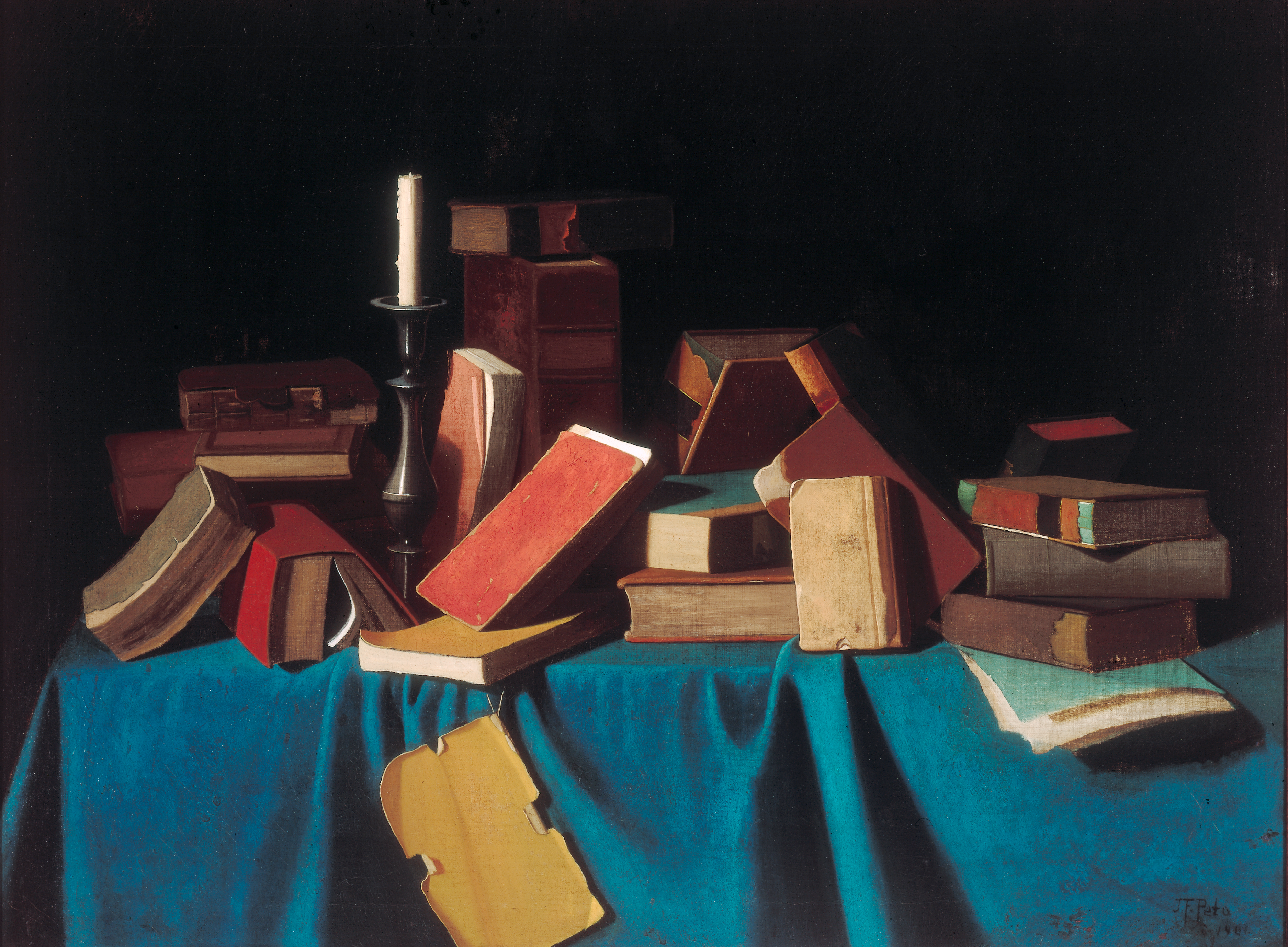
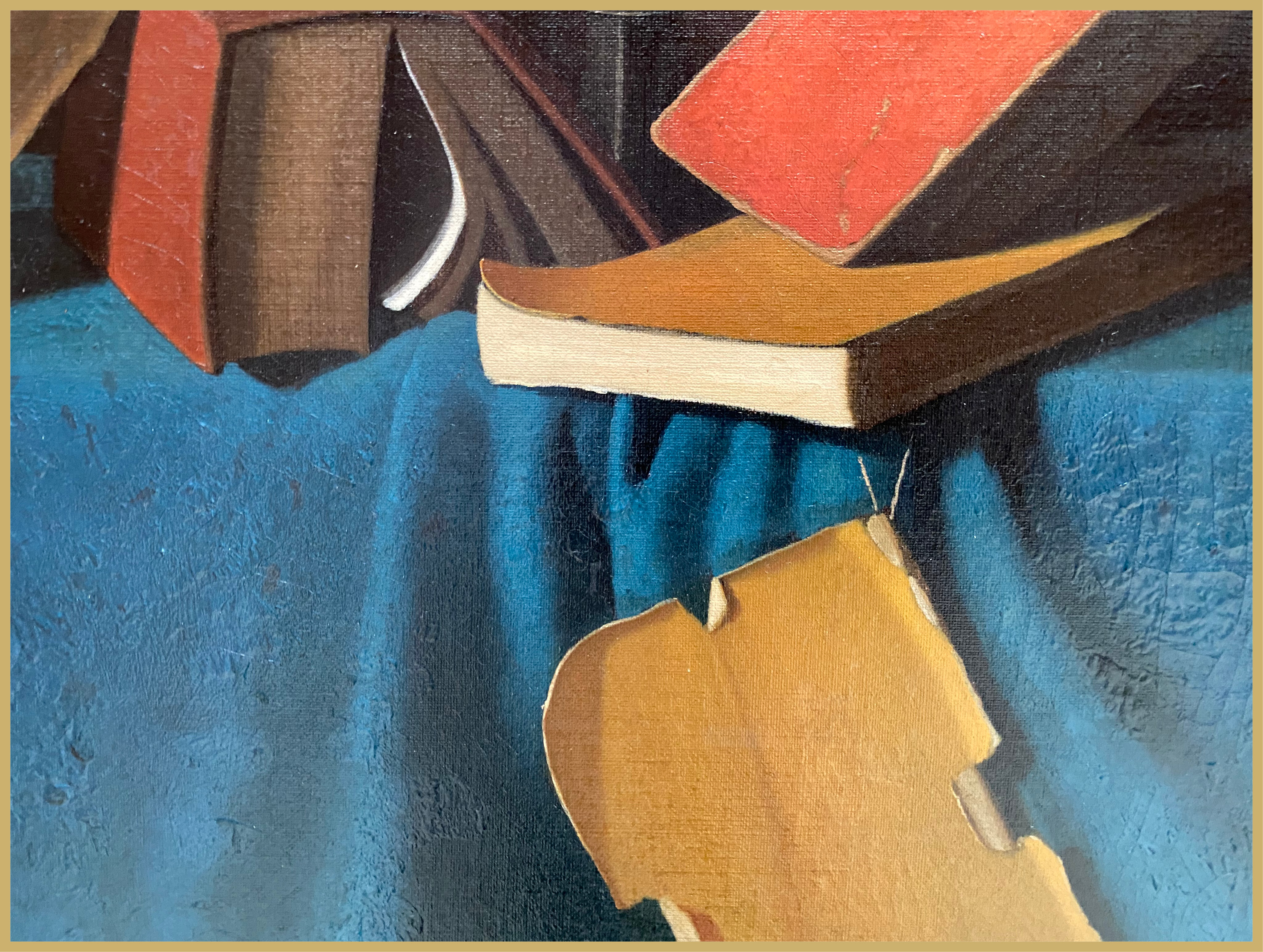
John Frederick Peto’s In the Library, c. 1900
Celebrated as a “jewel box”, the Timken is at once an uncommon collection of unquestioned “gems,” and a blissfully serene place to contemplate lastingly great works of art. A painting like In the Library fits awkwardly within such characterizations, however. An image of clutter, it looks ill-suited to any jewel-box. Chronologically, In the Library is the most contemporary work on the museum’s walls. It bears a date of 1900 (or, perhaps, 1901—it is hard to be sure). It is one of the institution’s most recent acquisitions, having been purchased by the Putnam Foundation in 2000. John Frederick Peto, the artist who created it, while central to the story of still-life painting in the United States, is far from a household name. Peto’s pictures are not likely to be mistaken for Pieter Claesz’s, but his deadpan illusionism has been cited as an inspiration to the likes of Jasper Johns. This large, forward-looking picture occupies a somewhat paradoxical place within the Timken’s founding logic, therefore.
The books that make up In the Library are in poor shape. They pile and tumble across a sky-blue tablecloth, covers chipped, leather bindings blistered, their spines split through careless use. These mute objects—no writing can be deciphered on Peto’s texts—are held in place by what can only be described as a provisional sense of gravity. A sheaf of papers at right projects uncomfortably beyond the table’s limit and an especially tattered cover hangs precariously over the front edge, prevented from falling into our space only by the thinnest triangle of thread. These elements appeal to unseen readers who might thoughtfully re-set them on the tabletop. But no one’s coming and, never mind, there’s hardly room enough to relocate these forlorn objects in the space provided. In the end, we understand they are balanced tentatively across the crowded space, confronting us with their own deliberate sullenness. Peto’s monotonous dark rectangle, comprised of smaller, colorful rectangles, is relieved only by a single, vertical element: an unlit candle that emerges from the furled lip of a pewter holder. That white stripe divides an otherwise featureless horizon. Another source of light, perhaps one less obviously nostalgic, streams in from the left and illuminates the picture’s stripped-down geometry.
Peto was one of several masters of trompe l’oeil—trick-the-eye—painting who emerged from Philadelphia toward the end of the nineteenth century. Decades after the Peale family introduced this popular genre to the region, Peto competed with the likes of William Michael Harnett, John Haberle, Jefferson David Chalfant, and other masters of hyperrealism for critical supremacy. Simulating quotidian things—letter racks, instrument stands, and lots of bookshelves—these painters played with inside jokes and self-reference. Works by Peto and Harnett were so similar as to eventually become confused by later scholars of American art. What was the point? In a brilliant analysis of post-Civil-War representations, Jay Cook argues that trompe l’oeil images, like this one, satisfied a modern craving for credulity. Low-brow magical acts, automata, and the rise of circus sideshows further underscore this tendency. Cook’s book, The Arts of Deception: Fraud in the Age of Barnum (Harvard, 2001) surveys inauthenticity and how it might be interpreted as a broader, modern cultural phenomenon. Peto’s messy library belonged fully to that mindset. It resonates with our own time and introduces a striking difference to the Timken’s orderly rationale.
Work of the Week #5
Emanuel de Witte, Interior of The Nieuwe Kerk, Amsterdam, 1657
These days I find myself reflecting on a time, not so long ago, when Balboa Park thronged with people. Families came to the Timken to expose young art lovers to some of the very best things that can be found in San Diego. I recall one young visitor distinctly. As I made my way through the galleries in the early afternoon, a man stopped me and asked if I worked at the museum. I nodded. He inclined his head toward a child: “Can you help him?” I looked down and saw a boy, about six, with a Timken brochure in his hand. The publication was part of a series that Kristina Rosenberg, the head of our Education Department, creates especially for kids: Be a Secret Art Agent. “Where can I find this dog?” the child inquired, pushing an illustration up toward my face. Not without exasperation, he added, “I’ve been looking all over for it.”
There are times when I long to get my work done without interruption and then there are other times when I actually enjoy thinking of myself as a “secret art agent.” That afternoon, I remember glancing at the well-marked publication, a form of “treasure hunt” that encourages children and their adult caregivers to look more closely at our collection. I instantly recognized the young detective’s problem and felt I was the source of his frustration. About a week earlier, I had arranged to move the Timken’s great oil painting by Emanuel de Witte, Interior of the Nieuwe Kerk, Amsterdam (1657) out of the Dutch/Flemish galleries in order to make room for a triptych by Pieter Claeissins (1499/50-1576) that had just arrived at the museum on extended loan. Clue #5 in Kristina’s Be a Secret Art Agent pamphlet could not be found because the dog, which was in de Witte’s painting, was not on view.
De Witte loved to paint architecture. By the time he got around to depicting the interior of De Nieuwe Kerk (The New Church), it had already undergone a series of historic transformations. Originally dedicated to Saint Catherine, the building was converted to Protestant worship after the Reformation swept through Northern Europe. In 1645, a fire in central Amsterdam partly destroyed the roof and it was busily being rebuilt around the time de Witte undertook what is now the Timken’s painting. The composition strikes a balance between showing off the mathematical precision of the church’s late-Medieval vaulting systems, its classicizing organ loft, and its plentiful suggestions of everyday life. Quite a lot is happening here. A parade of worshippers can be glimpsed near the right edge of the canvas. Well-dressed visitors pause in conversation in the foreground. Another group is busy exhuming bodies from beneath the stone flooring at left. And, it needs to be said, there are a surprising number of dogs. The head of a greyhound peeks out from the lower corner as if to direct our vision toward the center of the space. A black dog sits in an attitude that mimics the group of solid burghers to its right. A skinny dog turns its back on us, staring hungrily at a woman while she nurses an infant.
On that day, I led the family into the Timken’s art storage space and showed them de Witte’s work. The dogs were quickly found and the boy checked # 5 off of his list with visible satisfaction. I then watched as these visitors rejoined the flow of bodies in Balboa Park which, like the public in de Witte’s 17th-century view, has its own unique character and scattered purposes. We miss the secret art agents and their thirst for discovery.
Work of the Week #4
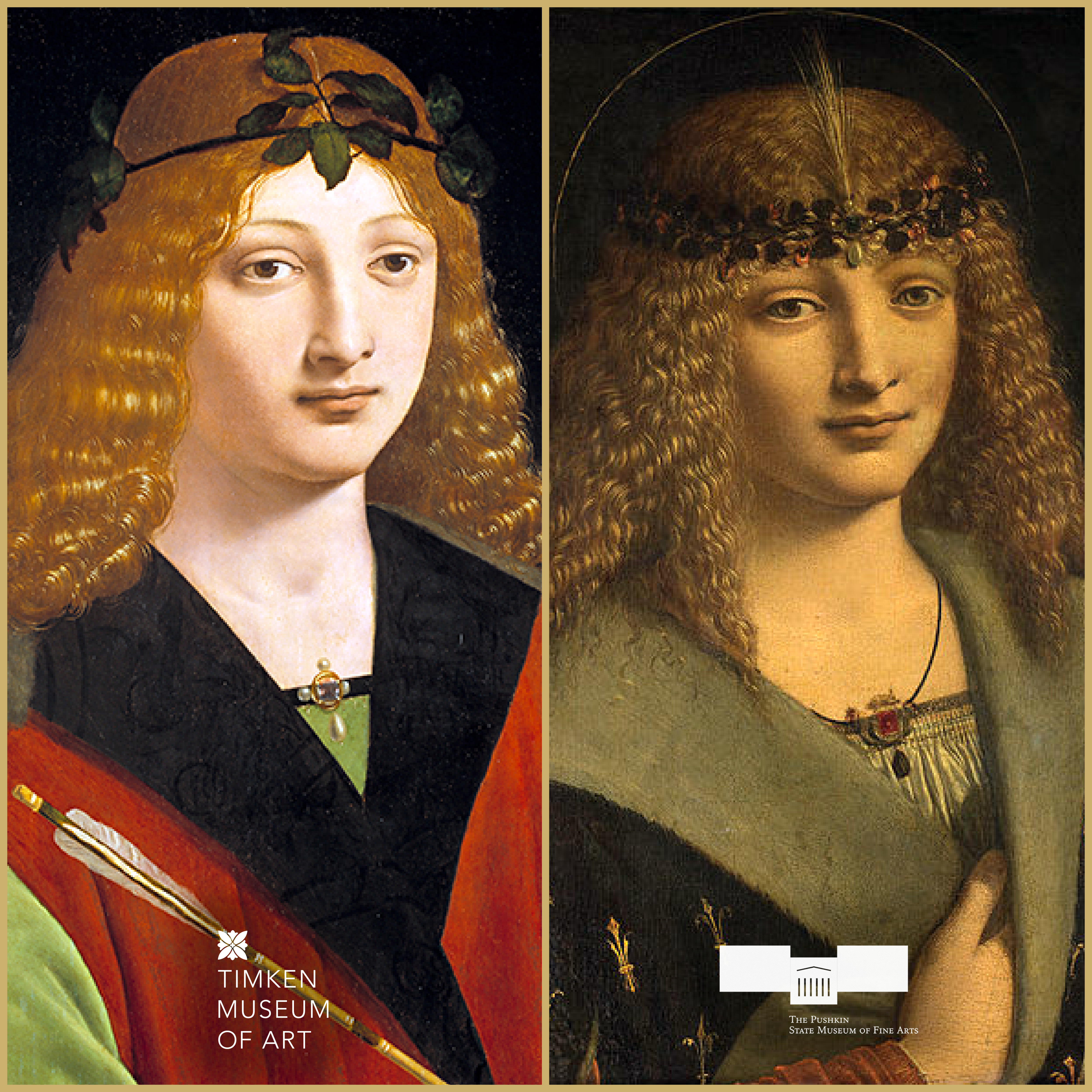
Giovanni Antonio Boltraffio, Portrait of a Youth with an Arrow, c. 1500 - Timken Museum of Art
Giovanni Antonio Boltraffio, Portrait of a boy as Saint Sebastian. Late 1490-s - The Pushkin State Museum of Fine Art
The small painting known as Portrait of a Youth with an Arrow by Giovanni Antonio Boltraffio (1467-1516) is noteworthy for its celebrated associations. First, and perhaps foremost, Boltraffio is best remembered for being a pupil of Leonardo da Vinci. Boltraffio belonged to a wealthy Milanese family and is mentioned in Giorgio Vasari’s biographical account of Leonardo’s life. Leonardo also mentions him by name in his notebooks. Furthermore, the soft features and serene expression of the young man in the Timken panel are reminiscent of Leonardo’s signature style. Boltraffio’s art historical reputation is modest by comparison to Leonardo’s, however. That fact partly accounts for a second association. The Timken’s picture was once owned by the Seventh Earl of Elgin, Thomas Bruce. Today, Lord Elgin is remembered mostly for his act of removing the marble decorations from the Parthenon in Athens in 1801. Within five years of orchestrating that controversial removal, Lord Elgin purchased Portrait of a Youth with an Arrow in Paris. At the time, he believed the painting was by Leonardo’s hand.
Since then, Portrait of a Youth with an Arrow has been studied by scholars, and included in exhibitions of Leonardo’s oeuvre, but always as the work of a follower. Students of Italian art history are increasingly interested in the “circle” surrounding Leonardo. The consensus that the Timken’s picture ought to be given to Boltraffio is less discouraging today, therefore, than it would have been to Lord Elgin, two centuries ago. We can further surmise that the identification of this painting as a “portrait” is a misnomer. Around the time of its purchase by the Putnam Foundation, in 1964, still another association was put forward: this might be a portrait of the Milanese poet, Girolamo Casio. But the Timken’s painting—while it prominently includes some attributes of the God of poetry, Apollo—doesn’t resemble any of the surviving depictions of Casio, including one painted by Boltraffio (1495, Pinacoteca di Brera, Milan). In fact, the work relates more closely to idealized subjects by the artist: a silverpoint drawing of Bacchus in the Galleria dell’ Accademia of Venice shows the same type of fair-haired young man with a nearly identical laurel wreath, and a depiction of Saint Sebastian at the Pushkin Museum in Moscow bears an even stronger resemblance to the face we encounter in San Diego.
While the Pushkin’s Portrait of a Boy as St. Sebastian (late 1490s) is far more finished than our panel, the two works have roughly the same dimensions and their poses are fundamentally the same. Like the Timken’s picture, the Pushkin’s Boltraffio once bore a hopeful attribution to Leonardo. It seems possible that both paintings could have served as preparatory studies for a large altarpiece showing Virgin and Child and Saints John the Baptist and Sebastian (c. 1500) now at the Louvre. The arrow held in the young man’s right hand further reinforces a connection between these representations. Sebastian was an early Christian martyr who Diocletian sentenced to death for his religious beliefs. Although Sebastian’s body was pierced multiple times by arrows, the execution miraculously failed. Could it be that Boltraffio is suggesting saintly triumph through his casual presentation of the arrow’s downturned shaft, the immaculate body, and the eternally calm countenance of this figure? We may never know for sure. Virtually from the start, uncertainty has surrounded this radiant picture.
Derrick R. Cartwright, Director of Curatorial Affairs
Work of the Week #3
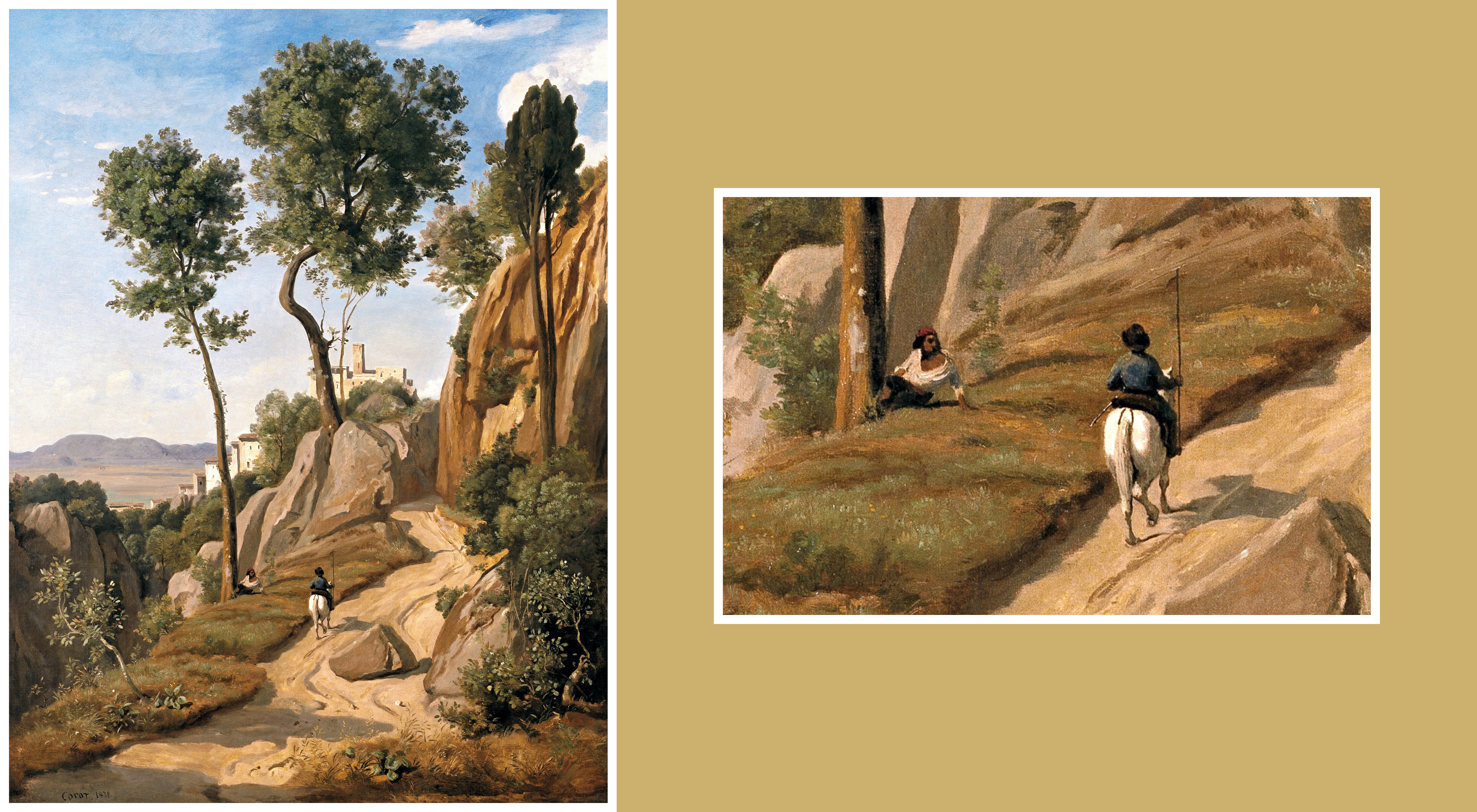
Jean-Baptiste-Camille Corot, View of Volterra, 1838
Reviewing the Salon of 1866, Émile Zola summarized the reigning concerns of French aesthetics by observing that “the work of art is a corner of creation seen through a temperament (. . . un oeuvre d’art est un coin de la création vu á travers un tempérament).” Zola’s poetic formulation became a refrain for anyone seeking to explain how Impressionism, Post-Impressionism, and other vanguard styles that privileged subjectivity, flourished during the last quarter of the 19th century. Indeed, the uniformity of Jean-Baptiste-Camille Corot’s later landscape representations, with their soft-focus approach to forms and generally muted atmospherics, was well covered by labels like “temperament” being applied to his plein-air practice.
At the Timken, we are familiar with a different Corot. View of Volterra (1838) is an appealingly crisp landscape that traces its origins back to the painter’s second trip to Italy, begun in the summer of 1834. Corot’s subject, the ancient, walled town of Volterra, occupies the near center of this large, vertical composition. In contrast to the artist’s subsequent, often more modestly-scaled pictures, View of Volterra is a sun-drenched evocation of the rugged conditions that he encountered while traversing the Tuscan countryside. As Fronia Wissman points out in 1988 in her exhibition that contextualized the Timken painting so well, Corot produced numerous sketches of Volterra and its surrounding environment. These open-air drawings and oil studies became the basis for works he would then finish in Paris. More than just enlarging these studies, Corot fundamentally reimagined the landscapes he sourced in Italy. For example, architectural landmarks that might have helped some viewers identify the site depicted in View of Volterra were left out. Our painting is less a public statement about Volterra—a portrait of the place—than it is a composite: a feeling about Tuscany, rooted in close observation and distanced by time.
As in many of his works, Corot couldn’t help but add a couple of figures to View of Volterra. More than just providing a sense of scale, the rider on horseback viewed from behind comes, more or less directly, out of his sketchbooks. A nearly identical rider appears in a smaller, contemporaneous painting by Corot, now at the National Gallery of Art, called View near Volterra. The reclining man at the base of the tree is of less certain origin. You can spot his kind, however, in similar works from the period, like Monte Pincio, Rome (The Art Institute of Chicago). Both of these figures are part of Corot’s effort to humanize an otherwise stark scene. Take these two characters out of the picture (you can accomplish this by placing your thumb on the screen, but don’t forget to wash your hands after!) and what’s left? A rutted path snaking through the trees and craggy rocks toward the fortifications in the distance. Without the fictional exchange between the two travelers in the foreground, the visual impact of the picture would be different. At the very least, they strategically acknowledge one another and, by extension, the artist invites us to join in his memory of the Italian landscape.
Derrick R. Cartwright, Director of Curatorial Affairs
____________________________________________
Work of the Week #2
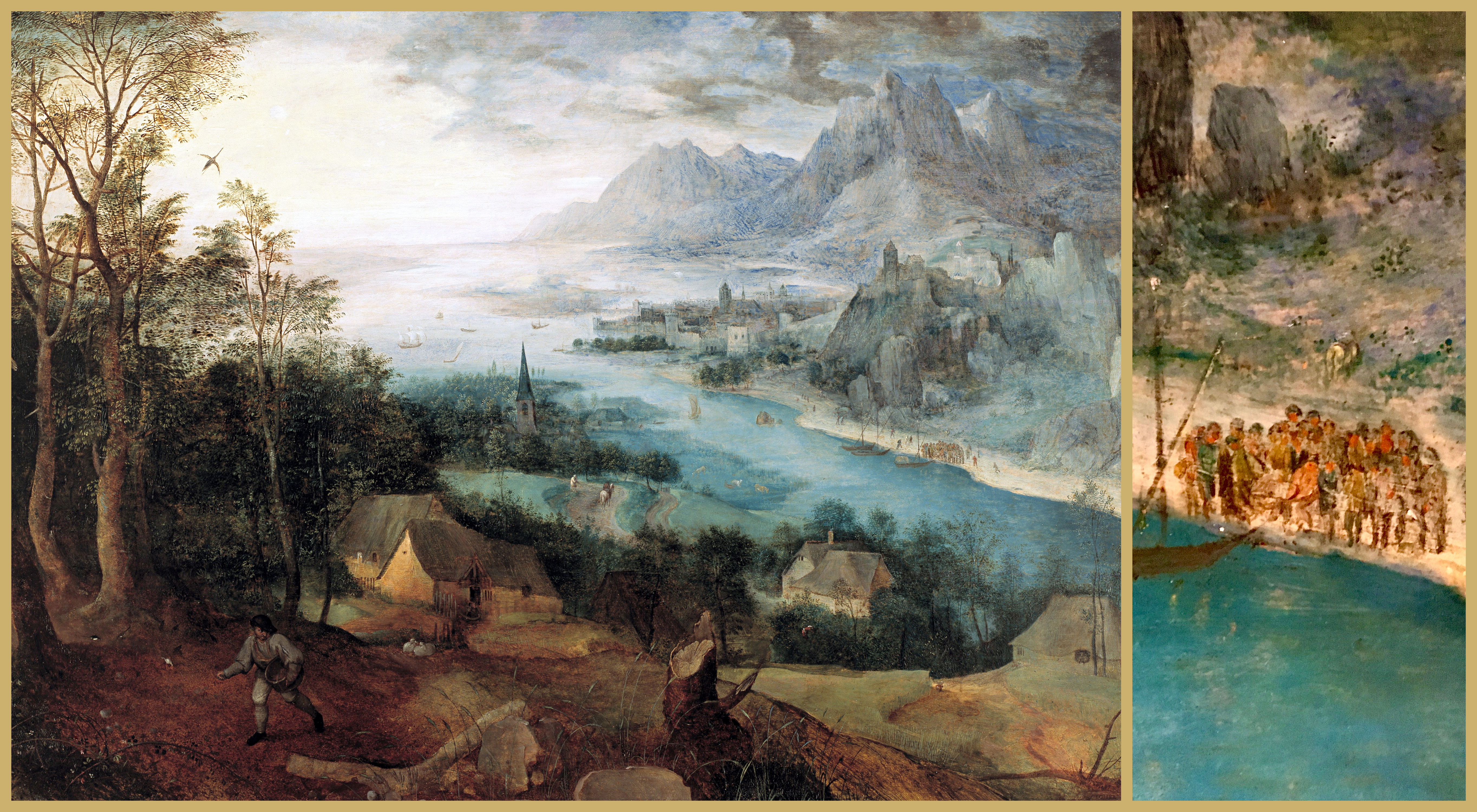
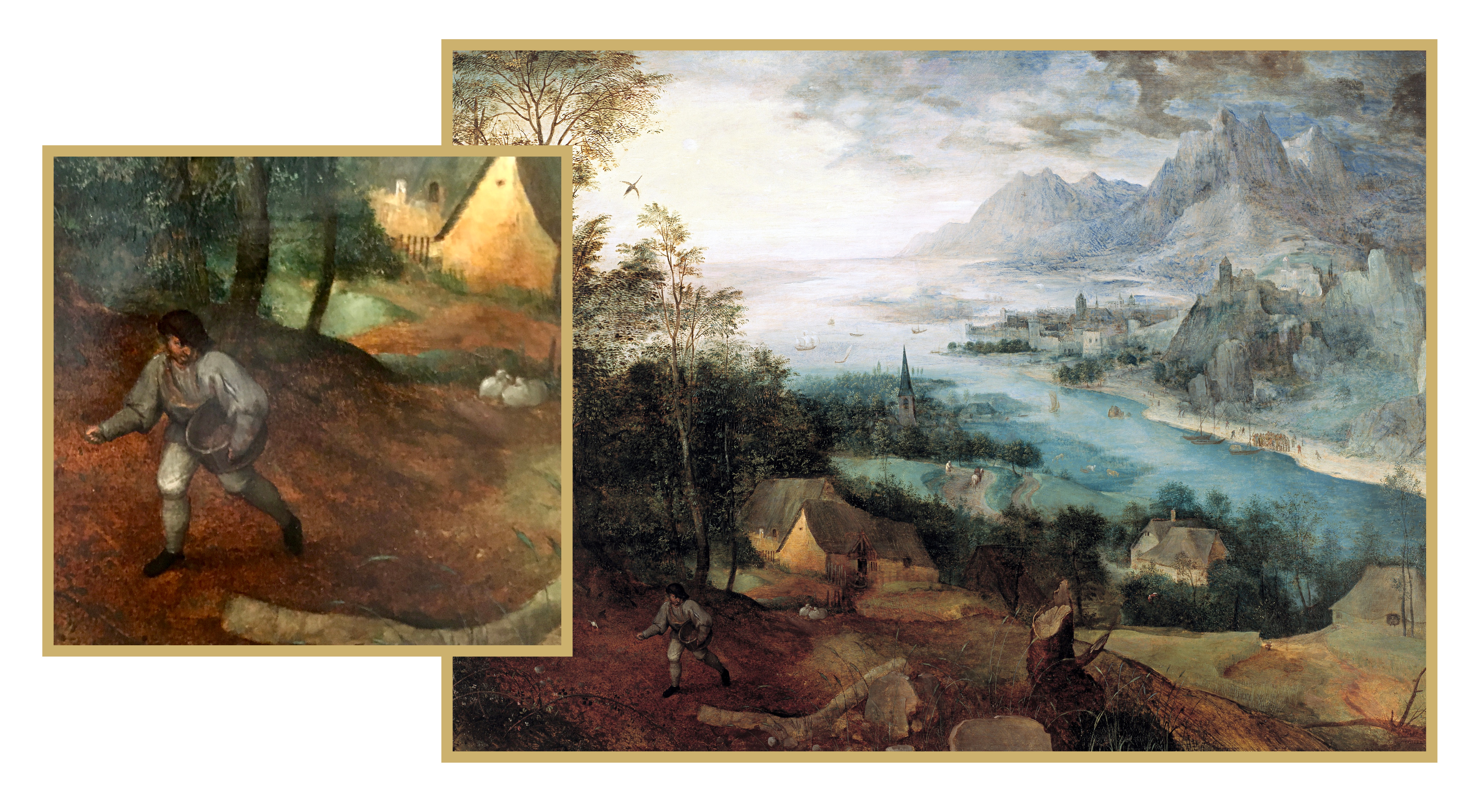
Parable of the Sower (1557) Pieter Bruegel the Elder
Pieter Bruegel, the Elder took pleasure in burying the lead. Many of his mature works had lofty, moralizing intentions, but their main representational strategy was to record the everyday messiness of life in 16th-century Flanders. Later generations called him “Peasant Bruegel” for this reason. I am struck by how even his most seemingly celebratory works, for example, Peasant Wedding (1567, Kunsthistorisches Museum, Vienna), are shot through with observations of bad behavior (don’t get me started on the proliferation of still darker imagery in works like his monumental The Triumph of Death [1562-63, Prado, Madrid]). Usually with a strong dose of humor, Bruegel’s works performed stinging social critiques.
The Timken is fortunate to be counted among just a handful of museums in North America that has a major painting by Bruegel the Elder in its permanent collection. Parable of the Sower was one of the last works that Amy Putnam actively participated in acquiring for us, just months before her death in 1958, and against the advice of her paid art consultant, Alfred Frankfurter. The most spiritually aware of the three Putnam sisters, Bruegel’s painting clearly touched Amy during her final months of life. After its purchase, Parable of the Sower, was put on display at the National Gallery of Art in Washington, DC until the new Timken Art Gallery opened to the public, in 1965. Because it is a delicate oil painting on a wooden panel, the work rarely leaves San Diego.
At first glance Parable of the Sower reads as a highly ambitious landscape. Minute description—every leaf in the stand of trees at left is detailed—is balanced by the artist’s interest in soft, atmospheric perspective. In the same way, the implied curvature of the earth and dramatically vertical mountain range in the upper right corner testify to Bruegel’s equal strengths at worldly observation and imaginative invention. Most careful viewers will eventually take note of the diminutive figure in the left foreground: the sower. Readers familiar with the bible may associate this figure with the Book of Matthew, where this laborer is conjured as part of a lesson about perseverance and sharing goodness. Indeed, Brueghel emphasizes this narrative by including hungry birds devouring the seeds as soon as the sower casts them from the basket on his hip. In the middle ground Bruegel suggests that fields flourish nonetheless. Still further away, and frequently missed by casual viewers, a sizeable crowd gathers near a boat on the banks of the lake/river. It is here, in the distance and without compositional fanfare, that Bruegel chooses to represent Christ delivering his eponymous sermon.
Although he seldom made it obvious, Bruegel loved to telescope the messages his works contained. In Parable of the Sower, he counsels us to take in the bigger picture, have some humility about the frustrations of daily life, never give up.
Derrick Cartwright, Director of Curatorial Affairs
__________________________________________
Work of the Week #1
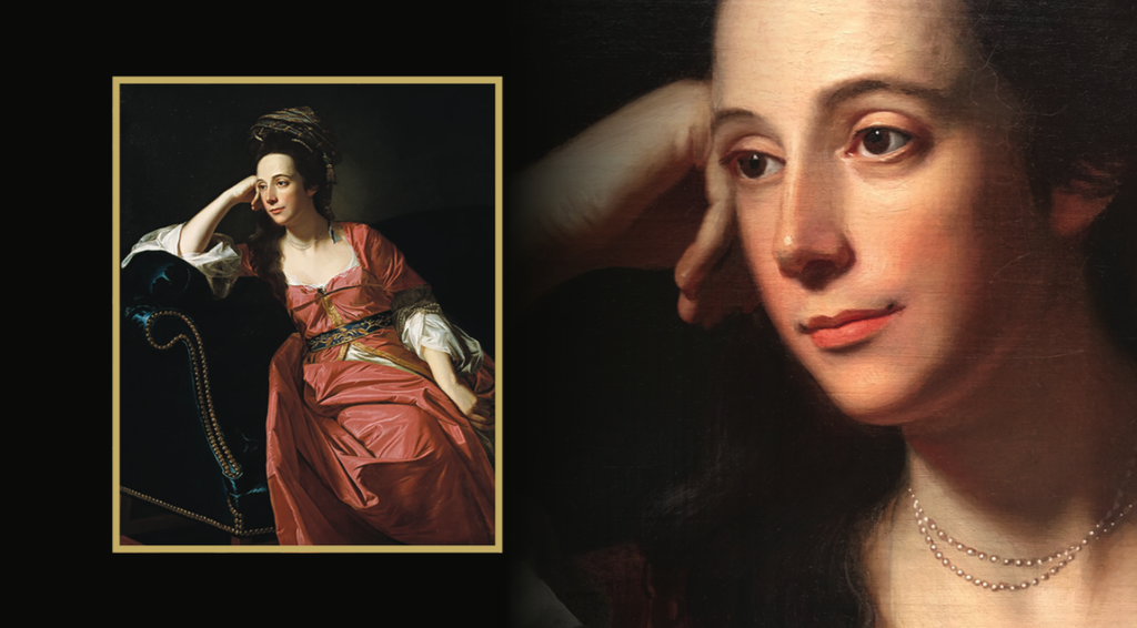
John Singleton Copley, Mrs. Thomas Gage, 1771
Of the many memorable works in the Timken Museum of Art’s permanent collection, the portrait of Margaret Kemble Gage (Mrs. Thomas Gage) by John Singleton Copley is a favorite. Why?
The painter’s uncanny ability to describe the crisp folds in the woman’s satin, coral-colored robe as well as the intricacy of her fashionable hairstyle certainly confirm his role as Boston’s leading portraitist of the late colonial period. Copley enjoyed his reputation as a flashy painter and this one has its fair share of dazzle. Speaking personally, however, I have always been drawn to the look on Margaret Kemble Gage’s face. Perhaps, the attraction has something to do with the historical circumstances she faced. Gage’s husband, General Thomas Gage, was in charge of British military forces in North America. We also know that the Gages were in the midst of making plans for her to return to the safety of England. As rebellious acts increased and full-scale war seemed imminent, the 37-year-old wife of one of the most powerful military figures in North America took a break from packing up her home to sit and have a portrait made. While doing this, she appears poised, yet deep in thought. Her serene expression is beautiful, but also inscrutable. Margaret Gage can’t have known what the future would bring to her loved ones, or herself, in June of 1771, the moment that Copley began painting her. Nevertheless, she looks ahead with an attitude of confidence and determination. Almost 250 years after its creation, Mrs. Thomas Gage comes across as a representation of quiet courage in the face of uncertainty.
The painting reminds us how works of art can serve as models for seeking our best selves.
Derrick R. Cartwright
Director of Curatorial Affairs
"Work of the Week: During this unprecedented time, when access to museums has been reduced due to widespread public health concerns, the Timken's staff wants to share its thoughts about how great works of art impact our lives. Work of the Week is a new project that hopes to inspire reflection, and dialogue, about the very best things that women and men have created over time."